The Interface Settings window allows users to customize the appearance and layout of the AnalyticsCreator working environment. These settings define how diagrams, navigation trees, and workspace pages are visually represented, making it easier to adapt the interface to individual preferences or monitor configurations.
Important: Interface settings are stored per user profile. This means each user can define their own visual preferences without affecting other users or the shared project environment. Changes made here apply only to the current user's interface layout and will not alter global project configurations.
The configuration options are organized into four tabs: Colors, Diagram, Navigation Tree, and Pages. Each tab offers controls that influence how diagrams and objects are displayed within the workspace.
A) Colors
The Colors tab provides complete control over the color palette of all diagram elements. Each object type in AnalyticsCreator can have its background and foreground colors configured separately. This allows for clear visual separation between different DWH layers, object types, and diagram components.
ID
Option
Description
1
Background Arrow
Defines the background color for connection arrows between objects.
2
Background Text
Specifies the color behind text elements and labels.
3
Background External Transformation
Sets the color for transformations coming from external sources.
4
Background Fact
Defines the background color for Fact tables in the Data Mart layer.
5
Background Header
Determines the color used in object headers.
6
Background Vault Hub
Color used for Vault Hub entities.
7
Background Vault Link
Sets background color for Vault Link entities.
8
Background Even Column
Background color applied to even-numbered columns for readability.
9
Background Odd Column
Background color applied to odd-numbered columns for contrast.
10
Background Other Object
Defines the background color for objects not categorized elsewhere.
11
Background Package
Sets the background for package objects in the diagram.
12
Background Vault Satellite
Color used for Vault Satellite entities.
13
Background Script Transformation
Specifies background color for script-based transformations.
14
Background Source
Defines background color for Source tables or external systems.
15
Background Table
Applies to background color of generic table objects.
16
Background View
Color for View-type objects in diagrams.
17
Border Diagram
Specifies border color for the entire diagram area.
18
Border Object
Defines border color around individual objects.
19
Line Color
Controls color for main connecting lines between objects.
20
Highlighted Label
Color used for highlighting selected or focused labels.
21
Default Presets
Applies predefined templates (Default 1, 2, or 3) to restore visual settings quickly.
25
Foreground Arrow
Sets arrow line color and border in the diagram.
26
Foreground Text
Defines text color for object labels and headers.
27
Foreground Dimension
Text and border color for dimension objects.
28
Foreground External Transformation
Defines color for external transformation text and lines.
29
Foreground Fact
Sets color for text and borders of Fact tables.
30
Foreground Header
Color for header text in diagram objects.
31
Foreground Vault Hub
Text and border color for Vault Hub entities.
32
Foreground Vault Link
Defines line and text color for Vault Link entities.
33
Foreground Even Column
Color for text in even-numbered columns.
34
Foreground Odd Column
Color for text in odd-numbered columns.
35
Foreground Other Object
Used for all remaining object types not specifically categorized.
36
Foreground Package
Text color used in package objects.
37
Foreground Vault Satellite
Sets text and border color for Vault Satellite objects.
38
Foreground Script Transformation
Defines color for text and outlines of script transformation objects.
39
Foreground Source
Text color for source objects.
40
Foreground Table
Defines text color used in table objects.
41
Foreground View
Text and border color for view objects.
42
Foreground Package (Alt)
Optional alternative package color variant for theme adjustments.
43
Foreground Table (Alt)
Alternate text or border color for tables.
44
Line Color Thin
Defines color for thinner connectors used in complex diagrams.
Screen Overview:
B) Diagram
The Diagram tab controls scaling, object proportions, and text formatting for the data flow visualization. These options help optimize diagram readability and aesthetic balance across different screen sizes.
B) Diagram
The Diagram tab controls the scaling, spacing, and visual proportions of elements displayed in the data flow diagram. These settings help maintain clear and visually balanced layouts, especially for complex DWH models.
ID
Parameter
Description
1
Arrow Height
Sets the height of arrows used to connect diagram objects.
2
Font Size
Defines the general font size used for object labels.
3
Cell Height
Adjusts the vertical size of diagram object cells.
4
Header Font Size
Sets the font size for object headers in diagrams.
5
Main Box Height
Defines the height of the main object boxes.
6
Sub Box Height
Defines the height of smaller sub-elements within objects.
7
Scale
Adjusts the overall zoom scaling of the diagram view.
8
Arrow Width
Determines the line thickness of connecting arrows.
9
Border Thickness
Specifies the thickness of borders around diagram boxes.
10
Cell Width
Controls the width of cells or boxes in the diagram.
11
Header Height
Sets the height of the header section inside diagram objects.
12
Main Box Width
Adjusts the width of main object boxes for better visibility.
13
Sub Box Width
Defines the width of sub-elements.
14
Minor Connector Line Opacity (%)
Controls the transparency of less important connector lines to reduce visual clutter.
Screen Overview:
C) Navigation Tree
The Navigation Tree tab defines the display settings of the project's left-hand folder structure. Adjustments here affect the layout of folders such as Sources, Layers, Packages, and Roles, enhancing usability and readability.
ID
Parameter
Description
1
Icon Size
Adjusts the size of folder and object icons in the tree view.
2
Line Space
Defines vertical spacing between tree elements for improved readability.
3
Scale
Adjusts the overall zoom level for the navigation tree panel.
4
Font Size
Defines the font size for the names of folders and objects.
5
Splitter Position
Determines the width between the navigation tree and the main diagram view.
Screen Overview:
D) Pages
The Pages tab defines how pages within the diagram workspace are displayed and aligned. This includes layout scaling, alignment rules, and maximum allowed dimensions for diagram and table views.
ID
Parameter
Description
1
Detail Page Horizontal Alignment
Sets how detail pages are aligned horizontally (Stretch, Left, Center, Right).
2
Detail Page Vertical Alignment
Defines the vertical alignment for detailed diagram pages.
3
Detail Page Max Width
Specifies the maximum allowed width for detailed diagram pages.
4
Detail Page Max Height
Specifies the maximum allowed height for detailed pages.
5
Frame Scale
Sets the zoom factor applied to page frames in the diagram view.
6
Table Page Horizontal Alignment
Controls horizontal alignment for table pages in the diagram.
7
Table Page Vertical Alignment
Sets vertical alignment for table pages.
8
Table Page Max Width
Defines the maximum width for table pages.
9
Table Page Max Height
Defines the maximum height for table pages.
Screen Overview:
[
{"id":193656403493,"name":"Getting Started","type":"category","path":"/docs/getting-started","breadcrumb":"Getting Started","description":"","searchText":"getting started welcome to the analyticscreator documentation. in this getting started section, you can choose from the following sections: installation system requirements download and installation understanding analyticscreator"}
,{"id":194231638534,"name":"Installation","type":"section","path":"/docs/getting-started/installation","breadcrumb":"Getting Started › Installation","description":"","searchText":"getting started installation installing analyticscreator: 32-bit and 64-bit versions this guide offers step-by-step instructions for installing either the 32-bit or 64-bit version of analyticscreator, depending on your system requirements. 💡note: to ensure optimal performance, verify that your system meets the following prerequisites before installation."}
,{"id":194231638452,"name":"System Requirements","type":"section","path":"/docs/getting-started/system-requirements","breadcrumb":"Getting Started › System Requirements","description":"","searchText":"getting started system requirements to ensure optimal performance, verify that the following requirements are met: 💡 note: if you already have sql server installed and accessible, you can proceed directly to the launching analyticscreator section. networking: communication over port 443 is where analytics communicates to the analyticscreator server. operating system: windows 10 or later. analyticscreator is compatible with windows operating systems starting from version 10. ⚠️ warning: port 443 is the standard https port for secured transactions. it is used for data transfers and ensures that data exchanged between a web browser and websites remains encrypted and protected from unauthorized access. microsoft sql server: sql server on azure virtual machines azure sql managed instances"}
,{"id":193657815102,"name":"Download and Installation","type":"section","path":"/docs/getting-started/download-and-installation","breadcrumb":"Getting Started › Download and Installation","description":"","searchText":"getting started download and installation access the download page navigate to the analyticscreator download page download the installer locate and download the installation file. verify sql server connectivity before proceeding with the installation, confirm that you can connect to your sql server instance. connecting to sql server: to ensure successful connectivity: use sql server management studio (ssms), a tool for managing and configuring sql server. if ssms is not installed on your system, download it from the official microsoft site: download sql server management studio (ssms) install the software once connectivity is confirmed, follow the instructions below to complete the installation."}
,{"id":194809538144,"name":"Configuring AnalyticsCreator","type":"section","path":"/docs/getting-started/configuring-analyticscreator","breadcrumb":"Getting Started › Configuring AnalyticsCreator","description":"","searchText":"getting started configuring analyticscreator this guide will walk you through configuring analyticscreator with your system. provide the login and password that you received by e-mail from analyticscreator minimum requirements configuration settings the configuration of analyticscreator is very simple. the only mandatory configuration is the sql server settings. sql server settings use localdb to store repository: enables you to store the analyticscreator project (metadata only) on your localdb. sql server to store repository: enter the ip address or the name of your microsoft sql server. security integrated: authentication is based on the current windows user. standard: requires a username and password. azure ad: uses azure ad (now microsoft entra) for microsoft sql server authentication. trust server certificate: accepts the server's certificate as trusted. sql user: the sql server username. sql password: the corresponding password. optional requirements paths unc path to store backup: a network path to store project backups. local sql server path to store backup: a local folder to store your project backups. local sql server path to store database: a local folder to store your sql server database backups. repository database template: the alias format for your repositories. default: repo_{reponame}. dwh database template: the alias format for your dwh templates. default: dwh_{reponame}. proxy settings proxy address: the ip address or hostname of your proxy server. proxy port: the port number used by the proxy. proxy user: the username for proxy authentication. proxy password: the password for the proxy user. now you're ready to create your new data warehouse with analyticscreator."}
,{"id":194231638533,"name":"Understanding AnalyticsCreator","type":"section","path":"/docs/getting-started/understanding-analytics-creator","breadcrumb":"Getting Started › Understanding AnalyticsCreator","description":"","searchText":"getting started understanding analyticscreator there are at least two different approaches to design a holistic business and data model. the bottom-up method, which is shown in the graphic below and the top-down method, which starts with the conceptual model first, although models can also be loaded from other modeling tools. connect analyticscreator to any data source, especially databases, individual files, data lakes, cloud services, excel files and other extracts. build-in connectors to many common sources are available as well as support of azure data factory, azure analytics. define data - analyticscreator extracts all metadata from the data sources, such as field descriptions, data types, key fields, and all relationships, which is stored in the analyticscreator metadata repository. this will: extract and capture ddl detect structure changes and forward in all higher layers. cognitive suggestion- intelligent wizards help to create a draft version of the model across all layers of the data analytics platform. choose different modelling approaches or create your own approach: data vault 2.0, dimensional, 3 nf, own historical data handling (scd, snapshot, cdc, gapless, ..) use azure devops model- the entire toolset of analyticscreator is at your disposal to further develop the draft model. behind the holistic graphical model, the generated code is already finished and can be also modified manually, including: automated transformations and wizards collaboration development process supported by data lineage flow-chart own scripting and macros are possible deploy - to deploy the data model in different environments (test, prod, ..), analyticscreator generates deployment packages that are also used for the change process of structures and loadings. deployment packages can be used locally, in fabric, azure as well in hybrid environments. this includes: stored procedures, ssis azure sql db, azure analysis services, synapse arm template for azure data factory tabular models, olap cubes power bi tableau qlik"}
,{"id":292127259841,"name":"Quick Start Guide","type":"section","path":"/docs/getting-started/quick-start-guide","breadcrumb":"Getting Started › Quick Start Guide","description":"","searchText":"getting started quick start guide this quick start guide helps new and trial users understand how to set up, model, and automate a data warehouse using analyticscreator. it covers everything from connectors to data marts - with practical examples based on sap source systems. analyticscreator automates the creation of data warehouses and analytical models. it connects to source systems (like sap, sql server, or others), imports metadata, and generates all required transformation, historization, and loading structures. this quick start shows how to: create connectors and relationships (foreign keys, references) import source tables build transformations for dimensions and facts define relationships and surrogate keys create data marts and calendar dimensions generate cubes and metrics for reporting tools (power bi, etc.)"}
,
{"id":194803188913,"name":"User Guide","type":"category","path":"/docs/user-guide","breadcrumb":"User Guide","description":"","searchText":"user guide you can launch analyticscreator in two ways: from the desktop icon after installation or streaming setup, a desktop shortcut is created. double-click the icon to start analyticscreator. from the installer window open the downloaded analyticscreator installer. instead of selecting install, click launch (labeled as number one in the image below). a window will appear showing the available analyticscreator servers, which deliver the latest version to your system. this process launches analyticscreator without performing a full installation, assuming all necessary prerequisites are already in place."}
,{"id":194831949947,"name":" Desktop Interface","type":"section","path":"/docs/user-guide/desktop-interface","breadcrumb":"User Guide › Desktop Interface","description":"","searchText":"user guide desktop interface with analyticscreator desktop users can: data warehouse creation automatically generate and structure your data warehouse, including fact tables and dimensions. connectors add connections to various data sources and import metadata seamlessly. layer management define and manage layers such as staging, persisted staging, core, and datamart layers. package generation generate integration packages for ssis (sql server integration services) and adf (azure data factory). indexes and partitions automatically configure indexes and partitions for optimized performance. roles and security manage roles and permissions to ensure secure access to your data. galaxies and hierarchies organize data across galaxies and define hierarchies for better data representation. customizations configure parameters, macros, scripts, and object-specific scripts for tailored solutions. filters and predefined transformations apply advanced filters and transformations for data preparation and enrichment. snapshots and versioning create snapshots to track and manage changes in your data warehouse. deployments deploy your projects with flexible configurations, supporting on-premises and cloud solutions. groups and models organize objects into groups and manage models for streamlined workflows. data historization automate the process of creating historical data models for auditing and analysis."}
,{"id":194831949967,"name":"Working with AnalyticsCreator","type":"section","path":"/docs/user-guide/working-with-analyticscreator","breadcrumb":"User Guide › Working with AnalyticsCreator","description":"","searchText":"user guide working with analyticscreator understanding the fundamental operations in analyticscreator desktop is essential for efficiently managing your data warehouse repository and ensuring accuracy in your projects. below are key basic operations you can perform within the interface: edit mode and saving — data warehouse editor single object editing: in the data warehouse repository, you can edit one object at a time. this ensures precision and reduces the risk of unintended changes across multiple objects. how to edit: double-click on any field within an object to enter edit mode. the selected field becomes editable, allowing you to make modifications. save prompt: if any changes are made, a prompt will appear, reminding you to save your modifications before exiting the edit mode. this safeguard prevents accidental loss of changes. unsaved changes: while edits are immediately reflected in the repository interface, they are not permanently saved until explicitly confirmed by clicking the save button. accessing views in data warehouse explorer layer-specific views: each layer in the data warehouse contains views generated by analyticscreator. these views provide insights into the underlying data structure and transformations applied at that layer. how to access: navigate to the data warehouse explorer and click on the view tab for the desired layer. this displays the layer's contents, including tables, fields, and transformations. adding and deleting objects adding new objects: navigate to the appropriate section (e.g., tables, layers, or connectors) in the navigation tree. right-click and select add [object type] to create a new object. provide the necessary details, such as name, description, and configuration parameters. save the object. deleting objects: select the object in the navigation tree and right-click to choose delete. confirm the deletion when prompted. ⚠️ note: deleting an object may affect dependent objects or configurations. filtering and searching in data warehouse explorer filtering: use filters to narrow down displayed objects by criteria such as name, type, or creation date. searching: enter keywords or phrases in the search bar to quickly locate objects. benefits: these features enhance repository navigation and efficiency when working with large datasets. object dependencies and relationships dependency view: for any selected object, view its dependencies and relationships with other objects by accessing the dependencies tab. impact analysis: analyze how changes to one object might affect other parts of the data warehouse. managing scripts predefined scripts: add scripts for common operations like data transformations or custom sql queries. edit and run: double-click a script in the navigation tree to modify it. use run script to execute and view results. validating and testing changes validation tools: use built-in tools to check for errors or inconsistencies in your repository. evaluate changes: use the evaluate button before saving or deploying to test functionality and ensure correctness. locking and unlocking objects locking: prevent simultaneous edits by locking objects, useful in team environments. unlocking: release locks once edits are complete to allow further modifications by others. exporting and importing data export: export objects, scripts, or configurations for backup or sharing. use the export option in the toolbar or navigation tree. import: import previously exported files to replicate configurations or restore backups. use the import option and follow the prompts to load the data."}
,{"id":194803189337,"name":"Advanced Features","type":"section","path":"/docs/user-guide/advanced-features","breadcrumb":"User Guide › Advanced Features","description":"","searchText":"user guide advanced features analyticscreator provides a rich set of advanced features to help you configure, customize, and optimize your data warehouse projects. these features extend the tool’s capabilities beyond standard operations, enabling more precise control and flexibility. scripts scripts in analyticscreator allow for detailed customization at various stages of data warehouse creation and deployment. they enhance workflow flexibility and enable advanced repository configurations. types of scripts object-specific scripts define custom behavior for individual objects, such as tables or transformations, to meet specific requirements. pre-creation scripts execute tasks prior to creating database objects. example: define sql functions to be used in transformations. pre-deployment scripts configure processes that run before deploying the project. example: validate dependencies or prepare the target environment. post-deployment scripts handle actions executed after deployment is complete. example: perform cleanup tasks or execute stored procedures. pre-workflow scripts manage operations that occur before initiating an etl workflow. example: configure variables or initialize staging environments. repository extension scripts extend repository functionality with user-defined logic. example: add custom behaviors to redefine repository objects. historization the historization features in analyticscreator enable robust tracking and analysis of historical data changes, supporting advanced time-based reporting and auditing. key components slowly changing dimensions (scd) automate the management of changes in dimension data. supports various scd types including: type 1 (overwrite) type 2 (versioning) others as needed time dimensions create and manage temporal structures to facilitate time-based analysis. example: build fiscal calendars or weekly rollups for time-series analytics. snapshots capture and preserve specific states of the data warehouse. use cases include audit trails, historical reporting, and rollback points. parameters and macros these tools provide centralized control and reusable logic to optimize workflows and streamline repetitive tasks. parameters dynamic management: centralize variable definitions for consistent use across scripts, transformations, and workflows. reusable configurations: update values in one place to apply changes globally. use cases: set default values for connection strings, table prefixes, or date ranges. macros reusable logic: create parameterized scripts for tasks repeated across projects or workflows. streamlined processes: use macros to enforce consistent logic in transformations and calculations. example: define a macro to calculate age from a birthdate and reuse it across transformations. summary analyticscreator’s advanced features offer deep customization options that allow you to: control object-level behavior through scripting track and manage historical data effectively streamline project-wide settings with parameters reuse logic with powerful macros these capabilities enable you to build scalable, maintainable, and highly flexible data warehouse solutions."}
,{"id":194809542259,"name":"Wizards","type":"section","path":"/docs/user-guide/wizards","breadcrumb":"User Guide › Wizards","description":"","searchText":"user guide wizards the wizards in analyticscreator provide a guided and efficient way to perform various tasks related to building and managing a data warehouse. below is an overview of the eight available wizards and their core functions. dwh wizard the dwh wizard is designed to quickly create a semi-ready data warehouse. it is especially useful when the data source contains defined table relationships or manually maintained references. supports multiple architectures: classic (kimball), data vault 1.0 & 2.0, or mixed. automatically creates imports, dimensions, facts, hubs, satellites, and links. customizable field naming, calendar dimensions, and sap deltaq integration. source wizard the source wizard adds new data sources to the repository. supports source types: table or query. retrieves table relationships and sap-specific metadata. allows query testing and schema/table filtering. import wizard the import wizard defines and manages the import of external data into the warehouse. configures source, target schema, table name, and ssis package. allows additional attributes and parameters. historization wizard the historization wizard manages how tables or transformations are historized. supports scd types: 0, 1, and 2. configures empty record behavior and vault id usage. supports ssis-based or stored procedure historization. transformation wizard the transformation wizard creates and manages data transformations. supports regular, manual, script, and external transformation types. handles both historicized and non-historicized data. configures joins, fields, persistence, and metadata settings. calendar transformation wizard the calendar transformation wizard creates calendar transformations used in reporting and time-based models. configures schema, name, start/end dates, and date-to-id macros. assigns transformations to specific data mart stars. time transformation wizard the time transformation wizard creates time dimensions to support time-based analytics. configures schema, name, time period, and time-to-id macros. assigns transformations to specific data mart stars. snapshot transformation wizard the snapshot transformation wizard creates snapshot dimensions for snapshot-based analysis. allows creation of one snapshot dimension per data warehouse. configures schema, name, and data mart star assignment. by using these eight wizards, analyticscreator simplifies complex tasks, ensures consistency, and accelerates the creation and management of enterprise data warehouse solutions."}
,{"id":373340594423,"name":"DWH Wizard ","type":"subsection","path":"/docs/user-guide/wizards/dwh-wizard-function","breadcrumb":"User Guide › Wizards › DWH Wizard ","description":"","searchText":"user guide wizards dwh wizard the dwh wizard allows for the rapid creation of a semi-ready data warehouse. it is especially effective when the data source includes predefined table references or manually maintained source references. prerequisites at least one source connector must be defined before using the dwh wizard. note: the dwh wizard support flat files using duckdb , in that case you should select the option \"use metadata of existing sources\" or use the source wizard instead. to launch the dwh wizard, click the “dwh wizard” button in the toolbar. instead, the user can use the connector context menu: using the dwh wizard select the connector, optionally enter the schema or table filter, and click \"apply\". then, the source tables will be displayed. optionally, select the \"existing sources\" radio button to work with already defined sources instead of querying the external system (ideal for meta connectors). if a table already exists, the \"exist\" checkbox will be selected. to add or remove tables: select them and click the ▶ button to add. select from below and click the ◀ button to remove. dwh wizard architecture options the wizard can generate the dwh using: classic or mixed architecture: supports imports, historization, dimensions, and facts. data vault architecture: supports hubs, satellites, links, dimensions, and facts with automatic classification when “auto” is selected. define name templates for dwh objects: set additional parameters: dwh wizard properties field name appearance: leave unchanged, or convert to upper/lowercase. retrieve relations: enable automatic relation detection from source metadata. create calendar dimension: auto-create calendar dimension and define date range. include tables in facts: include related tables in facts (n:1, indirect, etc.). use calendar in facts: include date-to-calendar references in fact transformations. sap deltaq transfer mode: choose between idoc or trfs. sap deltaq automatic synchronization: enable automatic deltaq sync. sap description language: select sap object description language. datavault2: do not create hubs: optionally suppress hub creation in dv2. historizing type: choose ssis package or stored procedure for historization. use friendly names in transformations as column names: use display names from sap/meta/manual connectors. default transformations: select default predefined transformations for dimensions. stars: assign generated dimensions and facts to data mart stars."}
,{"id":373340594424,"name":"Source Wizard","type":"subsection","path":"/docs/user-guide/wizards/source-wizard","breadcrumb":"User Guide › Wizards › Source Wizard","description":"","searchText":"user guide wizards source wizard the source wizard is used to add new data sources to the repository. to launch the source wizard, right-click on the \"sources\" branch of a connector in the context menu and select \"add source.\" source wizard functionality the appearance and functionality of the source wizard will vary depending on the selected source type (table or query): table: when selecting table as the data source, the wizard provides options to configure and view available tables. configuring a table data source when selecting \"table\" as the data source in the source wizard, click the \"apply\" button to display the list of available source tables. optionally, you can enter a schema or table filter to refine the results. configuration options: retrieve relations: enables the retrieval of relationships for the selected source table, if available. sap description language: specifies the language for object descriptions when working with sap sources. sap deltaq attributes: for sap deltaq sources, additional deltaq-specific attributes must be defined. configuring a query as a data source when selecting \"query\" as the data source in the source wizard, follow these steps: define schema and name: specify the schema and name of the source for the repository. enter the query: provide the query in the query language supported by the data source. test the query: click the “test query” button to verify its validity and ensure it retrieves the expected results. complete the configuration: click the “finish” button to add the new source to the repository. the source definition window will open, allowing further modifications if needed."}
,{"id":373340594425,"name":"Import wizard","type":"subsection","path":"/docs/user-guide/wizards/import-wizard","breadcrumb":"User Guide › Wizards › Import wizard","description":"","searchText":"user guide wizards import wizard to start the import wizard, use the source context menu: import status indicators sources marked with a \"!\" icon indicate that they have not yet been imported. attempting to launch the import wizard on a source that has already been imported will result in an error. typical import wizard window there is a typical import wizard window, as shown in the image below: options: source: the source that should be imported. target schema: the schema of the import table. target name: the name of the import table. package: the name of the ssis package where the import will be done. you can select an existing import package or add a new package name. click finish to proceed. the import definition window will open, allowing the configuration of additional import attributes and parameters, as shown in the image below: post-import actions refer to the \"import package\" description for more details. after creating a new import, refresh the diagram to reflect the changes, as shown in the image below:"}
,{"id":373340595386,"name":"Historization wizard","type":"subsection","path":"/docs/user-guide/wizards/historization-wizard","breadcrumb":"User Guide › Wizards › Historization wizard","description":"","searchText":"user guide wizards historization wizard the historization wizard is used to historicize a table or transformation. to start the historization wizard, use the object context menu: \"add\" → \"historization\" in the diagram, as shown in the image below: alternatively, the object context menu in the navigation tree can be used, as shown in the image below: parameters there is a typical historization wizard window, as shown in the image below: source table: the table that should be historicized. target schema: the schema of the historicized table. target name: the name of the historicized table. package: the name of the ssis package where the historization will be done. you can select an existing historization package or add a new package name. historizing type: you can select between ssis package and stored procedure. scd type: the user can select between different historization types: scd 0, scd 1, and scd 2. empty record behavior: defines what should happen in case of a missing source record. use vault id as pk: if you are using datavault or mixed architecture, the user can use hashkeys instead of business keys to perform historization. after clicking \"finish\", the historization will be generated, and the diagram will be updated automatically. then, the user can select the generated historization package and optionally change some package properties (see \"historizing package\")."}
,{"id":373340595387,"name":"Transformation wizard","type":"subsection","path":"/docs/user-guide/wizards/transformation-wizard","breadcrumb":"User Guide › Wizards › Transformation wizard","description":"","searchText":"user guide wizards transformation wizard the transformation wizard is used to create a new transformation. to start it, use the object context menu and select: \"add → transformation\" in the diagram. typical transformation wizard window supported transformation types regular transformations: described in tabular form, results in a generated view. manual transformations: hand-created views defined manually by the user. script transformations: based on sql scripts, often calling stored procedures. external transformations: created outside analyticscreator as ssis packages. main page parameters type: transformation type: dimension: fullhist, creates unknown member, joinhisttype: actual fact: snapshot, no unknown member, joinhisttype: historical_to other: fullhist, no unknown member, joinhisttype: historical_to manual, external, script: as named schema: schema name name: transformation name historizing type: fullhist snapshothist snapshot actualonly none main table: only for regular transformations create unknown member: adds surrogate id = 0 (for dimensions) persist transformation: save view to a table persist table: name of persist table persist package: ssis package name result table: for external/script types ssis package: for external/script types table selection page allows selection of additional tables. tables must be directly or indirectly related to the main table. parameters table joinhisttype none actual historical_from historical_to full join options: all n:1 direct related all direct related all n:1 related all related use hash keys if available parameter page configure additional parameters (for regular transformations only). fields: none all key fields all fields field names (if duplicated): field[n] table_field field name appearance: no changes upper case lower case key fields null to zero: replaces null with 0 use friendly names as column names stars page stars: data mart stars for the transformation default transformations: no defaults (facts) all defaults (dimensions) selected defaults dependent tables: manage dependent tables script page used for script transformations. enter the sql logic that defines the transformation. insert into imp.lastpayment(businessentityid, ratechangedate, rate) select ph.businessentityid, ph.ratechangedate, ph.rate from ( select businessentityid, max(ratechangedate) lastratechangedate from [imp].[employeepayhistory] group by businessentityid ) t inner join [imp].[employeepayhistory] ph on ph.businessentityid = t.businessentityid and ph.ratechangedate = t.lastratechangedate"}
,{"id":373340595388,"name":"Calendar transformation wizard","type":"subsection","path":"/docs/user-guide/wizards/calendar-transformation-wizard","breadcrumb":"User Guide › Wizards › Calendar transformation wizard","description":"","searchText":"user guide wizards calendar transformation wizard to create a calendar transformation, select \"add → calendar dimension\" from the diagram context menu. as shown in the image below: the calendar transformation wizard will open. typically, only one calendar transformation is required in the data warehouse. as shown in the image below: parameters schema: the schema of the calendar transformation. name: the name of the calendar transformation. date from: the start date for the calendar. date to: the end date for the calendar. date-to-id function: the macro name that transforms a datetime value into the key value for the calendar dimension. this macro is typically used in fact transformations to map datetime fields to calendar dimension members. stars: the data mart stars where the calendar transformation will be included."}
,{"id":373340595389,"name":"Time transformation wizard","type":"subsection","path":"/docs/user-guide/wizards/time-transformation-wizard","breadcrumb":"User Guide › Wizards › Time transformation wizard","description":"","searchText":"user guide wizards time transformation wizard to create a time transformation, select \"add → time dimension\" from the diagram context menu. as shown in the image below: the time transformation wizard will then open, allowing you to configure a new time transformation: parameters schema the schema in which the time transformation resides. name the name assigned to the time transformation. period (minutes) the interval (in minutes) used to generate time dimension records. time-to-id function the macro function that converts a datetime value into the key value for the time dimension. use case: convert datetime fields in fact transformations into time dimension members. stars the data mart stars where the time transformation will be included."}
,{"id":373340595390,"name":"Snapshot transformation wizard","type":"subsection","path":"/docs/user-guide/wizards/snapshot-transformation-wizard","breadcrumb":"User Guide › Wizards › Snapshot transformation wizard","description":"","searchText":"user guide wizards snapshot transformation wizard to create a snapshot transformation, select \"add → snapshot dimension\" from the diagram context menu. this will open the snapshot transformation wizard. ⚠️ note: only one snapshot dimension can exist in the data warehouse. as shown in the image below: parameters schema the schema in which the snapshot transformation resides. name the name assigned to the snapshot transformation. stars the data mart stars where this snapshot transformation will be included."}
,{"id":373340595391,"name":"Persisting wizard","type":"subsection","path":"/docs/user-guide/wizards/persisting-wizard","breadcrumb":"User Guide › Wizards › Persisting wizard","description":"","searchText":"user guide wizards persisting wizard the content of any regular or manual transformation can be stored in a table, typically to improve access speed for complex transformations. persisting the transformation is managed through an ssis package. to persist a transformation, the user should select \"add → persisting\" from the object context menu in the diagram. as shown in the image below: persisting wizard options as shown in the image below: transformation: the name of the transformation to persist. persist table: the name of the table where the transformation will be persisted. this table will be created in the same schema as the transformation. persist package: the name of the ssis package that manages the persistence process."}
,{"id":194817239195,"name":"Interface Settings","type":"section","path":"/docs/user-guide/interface-settings","breadcrumb":"User Guide › Interface Settings","description":"","searchText":"user guide interface settings the interface settings window in analyticscreator allows users to customize various visual elements of the application. it is organized into tabs that include options for diagrams, the navigation tree, and pages. each tab offers settings for colors, sizes, alignments, and more. the interface also includes preview functionality and buttons to restore defaults or save/cancel changes. tabs and categories colors: customize the color scheme of interface elements such as diagrams, tables, packages, and transformations. diagram: adjust visual properties of graphical elements like arrows, boxes, and fonts. navigation tree: modify the appearance and spacing of items in the left-hand navigation pane. pages: configure the layout and alignment of detail and table views within the application. common interface elements buttons at the bottom of the settings window: default 1, default 2, default 3, cancel, and save. a filter or dropdown in the main interface (not the settings window) allows filtering by groups or objects. color settings each item below includes a color picker for visual customization: background/foreground arrow background/foreground text background/foreground dimension background/foreground external transformation background/foreground fact background/foreground header background/foreground vault hub background/foreground vault link background/foreground even column background/foreground odd column background/foreground other object background/foreground package background/foreground vault satellite background/foreground script transformation background/foreground source background/foreground table background/foreground view border diagram border package border color line color thin highlighter label diagram settings adjustments to the layout and structure of diagrams: arrow height font size border thickness cell height cell width header font size header height header width sub box height sub box width scale minor connector line opacity (%) navigation tree settings icon size line spacing scale font size splitter position page layout settings detail page horizontal alignment: left, center, right, or stretch vertical alignment: top, center, bottom, or stretch max width max height table page horizontal alignment: left, center, right, or stretch vertical alignment: top, center, bottom, or stretch max width max height frame scale"}
,{"id":194809538311,"name":"Connectors & Sources","type":"section","path":"/docs/user-guide/connectors-sources","breadcrumb":"User Guide › Connectors & Sources","description":"","searchText":"user guide connectors & sources setting up connectors in analyticscreator connectors in analyticscreator allow users to establish data source connections, enabling efficient data management and analysis. here's a comprehensive guide to understanding and setting up various connectors. navigating connectors to create or edit a connector, navigate through the toolbar menu: connectors define the data source logic. heres a list of connector types supported by analyticscreator: ms sql server oracle csv excel duckdb (parquet, csv, s3) ms access oledb sap (using theobald connector) odbc connection string and templates analyticscreator provides a friendly interface for generating connection string templates. for several connector types, users can access these templates by clicking the template button. heres an example template: provider=sqlncli11;data source=[server];initial catalog=[database];integrated security=sspi; make sure to replace the placeholders [server] and [database] with the actual server and database names. csv connector properties the csv connector has unique properties enhancing file handling capabilities. users should pay attention to these additional settings to ensure seamless file integration and processing. row delimiters when defining row delimiters, users can utilize specific abbreviations for ease. these include: {cr} for carriage return {lf} for line feed {t} for tabulator these specifications enable seamless formatting and data structuring within your source files. automating data source descriptions for automatic data source description retrieval, ensure your connections to these data sources are active and functional. this automation simplifies data management and improves operational efficiency. cloud storage for connectors store connector definitions and associated data sources in the cloud. cloud storage provides a durable and accessible platform for managing your data across different repositories, enhancing collaboration and data security. encrypted strings we highly recommend keeping your connection strings encrypted. to encrypt your string, simply click on options encrypted strings new. to use your encrypted strings in your sources, enclose the name youve created with # on both sides. for example, if your dsn=duckdb, the connection string will be #duckdb# note: pro tip: if you're new to analyticscreator we highly recommend making use of the source - wizard configuring analyticscreator the source contains a description of the external data. each source belongs to a connector. each source has columns, and references (table keys) between sources can be defined. to open the source definition, use the \"edit source\" option from the source context menu in the navigation tree or diagram. to add a new source, use the \"add new source\" option from the source context menu in the navigation tree or diagram. below is a typical source definition: the properties of sources depend on the connector type and the source type. there are three source types: table view sap_deltaq query for the query source type, the source window will display an additional tab containing the query definition. you cannot create a source manually. the only source that can be created manually is the csv the user can check for changes in the source and propagate any detected changes to the data warehouse objects. to check for changes in all connector sources, use the connector context menu and select \"refresh all sources\" in the navigation tree. to check for changes in imported connector sources only, use the connector context menu and select \"refresh used sources\" in the navigation tree. to check for changes in a specific source, use the source context menu and select \"refresh source\" in the navigation tree. refresh source options: the following refresh options are available: detect differences: detects changes in the source but does not modify the repository. delete missing sources: deletes any missing sources from the repository. refresh source descriptions: refreshes the descriptions of the sources. refresh columns in imported tables: refreshes columns when there are new or changed source columns. delete missing columns in imported tables: deletes columns in imported tables if the source columns have been deleted. refresh primary keys in imported tables: updates primary keys if the sources primary key has changed. refresh descriptions in imported tables: updates descriptions of imported tables and columns."}
,{"id":194803189339,"name":"Data Structures","type":"section","path":"/docs/user-guide/data-structures","breadcrumb":"User Guide › Data Structures","description":"","searchText":"user guide data structures in a data warehouse, layers are a crucial aspect of its logical structure. users have the ability to define a variety of layers, each serving a specific purpose. below are six primary types of layers commonly used in a data warehouse architecture, along with their functions and interconnections. this configuration facilitates an efficient workflow, transforming raw data sources into insightful, user-accessible information. each layer plays a distinct role in the data journey—from acquisition to end-user presentation—supporting governance, transformation, historization, and analytics. 1. source layer (src) purpose: acts as the foundational logical data layer containing external data sources. characteristics: not part of the actual data warehouse storage. serves as the entry point for incoming external data. tables and transformations cannot be created in this layer. 2. staging layer (imp) also known as: import layer purpose: loads and structures raw data from the source layer into tables for further processing. characteristics: temporarily stores incoming data. frequently refreshed with the latest imports. prepares data for historization and persistence. 3. persisted staging layer (stg) purpose: begins the commitment to data historization and traceability. characteristics: stores data from the staging layer persistently. maintains historical records of changes. considered the first \"true\" layer of the data warehouse. 4. transformation layer (trn) layers purpose: applies additional logic and refinements to the data. characteristics: optional, but useful for cleansing, deduplication, or complex business logic. ensures high data quality and consistency. acts as a bridge between raw and modeled data. 5. data warehouse layer (dwh) purpose: converts structured data into analytical models (e.g., facts and dimensions). characteristics: core repository of business-ready data. supports advanced querying, reporting, and data analysis. 6. data mart layer (dm) purpose: provides business users with access to relevant datasets in a user-friendly structure. characteristics: often adopts star schema or other analytical models. optimized for reporting tools and dashboards. represents the interface between the data warehouse and the end-user. together, these layers enable a modular and governed approach to building scalable and maintainable data warehouse solutions in analyticscreator. schemas a schema is the microsoft sql server schema to which a data warehouse (dwh) object belongs. each schema should be assigned to a specific layer, and each layer can contain multiple schemas. stars a star is a part of a data mart layer. the data mart layer can contain several stars. each star corresponds to a schema. if you create an olap (online analytical processing) model, each star will produce one olap cube (tabular and multidimensional). galaxies a galaxy is a group of several stars. each star should belong to a galaxy. galaxy definition window:"}
,{"id":194803189343,"name":"Tables & References","type":"section","path":"/docs/user-guide/tables-references","breadcrumb":"User Guide › Tables & References","description":"","searchText":"user guide tables & references tables a table represents a database table or view within the data warehouse, and each table belongs to a specific schema. tables are created automatically when defining a data import, historization, or persisting process. views are created when defining a transformation. additionally, tables can be manually created to store results of external or script transformations. for most tables, several properties can be configured, including calculated columns, primary keys, identity columns, and indexes. table properties: table name: table name table schema: table schema table type: type of the table import table: filled by external data using ssis package. historicized table: contains historized data. includes: satz_id (bigint) — surrogate primary key dat_von_hist (datetime) — start of validity dat_bis_hist (datetime) — end of validity view without history view with history persisted table without history persisted table with history data mart dimension view without history data mart dimension view with history data mart fact view without history data mart fact view with history externally filled table without history externally filled table with history data vault hub table with history data vault satellite table with history data vault link table with history friendly name: used in olap cubes instead of table name. compression type: default, none, row, page description: description inherited by dependent objects. hist of table: names of persist, hub, satellite, or link tables. has primary key: if checked, adds primary key constraint. primary key name: name of the primary key. pk clustered: if checked, creates clustered pk. columns: column name data type, maxlength, numprec, numscale, nullable pkordinalpos default (e.g., getdate()) friendly name referenced column (for n:1 relationships) references (read-only, comma-separated list) identity column: name, type, seed, increment pk pos: position in pk for normal tables (not views), you can optionally define identity and calculated columns (see tab). calculated columns properties: column name: name of the column statement: sql statement (macros like @getvaulthash supported) persisted: if checked, column will be persisted pkordinalpos: position in primary key friendly name: used in olap cubes instead of column name referenced column: defines n:1 references references: comma-separated, read-only defining table relationships in analyticscreator relationships between tables can be defined to enable combining tables during transformations. these relationships include n:1 (\"1-field\" to \"1-primary key field\") references and more complex associations. defining n:1 references one-field to one primary key field: these references can be directly defined within the table definition using the referenced column attribute. example: a foreign key in one table referencing the primary key of another. more complex references can be defined using table references. here is a typical table reference definition: table reference properties: cardinality: unknown onetoone manytoone onetomany manytomany note: it is recommended to primarily use many-to-one (n:1) and one-to-many (1:n) cardinalities. join: sql join type table1: schema and table name of the first table table2: schema and table name of the second table alias 1: optional. alias of the first table. should be defined if reference statement is used alias 2: optional. alias of the second table. should be defined if reference statement is used description: reference name auto created: if checked, the reference was automatically created during synchronization. reference statement: optional. sql reference statement. should be used if the reference cannot be described using column references only. table aliases will be used. columns: there are columns and statements. either column or statement should be defined on each reference side. column1: column from the first table statement1: sql statement column2: column from the second table statement2: sql statement inheritance of table relations across dwh layers table relations will be inherited into subsequent dwh layers. for example, if references are defined between two import tables that are historicized, the same references will be automatically created between the corresponding historicized tables. if a reference is changed, the changes will propagate into the inherited references unless those references are used in transformations. in such cases, the references will be renamed by adding the suffix _changed(n), and new inherited references will be created. therefore, if a \"parent\" reference is changed, transformations using the inherited reference will not be updated automatically. however, you can manually update them by selecting the new inherited reference. the inherited references, where the auto created flag is set, cannot be modified unless you uncheck the auto created flag. defining relations between sources relations between sources are defined and will be inherited by the data warehouse objects during synchronization. the n:1 relation, which refers to a \"one field\" to a \"one primary key field\" reference, can be defined directly in the source definition by using the referenced column attribute. for more complex references, use source references. inheritance of source relations across dwh layers source relations will be inherited into subsequent dwh layers. for example, if references are defined between two source tables that are imported, the same references will be automatically created between the corresponding import tables. if a source reference is changed, the changes will propagate into the inherited references, unless those references are used in transformations. in such cases, the references will be renamed by adding the suffix _changed(n) and new inherited references will be created. therefore, if a \"parent\" reference is changed, transformations using the inherited reference will not be updated automatically. however, the user can manually update them by selecting the new inherited reference."}
,{"id":194803189345,"name":"Transformations","type":"section","path":"/docs/user-guide/transformations","breadcrumb":"User Guide › Transformations","description":"","searchText":"user guide transformations transformations a transformation is a process used to modify data. the result of a transformation is always either a single view or a single table. to create a new transformation, use the transformation wizard. each transformation has the following common properties: name: the name of the transformation schema: the schema for the transformation transtype: the type of transformation stars: a list of stars in which the transformation is involved star: the name of the star isfact: this should be selected for fact transformations filter: you can define an additional filter to restrict transformation data for a specific data mart analyticscreator supports the following transformation types: regular transformation manual transformation external transformation script transformation data mart transformation predefined transformation regular transformation a regular transformation is a view generated by analyticscreator based on the defined transformation parameters. tables, table relationships, and transformation columns must be specified, after which analyticscreator automatically creates the transformation view. below is a typical regular transformation definition: regular transformation properties: historization type: defines how to work with historicized data. fullhist: fully historicized transformation. includes: satz_id dat_von_hist dat_bis_hist snapshothist: for predefined snapshot dates (used for dimensions). snapshot: uses snapshot dates to combine historicized data (usually for facts). actualonly: uses only current data from historized sources (dimensions or facts). none: non-historicized data. create unknown member: adds surrogate id = 0 with default values for unmatched dimension members. fact transformation: check if defining a fact transformation. persist table: name of the table where results will be stored. persist package: name of the ssis package for persisting results. ssis package: for external or script transformations; launches transformation. hub of table: read-only source for hub transformations. sat of table: source table for satellite transformations. link of table: read-only source table for link transformations. snapshots: snapshot and group info (relevant for snapshot types). tables: participating tables seqnr: unique table sequence number table: table name table alias: unique alias used in joins/statements joinhisttype: none — no historicized data actual — only current data historical_from — value at start of linked record period historical_to — value at end of linked record period full — full historicizing info join type: inner, left, right, full, cross force join: loop join, hash join, merge join reference statement: optional custom join logic (e.g. t5.id = t1.customerid) filter statement: additional sql filter (e.g. t5.country = 'ger') sub select: additional subquery to refine reference logic. columns: transformation output columns column name tableseqnr (optional) reference (optional) statement: sql with aliases isaggr: aggregated column default value: used for unknown members seqnr: column sequence pk position: primary key position description references: table joins (see table references) seqnr1: first table seq number seqnr2: second table seq number reference: reference name predefined transformations: list of referenced transformations view tab: read-only view definition transformation compilation and creation compile: use the compile button to check and validate the transformation logic. errors will be flagged. create: use the create button to build the transformation view into the dwh. errors will be reported if present. manual transformation a manual transformation is a view that is created manually. properties: view: contains the manually created view definition. rename columns table: if you rename a column in the manually created view, enter the old and new column names into this table. below is a typical manual transformation definition: external transformation an external transformation is a transformation manually created using an ssis package. properties: result table: the table where the transformation results will be stored. ssis package: the name of the manually created ssis package. tables: a list of tables on which the transformation depends. only the table name is relevant. below is a typical external transformation definition: script transformation a script transformation is a transformation that uses an sql script. properties: result table: the table where the transformation results will be stored. ssis package: the name of the ssis package where the transformation script is executed. script: the sql script used in the transformation. below is a typical script transformation definition: data mart transformation data mart transformations are views created in the data mart layer. a data mart transformation cannot be created manually. instead, the stars — the affiliation of other transformations — must be defined, and the corresponding data mart transformations will be created automatically. every regular or manual transformation can be persisted. this means the content of the view can be stored in a table. predefined transformations predefined transformations are field-level transformations based on the field type. for example, below is a definition of a predefined transformation that removes leading and trailing spaces from all fields of type varchar and nvarchar: check and transformation statements the check statement is used to verify whether a field meets the transformation conditions. the transformation statement contains the actual sql transformation logic. several predefined transformations are built-in, but users can also create their own. predefined transformations are applied in regular transformations. when creating a transformation, users can select which predefined transformations to apply. list of predefined transformations predefined transformation description trim removes leading and trailing spaces from string fields (e.g., varchar, nvarchar). stringnulltona converts null values in string fields to \"na\". stringmaxt08000 trims string fields to a maximum length of 8000 characters. numbernulltozero converts null values in numeric fields to zero. xmltostring converts xml data type fields to string format. hierarchytostring converts hierarchical data into a string representation. timetodatetime converts time fields into datetime by appending a default date (e.g., \"1900-01-01\"). binarytostr converts binary data to a string format. anonymization anonymizes data by replacing sensitive fields with generic or masked values. applying multiple predefined transformations multiple predefined transformations can be applied simultaneously. below is an example result when combining multiple transformations on a single field: [fkart] = rtrim(ltrim(isnull([t1].[fkart], 'n.a.')))"}
,{"id":194809538313,"name":"Packages & Workflow","type":"section","path":"/docs/user-guide/packages-workflow","breadcrumb":"User Guide › Packages & Workflow","description":"","searchText":"user guide packages & workflow deployment packages multiple deployment packages can be created to manage different deployment configurations. each deployment package is a visual studio solution containing the necessary elements required to deploy the data warehouse. deployment package properties name: the name of the deployment package and the generated visual studio solution. create dacpac: if checked, the dacpac file containing the dwh structure will be generated. deploy dacpac: if checked, the dacpac file will be deployed to the database defined below. server, db name, integrated security, login, and password: connection attributes of sql server to which the dacpac file should be deployed. deployment options: allow data loss drop objects not in source backup db before changes block when drift detected deploy in single user mode allow incompatible platform these options control how the dacpac is deployed. see sqldeploy.exe options for more information. create power pivot: if checked, the excel file containing the power pivot/power bi semantic model will be created. this power pivot file can be imported into power bi. next options are common for multidimensional and tabular olap databases: create xmla file: if checked, the xmla file containing the olap database definition will be created. server, db name, login, password: connection attributes of the olap server where the olap database will be deployed. dummy information can be added here, but the xmla file should be edited to replace it with the correct server credentials. process cube in workflow package: if checked, the cube processing task will be added to the workflow package. create cube during deployment: if checked, the olap cube will be created using the olap server connection attributes. ssis packages: ssis packages that will be generated during deployment. to invert the selection, click on the header of the \"deploy\" column in the package list. ssis config type: choose between an environment variable and a config file to configure the connection to the database containing the [cfg].[ssis_configuration] table. this table holds the configurations for all ssis packages. ssis config env. var./ssis config file path: the name of the environment variable or the path to the config file that will be created. deploy ssis_configuration: if checked, the content of the [cfg].[ssis_configuration] table will be recreated. use project reference: if selected, the workflow package will access other ssis packages using a project reference. otherwise, it will use a file reference. other files: generate power bi project (.pbip) files generate tableau packaged workbook (.twbx) generate qlik script (.qvs)"}
,{"id":373340594422,"name":"Snapshots and Snapshot Groups","type":"subsection","path":"/docs/user-guide/packages-workflow/snapshots-and-snapshot-groups","breadcrumb":"User Guide › Packages & Workflow › Snapshots and Snapshot Groups","description":"","searchText":"user guide packages & workflow snapshots and snapshot groups snapshots are predefined dates calculated during the etl process and used in snapshot transformations to combine historicized data. by default, there is always at least one snapshot, referred to as the \"actual date\", which represents the current timestamp. additional snapshots can be defined as needed. below is a typical snapshot definition: sql expression for calculating the previous date this sql expression calculates the previous date relative to a given @actdate. it uses the dateadd, convert, and datepart functions to adjust the date by subtracting days and converting between data types. dateadd(ms, -2, convert(datetime, convert(date, dateadd(dd, 1-datepart(d, @actdate), @actdate)))) each snapshot must have a unique name. an sql statement is used to calculate the snapshot value, and the predefined variable @actdate (representing the current timestamp) can be used in this statement. multiple snapshots can be organized into snapshot groups for better management and usability, as shown below: working with multiple snapshots when working with multiple snapshots, a snapshot dimension can be defined and used as a common dimension in the data mart layer. to create a snapshot dimension, use the context menu: right-click over the core layer → add → snapshot dimension snapshots are used in regular snapshot transformations to combine historicized data based on predefined dates. these transformations rely on snapshot values to accurately represent the historical context of the data. using snapshot groups and individual snapshots both snapshot groups and individual snapshots can be selected and applied during the transformation process."}
,{"id":373340595396,"name":"Workflow package","type":"subsection","path":"/docs/user-guide/packages-workflow/workflow-package","breadcrumb":"User Guide › Packages & Workflow › Workflow package","description":"","searchText":"user guide packages & workflow workflow package a workflow package is used to execute all other packages in the correct order. there are no configuration options available."}
,{"id":373340595397,"name":"Script launching package","type":"subsection","path":"/docs/user-guide/packages-workflow/script-launching-package","breadcrumb":"User Guide › Packages & Workflow › Script launching package","description":"","searchText":"user guide packages & workflow script launching package a script launching package is used to execute script transformations. there are no configuration options available."}
,{"id":373340595398,"name":"Persisting package","type":"subsection","path":"/docs/user-guide/packages-workflow/persisting-package","breadcrumb":"User Guide › Packages & Workflow › Persisting package","description":"","searchText":"user guide packages & workflow persisting package a persisting package is used to persist transformations. there are no additional configuration options available."}
,{"id":373340595399,"name":"Historization package","type":"subsection","path":"/docs/user-guide/packages-workflow/historization-package","breadcrumb":"User Guide › Packages & Workflow › Historization package","description":"","searchText":"user guide packages & workflow historization package this package is used to historicize data. one package can be used to define multiple historizations. note: historicizing data refers to the process of tracking and storing changes to data over time. instead of just storing the current state of the data, historicizing data ensures that previous versions or states are preserved. this allows organizations to analyze how data has evolved, which is useful for trend analysis, auditing, and reporting. below is a typical historization definition: historization options missing record behavior: describes the behavior when a primary key is missing in the source table: close: closes the validity period of the corresponding key in the historicized table. add empty record: closes the period and adds a new record with default \"empty value\" columns. do not close: no action is taken; the key remains in the actual data. insert only: if set, the source data is appended without historization (used when no primary key exists). type: selects the historization algorithm: ssis package: historization is done via an ssis package. automatically created stored procedure: procedure named [cfg].[hist_tablename] is generated and executed. manually created stored procedure: procedure with same name is manually editable. use auto-generated procedure as a starting point. optional statement to calculate validfrom date: define a custom sql expression (returns date or datetime) to calculate the validity start date for new/existing keys. insert filter and delete filter: insert filter: restrict which source records get historicized. delete filter: restrict which records can be \"closed\" when primary keys are missing. scd type: choose historization logic per field: none (scd 0): no change tracking; current value only. scd 1: changes overwrite historical values. scd 2: adds new records for changed values, maintaining validity periods. calculated columns: define derived columns using previous ([s]) and current ([i]) values, e.g.: isnull(i.amount, 0) - isnull(s.amount, 0) ssis variables: use @variablename format to reference variables for filters. define values via [cfg].[ssis_configuration]. scripts: define pre- or post-historization sql scripts using the scripts tab."}
,{"id":373340595400,"name":"Import package","type":"subsection","path":"/docs/user-guide/packages-workflow/import-package","breadcrumb":"User Guide › Packages & Workflow › Import package","description":"","searchText":"user guide packages & workflow import package this package is used to import data from external data sources. a single package can be used to define multiple imports. below is a typical import definition: import package properties fields: defines the mapping between source and target fields, including any ssis expressions used for each field during import. ssis variables: allows defining ssis variables and their value expressions. values can be managed using the ssis_configuration table. these variables are commonly used in filter expressions. filter: filters restrict the data imported. use ssis variables with the “@” symbol (e.g., @date) to build dynamic filter logic. scripts (tab): sql scripts can be configured to run before or after the import process. impsql: allows redefining the default sql command used for data import (used when custom logic is required). update statistics: if selected, the sql server update statistics command is executed after the import completes. manually created: indicates that the ssis package is custom-built or modified. when selected: the package will not be auto-generated during deployment. however, it will be included in the overall workflow package execution. use logging: enables execution logs to be written to the dwh log tables, improving monitoring and traceability. externally launched: excludes the package from the main workflow execution. it must be triggered manually outside of the workflow."}
,{"id":373340595401,"name":"ETL","type":"subsection","path":"/docs/user-guide/packages-workflow/etl","breadcrumb":"User Guide › Packages & Workflow › ETL","description":"","searchText":"user guide packages & workflow etl ssis packages are automatically generated by analyticscreator as part of the deployment process. these packages are used to execute etl (extract, transform, load) or elt (extract, load, transform) processes within the data warehouse, depending on the architecture and requirements. types of ssis packages import packages these packages are used to import data from external sources into the data warehouse. historization packages these handle the historicization of data, ensuring changes are tracked over time for analytical purposes. persisting packages these packages are responsible for persisting transformation results within the data warehouse. script launching packages these packages are designed to execute script-based transformations. workflow packages these orchestrate the execution of all other packages in the correct sequence, ensuring that etl or elt processes are performed in a logical and efficient order. each package type is tailored to specific tasks, enabling seamless integration and efficient data processing in the data warehouse environment. analyticscreator simplifies the configuration and generation of these packages, providing a robust and automated etl solution."}
,{"id":373340595402,"name":"Version Control","type":"subsection","path":"/docs/user-guide/packages-workflow/version-control","breadcrumb":"User Guide › Packages & Workflow › Version Control","description":"","searchText":"user guide packages & workflow version control version control in analyticscreator analyticscreator supports version control by allowing users to export their repository into a structured json format. this enables seamless integration with git-based systems such as github or azure devops, empowering teams to manage their data product development process with full traceability, collaboration, and control. why use version control with analyticscreator? version control brings critical benefits to your data warehouse development lifecycle: track changes to your metadata and configurations enable collaboration across multiple developers revert to previous versions when needed integrate with ci/cd pipelines support consistent deployment and testing workflows exporting your repository 1. export to file in analyticscreator, click: file > save to file 2. choose format: .acrepox in the save dialog, select the file type: ac json files (*.acrepox) what's included in the .acrepox file? the exported file contains: project metadata data layers, etl logic, and semantic models parameters, transformations, macros relationships and object dependencies 🔒 credentials are not included. this ensures secure storage and prevents leaking sensitive information. implementing version control in a collaborative environment to implement version control in a collaborative environment, use the two-branch strategy: main: production-ready version changes: development and staging updates prerequisites a git repository (on github, azure devops, etc.) git installed locally access to the repository your previously exported .acrepox file step-by-step process step 1: clone the repository git clone https://your-repo-url.git cd your-repo-folder step 2: switch to the changes branch git checkout -b changes if changes already exists: git checkout changes step 3: add the exported .acrepox file place your exported file (e.g., customerdw.acrepox) into the project folder. then run: git add customerdw.acrepox git commit -m \"updated repository with latest model changes\" git push origin changes step 4: open pull request (pr) to main from github or azure devops: go to the pull requests section. create a new pr from changes → main. include a clear description of what's changed. review checklist: have you tested the export? are credentials excluded? have you added documentation for changes? step 5: archive and backup store previous versions of .acrepox files in a versions or archive folder within the repo for traceability, or use releases. best practices export regularly during development milestones use folders to organize models by project/component use tags or naming conventions for major releases communicate changes clearly in pr descriptions use secure ci/cd pipelines for automated deployment restoring a version to restore a specific version: checkout the version or tag in git open the .acrepox file in analyticscreator: file > open from file your full repository structure will be restored as exported."}
,{"id":194819914822,"name":"Modeling Approaches","type":"section","path":"/docs/user-guide/modeling-approaches","breadcrumb":"User Guide › Modeling Approaches","description":"","searchText":"user guide modeling approaches data warehouse design is governed by established modeling methodologies that provide structure, consistency, and scalability. analyticscreator supports the principal industry approaches and enables their automated implementation within microsoft-based environments. each methodology is applied through metadata-driven modeling, ensuring that the resulting schemas, transformations, and documentation are generated in a standardized and reproducible manner. this allows organizations to adopt the modeling approach most aligned with their strategic, architectural, and analytical requirements."}
,{"id":373340595392,"name":"Dimensional Modeling with AnalyticsCreator","type":"subsection","path":"/docs/user-guide/modeling-approaches/dimensional-modeling-with-analyticscreator","breadcrumb":"User Guide › Modeling Approaches › Dimensional Modeling with AnalyticsCreator","description":"","searchText":"user guide modeling approaches dimensional modeling with analyticscreator dimensional modeling with analyticscreator dimensional modeling in analyticscreator simplifies the design and organization of data warehouse structures, enabling efficient data analysis and reporting. by organizing data into facts (quantitative metrics) and dimensions (descriptive attributes), it enhances query performance and user understanding. analyticscreator supports various modeling techniques, such as classic (kimball), data vault, and hybrid approaches, ensuring flexibility based on business requirements. users can easily define and manage dimensions, facts, and measures, and automate the creation of relationships between tables. with built-in wizards, it streamlines the setup of data marts, calendar transformations, and historical data management. this powerful tool not only helps structure data for improved reporting but also ensures scalability and consistency across the data warehouse environment."}
,{"id":373340595393,"name":"Mixed Modeling DWH","type":"subsection","path":"/docs/user-guide/modeling-approaches/mixed-modeling-dwh","breadcrumb":"User Guide › Modeling Approaches › Mixed Modeling DWH","description":"","searchText":"user guide modeling approaches mixed modeling dwh mixed modeling approach in analyticscreator the mixed modeling approach combines elements of different data modeling strategies—most commonly kimball (dimensional modeling) and data vault—to meet modern enterprise data warehouse needs. it leverages the strengths of both approaches to optimize performance, data governance, historical tracking, and agility. when and why to use a mixed modeling approach enterprises are increasingly dealing with both structured and semi-structured data, frequent business rule changes, and the need for both auditability and performance. relying on a single modeling paradigm is often not sufficient. use kimball-style models in the data presentation layer to support fast query performance and ease of use for bi tools. use data vault in the raw data layer to handle changing business logic, full historization, and traceability. mix both when you need governance, auditability, and flexibility without sacrificing performance and usability. how the mixed model works in analyticscreator analyticscreator supports a mixed modeling approach by allowing users to define the logical and physical layers separately using metadata. this flexibility is built into the platform’s model-driven architecture. model core business entities using data vault (hubs, links, satellites) to ensure historization and auditability. expose business-friendly kimball-style dimensions and facts from the raw vault or stage views. use model variants in analyticscreator to define parallel data marts or reporting models on top of the same raw layer. deploy these models directly into fabric sql for governed data storage and onelake delta tables for consumption. benefits of the mixed modeling approach feature benefit auditability (data vault) full data lineage and historization in raw data vault layers performance (kimball) optimized schema for bi tools and reporting agility business rules and transformations can evolve without affecting historical raw data separation of concerns different teams can manage ingestion, raw data modeling, and consumption independently automation in ac schema changes propagate across layers using metadata-driven automation limitations and considerations initial setup of both modeling layers requires strategic planning and governance. data vault structures may be less intuitive for business users if directly exposed. requires a platform like analyticscreator to manage model complexity and deployment consistency. mixed modeling in fabric with analyticscreator analyticscreator simplifies the deployment of mixed modeling architectures into microsoft fabric: fabric sql databases: hosts the raw vault, stage layer, and dimensional models using the metadata-generated schema. azure data factory pipelines: automatically generated to handle data ingestion and etl into the appropriate layers. onelake delta tables: serve as consumption endpoints for power bi and other tools, supporting both real-time and batch scenarios. by combining these technologies with a mixed modeling strategy, you gain a balance of governance, performance, and adaptability at scale. use case example a global retail company implemented a mixed model in analyticscreator to meet audit requirements while supporting self-service bi. they modeled transactional data with data vault to preserve history and compliance. on top of the raw vault, they generated conformed dimensions and facts for finance and supply chain reporting in power bi. thanks to analyticscreator’s metadata engine, they deployed both models into microsoft fabric with one-click publishing, enabling a modern, governed, and flexible analytics platform. key takeaway the mixed modeling approach in analyticscreator enables you to build auditable, high-performing, and scalable data warehouses on microsoft fabric. by blending the strengths of kimball and data vault, and automating the deployment using metadata, organizations reduce risk and speed up delivery. next steps want to see how a mixed model would look in your fabric environment? book a technical session with our team to explore your use case."}
,{"id":373340595394,"name":"Data Vault Modeling","type":"subsection","path":"/docs/user-guide/modeling-approaches/data-vault-modeling","breadcrumb":"User Guide › Modeling Approaches › Data Vault Modeling","description":"","searchText":"user guide modeling approaches data vault modeling coming soon"}
,{"id":373340595395,"name":"Medallion Modeling","type":"subsection","path":"/docs/user-guide/modeling-approaches/medallion-modeling","breadcrumb":"User Guide › Modeling Approaches › Medallion Modeling","description":"","searchText":"user guide modeling approaches medallion modeling coming soon"}
,{"id":194803189348,"name":"Parameters & Macros","type":"section","path":"/docs/user-guide/parameters-macros","breadcrumb":"User Guide › Parameters & Macros","description":"","searchText":"user guide parameters & macros parameters analyticscreator provides various parameters that can be modified to customize its functionality. to access the parameter settings page, navigate to help — parameters in the toolbar. once the parameter settings page is open, use the search criteria field to locate specific parameters. below is a list of parameters available for modification in analyticscreator: parameter description initial value allow_snowflake_tabular_olap allow dim-dim relations in tabular olap cubes 0 autocreated_references_use_friendly_name use friendly names instead of table names in description of autocreated references: 0- no, 1 - yes 0 csv_empty_string_length length of empty string fields 50 csv_min_string_length minimum length of string fields 50 csv_scan_rows count of rows scanned to get the field properties 500 datavault2_create_hubs datavault2 create hubs: 0 - no, 1 - yes 1 default_calendar_macro name of default calendar macro null deployment_do_not_drop_object_types comma-separated list of object types (see description of sqlpackage.exe) aggregates, applicationroles, assemblies, asymmetrickeys, brokerpriorities, certificates, contracts, databaseroles, databasetriggers, extendedproperties, fulltextcatalogs, fulltextstoplists, messagetypes, partitionfunctions, partitionschemes, permissions, queues, remoteservicebindings, rolemembership, rules, searchpropertylists, sequences, services, signatures, symmetrickeys, synonyms, userdefineddatatypes, userdefinedtabletypes, clruserdefinedtypes, users, xmlschemacollections, audits, credentials, cryptographicproviders, databaseauditspecifications, endpoints, errormessages, eventnotifications, eventsessions, linkedserverlogins, linkedservers, logins, routes, serverauditspecifications, serverrolemembership, serverroles, servertriggers description_pattern_calendar_id autogenerated description of hist_id (satz_id) field in calendar dimension. you can use {tablename}, {tableid} and {cr} placeholders calendar id description_pattern_datefrom autogenerated description of datefrom (dat_von_hist) field. you can use {tablename}, {friendlyname}, {tableid} and {cr} placeholders {tablename}: start of validity period description_pattern_dateto autogenerated description of dateto (dat_bis_hist) field. you can use {tablename}, {friendlyname}, {tableid} and {cr} placeholders {tablename}: end of validity period description_pattern_hist_id autogenerated description of hist_id (satz_id) field. you can use {tablename}, {friendlyname}, {tableid} and {cr} placeholders {tablename}: surrogate key description_pattern_snapshot_id autogenerated description of hist_id (satz_id) field in snapshot dimension . you can use {tablename}, {tableid} and {cr} placeholders snapshot id diagram_name_pattern object name in diagram. you can use {name}, {friendly name}, {fullfriendlyname}, {id} and {cr} placeholders {fullfriendlyname} dwh_create_references create disabled references between tables in data warehouse 0 dwhwizard_calendar dwh wizard. 1 - create, 0 - do not create 1 dwhwizard_calendar_from dwh wizard. calendar start date 19800101 dwhwizard_calendar_to dwh wizard. calendar start date 20201231 dwhwizard_calendar_transname dwh wizard. calendar dimension name dim_calendar dwhwizard_dimname dwh wizard. template for generated dimensions dim_{src_name} dwhwizard_dwhtype dwh wizard. 1 - classic, 2 - datavault 1.0, 3 - datavault 2.0, 4 - mixed 1 dwhwizard_fact dwh wizard. 1 - n:1 direct related, 2 - all direct related, 3 - n:1 direct and indirect related, 4 - all direct and indirect related 3 dwhwizard_fact_calendar dwh wizard. 1 - use calendar in facts, 0 - do not use calendar in facts 1 dwhwizard_factname dwh wizard. template for generated facts fact_{src_name} dwhwizard_histpackagename dwh wizard. template for generated hist package names hist_{connector_name}{nr} dwhwizard_hub_packagename dwh wizard. template for generated hub packages hist_{connector_name}_hub{nr} dwhwizard_hub_tablename dwh wizard. template for generated hub tables {src_name}_hub dwhwizard_hub_transname dwh wizard. template for generated hub transformations {src_name}_hub dwhwizard_imppackagename dwh wizard. template for generated import package names imp_{connector_name}{nr} dwhwizard_link_packagename dwh wizard. template for generated link packages hist_{connector_name}_link{nr} dwhwizard_link_tablename dwh wizard. template for generated link tables {src_name}_link dwhwizard_link_transname dwh wizard. template for generated link transformations {src_name}_link dwhwizard_sat_packagename dwh wizard. template for generated sat packages hist_{connector_name}_sat{nr} dwhwizard_sat_tablename dwh wizard. template for generated sat tables {src_name}_sat dwhwizard_sat_transname dwh wizard. template for generated sat transformations {src_name}_sat dwhwizard_tablename dwh wizard. template for generated table names {src_name} dwhwizard_tablesperpackage dwh wizard. tables per package 10 force_description_inheritance force inheritance of table and column description: 0 - no, 1 - yes 0 force_friendlynames_inheritance force inheritance of table and column friendly names: 0 - no, 1 - yes 0 friendlyname_pattern_calendar_id autogenerated friendly name of hist_id (satz_id) field in calendar dimension. you can use {tablename}, {tableid} and {cr} placeholders calendar friendlyname_pattern_datefrom autogenerated friendly name of datefrom (dat_von_hist) field. you can use {tablename}, {friendlyname}, {tableid} and {cr} placeholders {friendlyname}_validfrom friendlyname_pattern_dateto autogenerated friendly name of dateto (dat_bis_hist) field. you can use {tablename}, {friendlyname}, {tableid} and {cr} placeholders {friendlyname}_validto friendlyname_pattern_duplicated_columns autogenerated replacement of duplicated friendly names. you can use {friendlyname}, {columnname}, {columnid} and {nr} (consecutive number) placeholders {friendlyname}_{columnname} friendlyname_pattern_duplicated_tables autogenerated replacement of duplicated friendly names. you can use {friendlyname}, {tablename}, {tableid} and {nr} (consecutive number) placeholders {friendlyname}_{tablename} friendlyname_pattern_hist_id autogenerated friendly name of hist_id (satz_id) field. you can use {tablename}, {friendlyname}, {tableid} and {cr} placeholders {friendlyname} friendlyname_pattern_snapshot_id autogenerated friendly name of hist_id (satz_id) field in snapshot dimension . you can use {tablename}, {tableid} and {cr} placeholders snapshot hist_default_type 1- ssis package, 2 - stored procedure 1 hist_default_use_vaultid 0 - don't use vault_hub_id as primary key. 1 - use vault_hub_id as primary key 1 hist_do_not_close default value of \"missing record behaviour\" parameter for new historizations. 0 - close, 1 - don't close 0 layer1_name source layer name source layer layer2_name staging layer name staging layer layer3_name persisted staging layer name persisted staging layer layer4_name transformation layer name transformation layer layer5_name data warehouse layer name data warehouse layer layer6_name data mart layer name data mart layer oledbprovider_sqlserver oledb provider for sql server sqlncli11 ref_tables_recursion_depth max recursion depth due the detection of referenced tables in transformation wizard 5 sap_deltaq_autosync 0-disable, 1- enable 1 sap_deltaq_transfermode i-idoc, t- trfc t sap_description_language sap language to get table and field descriptions e sap_max_record_count max count of records returned by sap 1000 sap_theobald_version 0 - match the sql server version, number (2008, 2012 etc) 2012 sap_usetablecompression load sap using compression 1 show_hub_deps show vault hub dependencies 0 source_reference_description_pattern autogenerated source reference description. you can use {sourceschema1}, {sourcename1}, {sourceid1}, {friendlyname1}, {sourceschema2}, {sourcename2}, {sourceid2} and {friendlyname2} placeholders fk_{sourcename1}_{sourcename2} source_reference_onecol_description_pattern autogenerated one-column source reference description. you can use {sourceschema1}, {sourcename1}, {sourceid1}, {friendlyname1}, {sourceschema2}, {sourcename2}, {sourceid2}, {friendlyname2}, {columnname}, {columnid} and {columnfriendlyname} placeholders rc_{sourcename1}_{sourcename2}_{columnname} source_refresh_del_missing_imp_cols source refresh - delete missing import columns: 0 - no, 1 - yes 0 source_refresh_del_missing_sources source refresh - delete missing sources: 0 - no, 1 - yes 0 source_refresh_refresh_imp_cols source refresh - refresh import columns: 0 - no, 1 - yes 0 source_refresh_refresh_imp_desc source refresh - refresh import descriptions: 0 - no, 1 - yes 0 source_refresh_refresh_pk source refresh - refresh primary keys in import tables: 0 - no, 1 - yes 0 source_refresh_refresh_src_desc source refresh - refresh source descriptions: 0 - no, 1 - yes 0 ssis_replace_decimal_separator 0 - do not replace, 1 - replace point by comma, 2 - replace comma by point 1 sync_timeout timeout for dwh synchronization, seconds 600 table_compression_type default table compression type: 1-none, 2-page, 3-raw 1 table_reference_description_pattern autogenerated table reference description. you can use {tableschema1}, {tablename1}, {tableid1}, {friendlyname1}, {tableschema2}, {tablename2}, {tableid2} and {friendlyname2} placeholders fk_{tablename1}_{tablename2} table_reference_onecol_description_pattern autogenerated one-column table reference description. you can use {tableschema1}, {tablename1}, {tableid1}, {friendlyname1}, {tableschema2}, {tablename2}, {tableid2}, {friendlyname2}, {columnname}, {columnid} and {columnfriendlyname} placeholders rc_{tablename1}_{tablename2}_{columnname} thumbnail_diagram_dock 0 - no dock, 1 - left top corner, 2 - right top corner, 3 - left down corner, 4 - right down corner 4 thumbnail_diagram_height height (points) 300 thumbnail_diagram_left left (points) 0 thumbnail_diagram_margin margin (points). 30 thumbnail_diagram_show 0 - do not show, 1 - show 1 thumbnail_diagram_top top (points) 0 thumbnail_diagram_width width (points) 300 trans_default_use_vault_relations 0 - use business relations rather than vault relations. 1 - use vault relations rather than business relations 1 trans_friendly_names_as_column_names use friendly names as column names in transformations: 0 - no, 1 - yes 1 transformations_createviews create view when saving transformation: 2-yes, 1-compile only, 0-no 0 scripts scripts are a set of sql commands that will be executed under specific conditions. there are four types of scripts: pre-deployment script: this script is executed prior to dwh synchronization and before deployment. post-deployment script: this script is executed after dwh synchronization and before deployment. pre-workflow script: this script is executed in the workflow package before starting all other packages. post-workflow script: this script is executed in the workflow package after all other packages have finished. deployment script control the deployment script can be disabled during synchronization or deployment by using the \"do not deploy\" and \"do not synchronize\" flags. below is a typical script definition: pre and post-deployment scripts for stored procedures pre and post-deployment scripts can be used to create stored procedures for use in transformations. in this case, the script should be executed only during data warehouse (dwh) synchronization. including the create procedure script during deployment is unnecessary, as the procedure definition is already included in the deployment package. macros a macro is a powerful tool used to simplify transformation definitions in analyticscreator. every macro has the following components: name: the name of the macro. language: the programming language used in the macro. definition statement: the logic or functionality defined within the macro. referenced table (optional): used for auto-referencing in transformations. currently, two languages are supported: t-sql and ssis. t-sql macros: used in transformations, calculated fields, and database objects. ssis macros: used in ssis statements for import constraints or field logic. macro example a typical macro definition: macro statement and parameters every macro uses positional parameters like :1, :2, etc. to call a macro, prefix it with @ and supply parameters in parentheses. for example: @date2id(t1.budat) this will be parsed into: convert(bigint, isnull(datediff(dd, '20000101', convert(date, t1.budat)) + 1, 0)) macro parameters and null replacement if fewer parameters are passed than defined, the remaining placeholders will be replaced by null. @date2id() results in: convert(bigint, isnull(datediff(dd, '20000101', convert(date, null)) + 1, 0)) referenced table parameter the referenced table parameter allows automatic creation of a reference between a field and the referenced table, based on the macro logic. macro usage in transformations macros are commonly used in transformation column definitions. for example: this will be parsed in the transformation view as: [fk_modifieddate] = case when t1.modifieddate < '19800101' then 0 when t1.modifieddate > '20401231' then convert(bigint, datediff(dd, '19800101', '20401231') + 1) else convert(bigint, isnull(datediff(dd, '19800101', convert(date, t1.modifieddate)) + 1, 0)) macro updates if a macro definition is changed, all dependent transformations and calculated fields will be recalculated automatically to reflect the change."}
,
{"id":194803189334,"name":"Reference","type":"category","path":"/docs/reference","breadcrumb":"Reference","description":"","searchText":"reference analyticscreator reference guide the analyticscreator is the central storage location for all metadata related to your data warehouse projects. it serves as the foundation for organizing and managing the various elements of a data warehouse, ensuring consistency, scalability, and efficient collaboration across teams. what is the analyticscreator repository? the repository stores all data warehouse project metadata information, including details about data sources, transformations, layers, and configurations. it is designed to act as a centralized structure where users can: define and manage data warehouse artifacts. configure and store database objects and workflows. organize elements into logical folders for better accessibility. while the repository encompasses all metadata, not every item within it needs to be actively used, allowing flexibility in managing large and complex projects. repository structure the repository is organized into folders, with each folder representing a specific data warehouse artifact or database object. these objects include but are not limited to: connectors: configurations for connecting to external data sources like mssql, oracle, or sap. layers: hierarchical structures for organizing data, such as staging, core, and data marts. packages: collections of related objects or configurations for deployment. indexes: structures to improve query performance by optimizing data retrieval. roles: access controls and permissions for users interacting with the data warehouse. galaxies, hierarchies, partitions, and parameters: components used in data modeling to define relationships, subsets, and configurations. macros and scripts: reusable logic and code snippets for data transformations and operations. object scripts: scripts tied to specific data objects for precise customizations. filters: tools for selecting or excluding specific data based on defined conditions. predefined transformations: built-in processes to streamline common data processing tasks. snapshots: static copies or versions of data at specific points in time for auditing or rollback purposes. deployments: configurations and workflows for deploying changes to the data warehouse. groups: logical groupings of related objects or users for better management. models: representations of the structure and relationships within the data warehouse. types of repositories analyticscreator supports three types of repositories, offering flexibility in storage and collaboration: sql server repository stored in microsoft sql server databases. ideal for centralized storage and multi-user collaboration in larger projects. local file repository stored locally on your system. suitable for individual users or small-scale projects requiring minimal setup. analyticscreator cloud repository a cloud-based storage solution. enables seamless collaboration and remote access, making it ideal for distributed teams. both the sql server repository and cloud repository are essentially microsoft sql server databases with a predefined schema to store all analyticscreator metadata. no additional software is required for setup. key benefits of the repository centralized management all metadata is stored in one location, ensuring consistency and reducing redundancy. scalability supports projects of all sizes, from small, local setups to large, multi-user cloud environments. flexibility allows users to organize, customize, and manage artifacts based on project requirements. collaboration with sql server or cloud repositories, teams can work collaboratively on shared projects. best practices for using the repository organize folders: group objects logically to reflect the structure and purpose of your data warehouse. use appropriate types: select the repository type that best suits your project scale and team collaboration needs. regular backups: for sql server and local repositories, ensure regular backups to prevent data loss. optimize performance: use indexes, filters, and partitions effectively to manage large datasets efficiently. version control: keep track of changes and maintain versioning to facilitate rollback if necessary. the analyticscreator repository is a robust and versatile solution for managing metadata, enabling you to build scalable and efficient data warehouses. its flexibility across storage types and comprehensive feature set make it a cornerstone of analyticscreator's functionality. let me know if you'd like further enhancements! [[doc:19365640354|read more]]"}
,{"id":195503817078,"name":"Context Menus","type":"section","path":"/docs/reference/context-menus","breadcrumb":"Reference › Context Menus","description":"","searchText":"reference context menus context menus context menus appear when you right-click items in the analyticscreator gui (diagram canvas, schemas, tables, columns, stars/galaxies, models, etc.). they provide quick access to actions that are relevant to the selected object. many actions are available from multiple places (for example, both the ribbon and a context menu). each entry below lists all launch points so you can start the same function wherever it's most convenient. use this page as a lookup: find an object type, scan the actions, and see what they do and where to launch them."}
,{"id":373340595417,"name":"Diagram Canvas","type":"subsection","path":"/docs/reference/context-menus/diagram-canvas","breadcrumb":"Reference › Context Menus › Diagram Canvas","description":"","searchText":"reference context menus diagram canvas diagram canvas the canvas right-click menu provides shortcuts that affect the whole diagram (layout, filters, helpers, and model-wide actions). items may be disabled when not applicable (e.g., remove filter if no filter is active). feature description launched from show thumbnail toggle a small navigator preview of the current diagram to pan and jump quickly across large models. context menu only store filter save the current diagram filter (e.g., visible schemas/tables) for quick reuse. context menu only remove filter clear the active filter and display all objects. (disabled when no filter is applied.) context menu only refresh reload the diagram from the repository to reflect the latest metadata/layout changes. context menu only add ▸ insert new objects into the diagram (e.g., tables or other elements, depending on configuration). ribbon alternatives vary (commonly under dwh → tables); context menu recommended for speed. synchronize dwh synchronize warehouse structures with the latest source/metadata changes. ribbon → file → sync wizard dwh wizard launch the guided wizard to create/extend warehouse structures from selected sources or templates. ribbon → file → dwh wizard add/refresh hash keys generate or update hash keys used for change detection and surrogate keys across the model. context menu only import/export definition ▸ import or export the diagram definition/layout for reuse, sharing, or versioning. context menu only locks ▸ lock/unlock elements to prevent accidental edits to positions or properties. context menu only model ▸ create or update a semantic model from the current diagram selection. ribbon → data products → models (where available) save diagram as picture export the current diagram as an image for documentation and sharing. context menu only note: availability depends on selection and permissions. if you don't see a command, confirm you're right-clicking the canvas (not an object) or use the ribbon path listed above. submenu — add ▸ use add to insert tables and helper objects into the diagram. disabled items appear when the selection or context doesn't meet prerequisites. feature description launched from externally filled table add a table whose data is managed outside of ac (e.g., staging from a third-party process). context menu → add data source insert a source object placeholder to wire up lineage and mappings. context menu → add import add an import object to bring data from external files or systems. ribbon → etl → imports historization create a historization (scd) object for tracking changes over time. ribbon → etl → historizations persisting add a persisting step to materialize interim results between layers. context menu → add transformation insert a transformation node to shape or enrich data. ribbon → etl → transformations data vault hub add a data vault hub structure for business keys. context menu → add data vault satellite add a data vault satellite for descriptive attributes and history. context menu → add data vault link add a data vault link to relate hubs (many-to-many keys). context menu → add calendar dimension generate a reusable calendar dimension (year, month, day, etc.). ribbon → etl → new transformation — calendar dimension time dimension create a time-of-day dimension (hours, minutes, seconds). ribbon → etl → new transformation — time dimension snapshot dimension create a snapshot dimension to capture point-in-time states. ribbon → etl → new transformation — snapshot dimension note: greyed items indicate the current context doesn't support that action (e.g., nothing selected or incompatible layer). submenu — import/export definition ▸ import or export diagram/layout definitions to move work between environments or share configurations. feature description launched from import from file load a diagram definition from a local file. context menu → import/export definition import from cloud load a diagram definition from connected cloud storage. context menu → import/export definition export to file save the current diagram definition to a local file. context menu → import/export definition export to cloud save the current diagram definition to cloud storage. context menu → import/export definition submenu — locks ▸ manage edit locks to prevent conflicts or accidental changes. feature description launched from release synchronization lock clear a sync lock if a previous synchronization didn't complete cleanly. context menu → locks unlock my locked object unlock items currently locked by your user. context menu → locks unlock all locked objects attempt to release all locks in the diagram (permissions required). context menu → locks submenu — model ▸ build or update a semantic model based on the current diagram selection for downstream bi tools. feature description launched from create model from selection generate a new model with facts, dimensions, and relationships currently in view/selected. ribbon → data products → models update model sync an existing model with recent schema or relation changes. ribbon → data products → models"}
,{"id":373340595418,"name":"Object membership","type":"subsection","path":"/docs/reference/context-menus/object-membership","breadcrumb":"Reference › Context Menus › Object membership","description":"","searchText":"reference context menus object membership analyticscreator objects, such as sources, tables, and transformations, can be organized into groups. these groups allow users to: display only the objects belonging to a specific group. enable or disable objects in the workflow based on their group membership. to add an object to a group, select \"object groups\" from the object's context menu, as shown in the image below. the group window will open, allowing you to manage group memberships. creating and managing groups to create a new group, enter a group name and check the \"member\" checkbox. to add all objects dependent on the selected object to the group, select the \"inherit successors\" checkbox. to add all objects that the selected object depends on to the group, select the \"inherit predecessors\" checkbox. to create sql scripts for turning group objects on and off in the workflow package, select the \"create workflow\" checkbox. three sql scripts can be created: ssis_configuration complete script: contains the workflow configuration, disabling all objects except those that belong to the group. ssis_configuration enable script: contains the workflow configuration, enabling objects that belong to the group. ssis_configuration disable script: contains the workflow configuration, disabling objects that belong to the group. there is the group membership of one object, as shown in the image below: this object belongs to several groups. the \"inherited\" flag indicates that the group membership was inherited from a dependent or depending object. this object is displayed in the \"inherited from object\" column. to disable the \"inherited\" membership, select the \"exclude\" checkbox."}
,{"id":373340595419,"name":"Object groups","type":"subsection","path":"/docs/reference/context-menus/object-groups","breadcrumb":"Reference › Context Menus › Object groups","description":"","searchText":"reference context menus object groups object groups object groups in analyticscreator are a powerful feature that allows users to manage and organize objects, such as sources, tables, and transformations, efficiently. groups can be used to filter displayed objects or control workflow execution by including or excluding specific objects. object membership objects such as sources, tables, and transformations can be assigned to groups. these groups help to: display only the objects belonging to a specific group. enable or disable objects in the workflow based on their group membership. groups in the navigation tree in the navigation tree, all defined groups are displayed with different icons for: common groups workflow groups filtering the diagram by group to display only the objects belonging to a specific group in the diagram: use the group dropdown in the menu bar. select the desired group to filter the diagram view."}
,{"id":195356658360,"name":"File","type":"section","path":"/docs/reference/file-menu","breadcrumb":"Reference › File","description":"","searchText":"reference file file the file menu contains commands for creating, connecting, and maintaining repositories in analyticscreator. from here, you can start new projects, connect to existing repositories, synchronize metadata, and back up or restore configurations. it's the primary place to manage the setup and ongoing maintenance of your warehouse models. icon feature description dwh wizard rapidly creates a semi-ready warehouse, ideal when sources include predefined or curated table references. sync dwh synchronizes the warehouse with metadata and source changes to keep structures current. new creates a new repository configuration for metadata and model definitions. connect connects to an existing repository database to reuse or update metadata. backup & restore — load from file imports repository data or metadata from a local file. backup & restore — save to file saves the current repository or project metadata to a portable file. backup & restore — load from cloud restores repository data directly from cloud storage. backup & restore — save to cloud backs up the repository or metadata to connected cloud storage. find on diagram highlights specific tables, columns, or objects within the modeling diagram. dwh wizard the dwh wizard allows for the rapid creation of a semi-ready data warehouse. it is especially effective when the data source includes predefined table references or manually maintained source references. prerequisites at least one source connector must be defined before using the dwh wizard. note: the dwh wizard support flat files using duckdb, in that case you should select the option \"use metadata of existing sources\" or use the source wizard instead. to launch the dwh wizard, click the \"dwh wizard\" button in the toolbar. instead, the user can use the connector context menu: using the dwh wizard select the connector, optionally enter the schema or table filter, and click \"apply\". then, the source tables will be displayed. optionally, select the \"existing sources\" radio button to work with already defined sources instead of querying the external system (ideal for meta connectors). if a table already exists, the \"exist\" checkbox will be selected. to add or remove tables: select them and click the ▼ button to add. select from below and click the ▲ button to remove. dwh wizard architecture options the wizard can generate the dwh using: classic or mixed architecture: supports imports, historization, dimensions, and facts. data vault architecture: supports hubs, satellites, links, dimensions, and facts with automatic classification when \"auto\" is selected. define name templates for dwh objects: set additional parameters: dwh wizard properties field name appearance: leave unchanged, or convert to upper/lowercase. retrieve relations: enable automatic relation detection from source metadata. create calendar dimension: auto-create calendar dimension and define date range. include tables in facts: include related tables in facts (n:1, indirect, etc.). use calendar in facts: include date-to-calendar references in fact transformations. sap deltaq transfer mode: choose between idoc or trfs. sap deltaq automatic synchronization: enable automatic deltaq sync. sap description language: select sap object description language. datavault2: do not create hubs: optionally suppress hub creation in dv2. historizing type: choose ssis package or stored procedure for historization. use friendly names in transformations as column names: use display names from sap/meta/manual connectors. default transformations: select default predefined transformations for dimensions. stars: assign generated dimensions and facts to data mart stars. synch dwh new connect"}
,{"id":373340595404,"name":"DWH Wizard","type":"subsection","path":"/docs/reference/file-menu/dwh-wizard","breadcrumb":"Reference › File › DWH Wizard","description":"","searchText":"reference file dwh wizard the dwh wizard launch from: ribbon → file → dwh wizard canvas (right-click) → dwh wizard navigation pane (right-click) → connectors → dwh wizard the dwh wizard in analyticscreator provides a powerful, metadata-driven interface to import source structures and define how they will be transformed and loaded into your data warehouse. it supports classic dimensional modeling (kimball), datavault 2.0, and hybrid approaches. how to access the dwh wizard the dwh wizard has 3 screens, the first screen is divided into three main sections: a) metadata source and filtering this top section allows you to select the connector, choose the dwh modeling approach (classic, datavault 2.0, or mixed), and configure metadata loading options. you can also apply schema and table filters to limit the imported metadata scope. b) source object selection this middle panel displays all objects retrieved from the source. you can browse, search, and select the tables or views you want to include in your data warehouse model. c) object configuration and classification once selected, objects appear in this section where you can define how each should be processed—whether to import, apply transformations, enable historization, or classify them as dimensions or facts. description of interface elements metadata source and filtering id property description 1 connector connector used to obtain metadata. 2 dwh type: classic target architecture is dimensional/star schema (kimball). 2 dwh type: datavault 2.0 target architecture is datavault 2.0. 2 dwh type: mixed hybrid approach using kimball model with dv2 elements (e.g., hash keys). 3 read metadata from connector loads live metadata from the source. 3 use metadata of existing sources uses previously imported metadata; required if the connection string is empty. 4 schema filter limits metadata to a schema name or pattern (e.g., dbo, prod%). 5 comma-separated list of table filters optional filter for table names using wildcards or specific names (e.g., bkpf, bseg, %sales%). 6 apply executes metadata loading using the selected connector and filters. source object selection id column description 1 exists in dwh read-only. checked if the object already exists and will be refreshed. 2 type object type (table, view, deltaq, odp). 3 schema schema name of the source object. 4 table name name of the source table or view. 5 description marks the object for import. object configuration & classification id column description 1 exists in dwh read-only. checked if the object already exists and will be refreshed. 3 type object type (table, view, deltaq, odp). 4 schema schema name of the source object. 5 table name name of the source table or view. 6 import marks the object for import. 7 trans creates a transformation for the object after import. 8 hist enables historization (scd type 2). 9 dimension defines the object as a dimension table. 10 fact defines the object as a fact table. step 2: define dwh object names in this screen, you can override or rename the names of the dwh objects before generation. naming templates id field name description 1 tables per package defines the maximum number of tables that will be grouped into a single ssis or adf package during deployment. 2 import package names template used for naming import packages. variables like {connector_name} and {nr} ensure unique and consistent naming. 3 historizing package names naming pattern for packages that handle historization (e.g., slowly changing dimensions). 4 table names naming convention template for physical table names generated in the dwh. 5 transformation names defines how transformation objects (views, procedures, or logic layers) will be named. 6 dimension names template for naming dimension objects derived from source tables. 7 fact names naming convention for fact tables in the dimensional model. 8 hub package name pattern for naming packages responsible for generating hub entities (datavault 2.0 only). 9 sat package name template for naming packages that generate satellite (sat) entities. 10 link package name pattern used to name link package files (relationships between hubs). 11 hub transformation name naming convention for transformation logic related to hubs. 12 sat transformation name template used to name sat transformation views or queries. 13 link transformation name defines naming pattern for transformations related to links. 14 hub table name naming format for physical hub tables in the dwh. 15 sat table name naming template for satellite tables. 16 link table name format used to name link tables, which store relationships. 17 linksat table name naming convention for link-satellite tables (hybrid structures in dv2.0). 18 key field name pattern for foreign key field names, typically prefixed with fk_. 19 calendar in facts name naming template for calendar-related foreign keys in fact tables. step 3: optional attributes and parameters the third screen is where you define optional attributes and parameters. optional attributes and parameters id attribute description 1 field name appearance choose how field names appear: no changes / upper case / lower case. 2 retrieve relations attempts to detect foreign key relationships from the source database. 3 create snapshot dimension if enabled, creates a snapshot dimension (inactive if one already exists). 4 create calendar dimension if enabled, creates a calendar/time dimension (inactive if one already exists). 5 calendar dimension name name of the calendar dimension to be created. 6 calendar period start and end date for the calendar dimension. 7 include tables in facts n:1 direct related — include directly n:1 related tables in the fact transformation. all direct related — include all directly related tables in the fact transformation. n:1 direct and indirect related — include both directly and indirectly related n:1 tables. all direct and indirect related — include all directly and indirectly related tables. 8 sap deltaq transfer mode idoc — defines the transfer mode for sap deltaq sources. t-rfc — language used to retrieve descriptions from sap. 9 sap description language language used to retrieve descriptions from sap. 10 use friendly names in transformation as column names if enabled, uses friendly names (if available) in generated transformation columns. 11 default transformations no defaults — no predefined transformation templates are used. all defaults — all predefined transformation templates will be applied. selected defaults — only the selected predefined templates will be applied. 12 default transformations (list) list of available transformation templates (used if “selected defaults” is chosen). 13 stars defines star schemas to create facts and dimensions. 14 schemas for the generated objects specifies target schemas for each layer: • import tables • import transformations • historized tables • facts and dimensions 15 column names first row blob-specific: indicates that the first row of the file contains column headers. 16 code page defines text encoding format (e.g., 65001 - unicode utf-8). 17 text qualifier character used to wrap values in text fields (e.g., \" or '). 18 column delimiter delimiter used in blob files. supports {cr} (carriage return), {lf} (line feed), and {t} (tab). now you're ready to generate your dwh objects with analyticscreator."}
,{"id":373340595405,"name":"Sync DWH","type":"subsection","path":"/docs/reference/file-menu/sync-dwh","breadcrumb":"Reference › File › Sync DWH","description":"","searchText":"reference file sync dwh synchronize properties the synchronize properties panel controls how analyticscreator updates and maintains your data warehouse model. from this interface, you can define the scope of metadata synchronization, choose which objects to refresh, and perform targeted updates such as recalculating diagrams or renewing relationships. it's an essential feature for ensuring consistency, minimizing runtime impact, and maintaining governance across evolving models and metadata. launch sync dwh from the sync dwh has 5 templates templates full selected group new objects all aditional tasks no additional tasks description of interface elements id synchronize property description 1 full synchronize the complete dwh model will be recreated 2 synchronize selected groups only only the objects related to the selected object group will be recreated. other objects remain unchanged. 3 synchronize new objects only only new objects will be created. other objects remain unchanged. 4 full refresh diagram will be recalculated. 5 refresh selected group only diagram will be recalculated only for the objects related to the selected object group. 6 refresh new objects only diagram will be recalculated only for the new objects. 7 no refresh diagram will not be recalculated. 8 repair repository some repair and cleansing tasks will be performed on the repository. 9 update relations inherited table relations will be renewed. 10 update missing olap references olap references will be automatically renewed. 11 update friendly names inherited table and column friendly names will be renewed. 12 update descriptions inherited table and column descriptions will be renewed. 13 update anonymizations inherited anonymization information will be renewed. 14 update column dependencies column dependencies will be recalculated. 15 update object groups the membership of the inherited objects to the object groups will be recalculated."}
,{"id":373340595406,"name":"New","type":"subsection","path":"/docs/reference/file-menu/new-dwh","breadcrumb":"Reference › File › New","description":"","searchText":"reference file new new the new command is used to create a new metadata repository in analyticscreator. launch new from click file > new to start a new analyticscreator project. a clean repository structure will be initialized, ready to define connections and import metadata. this repository is the foundational component of any project, used to store all metadata definitions including source systems, models, transformation logic, and deployment configurations. use this option when starting a new data warehouse project or when a clean modeling environment is required. icon feature description new repository initializes a new repository project within analyticscreator. this creates a new metadata structure where source connections, transformations, and model logic can be defined from scratch."}
,{"id":373340595407,"name":"Connect","type":"subsection","path":"/docs/reference/file-menu/connect","breadcrumb":"Reference › File › Connect","description":"","searchText":"reference file connect connect the connect command is used to open and work with an existing repository in analyticscreator. each repository stores all project metadata including sources, models, object groups, and transformation logic. by connecting to a repository, you gain access to an established modeling environment where you can edit and synchronize. this option is essential when returning to a previously created projects. launch from click file > connect to open the connection dialog. icon feature description connect to repository connects to an existing repository database previously created in analyticscreator. this allows users to access, maintain, or deploy existing metadata models."}
,{"id":373340595408,"name":"Backup and Restore ","type":"subsection","path":"/docs/reference/file-menu/backup-and-restore","breadcrumb":"Reference › File › Backup and Restore ","description":"","searchText":"reference file backup and restore backup & restore the backup & restore options allow users to export and import repository metadata and configurations, either locally or through connected cloud storage. this functionality is critical for version control, migration between environments, and disaster recovery planning. whether you're backing up a modeling project, restoring a previous version, or sharing configuration files across teams, these commands ensure your metadata stays portable and protected. lauch from access all options via file > backup & restore. icon feature description load from file imports metadata or repository data from a local file. use this when restoring a backup or importing a configuration snapshot. save to file exports the current repository metadata and project configuration to a local file. ideal for backups or offline versioning. always select filke file as .sql extension load from cloud restores metadata or repository content from a previously saved cloud-based backup. requires a configured cloud connection. save to cloud backs up the current repository or metadata state to a configured cloud storage target for secure, remote retention."}
,{"id":195356658361,"name":"Sources","type":"section","path":"/docs/reference/sources","breadcrumb":"Reference › Sources","description":"","searchText":"reference sources sources the sources menu is where you configure data connectivity. add new connectors, manage connected systems (databases and files), and maintain reference tables used across models. icon feature description connectors lists and manages available connectors for different data sources. sources displays and manages connected source systems (databases and flat files). references manages reference tables for lookups, hierarchies, or static mappings. new connector adds a new data source connector (select type and authentication). new connector imports connector definitions from a previously exported file. new connector imports connector settings directly from cloud storage or a repository."}
,{"id":373340595420,"name":"Connnectors - List Connectors","type":"subsection","path":"/docs/reference/sources/list-connectors","breadcrumb":"Reference › Sources › Connnectors - List Connectors","description":"","searchText":"reference sources connnectors - list connectors the connectors menu in analyticscreator defines metadata for establishing a connection to a source system. each connector includes a name, a source type, and a connection string. these connections are used in etl packages to access external data sources during data warehouse generation. function connectors allow the platform to integrate with relational databases or other supported systems. the connection string is stored in the project metadata and referenced during package execution. each connector is project-specific and can be reused across multiple packages or layers. access connectors are managed under the sources section in the analyticscreator user interface. all defined connectors are listed in a searchable grid, and new entries can be created or deleted from this screen. selecting new opens a connector definition form with metadata fields and a connection string editor. properties id property description 1 connectorname logical name identifying the connector within the project 2 connectortype type of source system (e.g., mssql, oracle, etc.) 3 connectionstring ole db or equivalent connection string used to connect to the source system the first image below shows the main connectors interface. the second shows the editor that appears when a new connector is created. screen overview the image below shows the list connectors interface with columns labeled for easy identification new connector dialog properties id property description 1 connectorname logical name identifying the connector within the project 2 connectortype type of source system (e.g., mssql, oracle, etc.) 3 azure source type type of azure source type (e.g., azure sql, azure postgres, etc.) 4 connectionstring ole db or equivalent connection string used to connect to the source system 5 cfg.ssis do not store connection string in cfg.ssis_configurations screen overview the image below shows the new connector interface with columns labeled for easy identification:"}
,{"id":373340595421,"name":"Sources - List Sources","type":"subsection","path":"/docs/reference/sources/list-sources","breadcrumb":"Reference › Sources › Sources - List Sources","description":"","searchText":"reference sources sources - list sources the sources section in analyticscreator allows users to view and manage all available source objects connected via defined connectors. this interface displays metadata for each object such as tables or views from the selected source system. function each entry in the list corresponds to a source object that can be further used in schemas, layers, or transformations. the grid provides filtering and sorting capabilities to facilitate navigation through large datasets. access to access this screen, go to sources > sources in the analyticscreator interface. the list will populate automatically based on the selected connector. properties id property description 1 source schema database schema where the source object resides 2 source name name of the source table or view 3 connector name of the connector associated with this source 4 type type of the source object (e.g., table, view) 5 path optional logical path for grouping or documentation purposes 6 friendly name optional alias used for display or documentation 7 description free-text description of the source object's role or contents screen overview the image below shows the list sources interface with columns labeled for easy identification:"}
,{"id":373340595422,"name":"References - List References","type":"subsection","path":"/docs/reference/sources/list-references","breadcrumb":"Reference › Sources › References - List References","description":"","searchText":"reference sources references - list references sources the sources menu is where you configure data connectivity. add new connectors, manage connected systems (databases and files), and maintain reference tables used across models. icon feature description connectors lists and manages available connectors for different data sources. sources displays and manages connected source systems (databases and flat files). references manages reference tables for lookups, hierarchies, or static mappings. new connector — add adds a new data source connector (select type and authentication). new connector — import from file imports connector definitions from a previously exported file. new connector — import from cloud imports connector settings directly from cloud storage or a repository."}
,{"id":373340595423,"name":"New Connector — Add","type":"subsection","path":"/docs/reference/sources/new-connector-add","breadcrumb":"Reference › Sources › New Connector — Add","description":"","searchText":"reference sources new connector — add new connector dialog properties id property description 1 connectorname logical name identifying the connector within the project 2 connectortype type of source system (e.g., mssql, oracle, etc.) 3 azure source type type of azure source type (e.g., azure sql, azure postgres, etc.) 4 connectionstring ole db or equivalent connection string used to connect to the source system 5 cfg.ssis do not store connection string in cfg.ssis_configurations screen overview the image below shows the new connector interface with columns labeled for easy identification:"}
,{"id":373340595424,"name":"New Connector — Import from file","type":"subsection","path":"/docs/reference/sources/new-connector-import-from-file","breadcrumb":"Reference › Sources › New Connector — Import from file","description":"","searchText":"reference sources new connector — import from file new connector from file this option allows you to import a connector definition from a local configuration file. it simplifies the setup by reusing predefined connection metadata, reducing manual input and potential errors. function enables quick creation of connectors from previously exported files auto-fills all required metadata fields such as name, type, and connection string useful for reusing configurations across projects or environments"}
,{"id":373340595425,"name":"New Connector — Import from cloud","type":"subsection","path":"/docs/reference/sources/new-connector-import-from-cloud","breadcrumb":"Reference › Sources › New Connector — Import from cloud","description":"","searchText":"reference sources new connector — import from cloud new connector from cloud (analyticscreator private cloud) this option allows you to import a connector definition directly from the analyticscreator private cloud. it simplifies the setup by retrieving centrally managed connector metadata, reducing manual input and ensuring consistency across teams and environments. function enables quick creation of connectors using definitions stored in the analyticscreator private cloud automatically fills in all required metadata fields such as name, type, azure source type, and connection string ensures standardized and centrally managed connector configurations across multiple projects or environments"}
,{"id":195356658432,"name":"DWH","type":"section","path":"/docs/reference/dwh","breadcrumb":"Reference › DWH","description":"","searchText":"reference dwh dwh the dwh menu focuses on warehouse modeling. define layers and schemas, configure tables and indexes, and manage reusable assets such as references, macros, predefined transformations, and snapshots. icon feature description layers configure warehouse layers and their responsibilities. schemas list and manage schemas within the warehouse model. tables display and configure fact and dimension tables. indexes list and configure indexes to optimize query performance. references manage reference tables for lookups, hierarchies, or static mappings. macros create and manage reusable macro actions. predefined transformations library of ready-to-use transformations for common patterns. snapshots define snapshot structures to capture point-in-time states."}
,{"id":373340595426,"name":"Layers","type":"subsection","path":"/docs/reference/dwh/layers","breadcrumb":"Reference › DWH › Layers","description":"","searchText":"reference dwh layers the layers feature in analyticscreator defines the logical and sequential structure in which metadata objects are grouped and generated. each object in a project is assigned to a layer, which determines its build order and visibility during solution generation. function layers represent vertical slices in a project's architecture, such as source, staging, persisted staging, transformation, data warehouse - core , or datamart. one layer can have one or more than one schema associated into it. they are used to control: object assignment and isolation deployment sequencing across environments selective generation of solution parts build-time logic and dependency resolution layer configuration impacts how analyticscreator generates the sql database schema, azure data factory pipelines, and semantic models. access layers are accessible from the dwh. a dedicated layers panel displays all defined layers, their order, and assignment status. properties id property description 1 name the description of the purpose of the the layer 2 seqnr defines the sequence number of the layer and it will control the display order into the lineage 3 description a field to provide a detailed description of the layer screen overview the image below shows the list layers interface with columns labeled for easy identification behavior layers are executed in the defined top-down order disabling a layer excludes its objects from generation each object must belong to one and only one layer layers influence sql build context and pipeline generation usage context layers are typically aligned with logical data architecture phases. common usage includes separating ingestion, transformation, modeling, and reporting responsibilities. notes layer configurations are stored within the project metadata changes to layer order or status require regeneration of the solution layer visibility and behavior apply across all deployment targets"}
,{"id":373340595427,"name":"Schemas","type":"subsection","path":"/docs/reference/dwh/schemas","breadcrumb":"Reference › DWH › Schemas","description":"","searchText":"reference dwh schemas the schemas feature in analyticscreator defines the physical sql schema name in which objects are deployed. schemas are used to organize database objects within the target system and are associated with specific schema types and layers to reflect architectural and processing roles. function schemas determine the physical namespace of tables, views, and other sql objects. they support: object organization within the target database alignment with data architecture phases governance through naming conventions and access control association with specific layers for sequencing unlike layers, which control generation order, schemas define the database location where objects are deployed. access schemas are configured in the schemas management screen within the project. each schema is defined by its name, schema type, and the associated layer. properties property description name sql schema name used during deployment (e.g., stg, dwh) schema type logical role of the schema in the data pipeline (e.g., staging, core, datamart) layer associated layer that controls the build sequence for the schema's objects description optional field for describing the schema's purpose or contents screen overview the image below shows the list schemas interface with columns labeled for easy identification behavior schemas are assigned to objects during metadata modeling schema names appear in fully qualified sql object paths (e.g., stg.customer) schemas must exist in the target system or be generated during deployment one schema can be linked to one layer; each object belongs to one schema standard schema types the following schema types are commonly used within a kimball-based architecture: name schema type layer description imp staging staging layer used for transient import of raw data stg persisted staging persisted staging layer stores cleaned and typed staging tables trn transformation transformation layer used for business rule and kpi calculations dwh core core layer hosts conformed dimensions and facts star datamart datamart layer star-schema layer for bi consumption notes schemas are reused across environments using environment configurations schema type and layer must be defined to ensure proper generation behavior schemas do not define processing logic — that is handled in the layer and object definition"}
,{"id":373340595428,"name":"Tables","type":"subsection","path":"/docs/reference/dwh/tables","breadcrumb":"Reference › DWH › Tables","description":"","searchText":"reference dwh tables the tables section in analyticscreator displays all table metadata objects defined within the current project. these tables may be sourced from connectors or created during transformations and data warehouse modeling. the interface provides key attributes related to historization, persistence, type, and schema context. function tables represent the structured storage of data, either imported from external sources or generated as part of transformation and modeling processes. each table has attributes that control its behavior in the data warehouse, including historization and persistence options. access tables are managed from the dwh > tables section in the analyticscreator user interface. the grid displays all tables in the project, and users can filter or search based on various criteria. each entry provides details such as schema, table type, and description. properties id property description 1 table schema the database schema (e.g., dwh, imp) where the table resides 2 table name the name of the table used in the sql database and pipelines 3 historization of table indicates if historization (type 2 scd logic) is applied to the table 4 persistance of table if enabled, stores the table as a persisted table (not a view) 5 table type defines the type of object (e.g., import table, view with history, view without history, persisted table with history) 6 friendly name optional user-defined label for easier identification of the table 7 description free-text field used for documenting the purpose or contents of the table screen overview the image below shows the list tables interface with columns labeled for easy identification. behavior tables can be views or physical tables, depending on historization and persistence settings each table is associated with one layer and schema changes to historization or persistence impact generation results table metadata drives the generation of sql objects and integration packages notes metadata is stored at project level and used during deployment friendly names and descriptions help improve documentation and collaboration proper historization and persistence configurations are essential for accurate lineage and auditability"}
,{"id":373340595429,"name":"Indexes","type":"subsection","path":"/docs/reference/dwh/indexes","breadcrumb":"Reference › DWH › Indexes","description":"","searchText":"reference dwh indexes the indexes feature in analyticscreator defines the physical sql index configuration applied to database tables during generation. indexes are created as part of the deployment scripts for supported sql targets. function indexes improve query performance and enforce physical data structures on generated tables. they are defined at the table level and can include standard sql indexing features such as primary keys, uniqueness, clustering, column ordering, and compression type. access index definitions are created and managed via the index details window in the editor. each index is associated with a specific schema and table within the project. properties property description schema target schema where the index will be applied table table to which the index belongs index name logical name of the index in the deployment script description optional comment describing the index purpose compression type specifies index storage format (e.g., columnstore index) is unique marks the index as enforcing uniqueness is primary key flags the index as a primary key constraint is clustered indicates that the index defines the physical data order is columnstore indicates the use of a columnstore format for the index screen overview the image below shows the list indexes interface with columns labeled for easy identification behavior indexes are created during sql generation if enabled in the deployment settings each table may define multiple indexes based on platform support primary key flags enforce both uniqueness and clustering by default (unless overridden) compression type and columnstore flags may be mutually exclusive depending on target supported compression types columnstore index – read-optimized compressed index for large tables none – standard row-based index without compression notes index features are platform-dependent; not all types apply to all targets for onelake delta tables, indexes are not physically created index metadata is stored in the project file and regenerated per environment"}
,{"id":373340595430,"name":"References","type":"subsection","path":"/docs/reference/dwh/references","breadcrumb":"Reference › DWH › References","description":"","searchText":"reference dwh references the references feature in analyticscreator defines the logical relationships between tables in the data model. references are used to create foreign key constraints in the sql layer and to drive semantic relationships in the power bi model. function references link a child table (foreign key side) to a parent table (primary key side) based on one or more columns. these relationships define the dimensional structure of the data model and influence the generation of joins, constraints, and semantic navigation. access references are configured per table and can be managed from the references tab in the object properties. each reference includes the parent table, mapping columns, and related settings for constraint enforcement and semantic behavior. properties id property description 1 autocreated indicates whether the reference was created automatically by the system 2 used marks whether the reference is currently active and considered during generation 3 schema1 schema of the child (referencing) table 4 table1 child table that contains the foreign key column 5 schema2 schema of the parent (referenced) table 6 table2 parent table containing the primary key 7 doublesided indicates if the relationship should be created in both directions in the semantic model 8 inactive marks whether the reference is inactive (disabled for generation) 9 force inheritance forces the inheritance of certain behaviors from parent to child in model relationships 10 don't inherit blocks the inheritance of properties from referenced objects 11 cardinality relationship type: onetomany or onetoone 12 references the join condition used for the foreign key definition (e.g., t1.[column] = t2.[column]) 13 description a textual explanation of the reference and its role 14 parentdescription auto-generated or user-defined technical name for the foreign key relationship screen overview the image below shows the list references interface with columns labeled for easy identification. behavior references define both sql-level constraints and semantic model relationships only active references are considered during generation references support 1:1 and 1:n relationships; m:n is not supported each reference must map at least one column pair (foreign key → primary key) notes constraint creation is optional and platform-dependent semantic relationships are used in power bi model generation references are stored in project metadata and applied per environment"}
,{"id":373340595431,"name":"Macros","type":"subsection","path":"/docs/reference/dwh/macros","breadcrumb":"Reference › DWH › Macros","description":"","searchText":"reference dwh macros the macros feature in analyticscreator allows reusable sql expressions or logic blocks to be centrally defined and referenced across multiple objects in the project. macros help standardize transformations and reduce redundancy in calculated columns or expressions. function a macro represents a named t-sql expression that can be injected into generated sql scripts. macros are typically used for logic such as date conversions, conditional formatting, or derived column values that need to be reused in multiple tables or transformations. access macros are defined in the macros module under the dwh menu. each macro includes a name, language, referenced table (optional), and the sql statement to be generated. properties id property description 1 name unique identifier for the macro used in referencing expressions 2 language specifies the sql dialect or scripting language used (e.g., t-sql) screen overview the image below shows the list macros interface with columns labeled for easy identification behavior macros can be reused in calculated columns, transformation rules, and expressions macros are substituted inline during sql code generation changes to a macro affect all referencing objects upon regeneration macros support sql syntax specific to the selected language (e.g., t-sql) notes macro logic must be valid sql when substituted into the target expression context macros are stored in the project metadata and regenerated per environment macros do not support parameterization; each macro is static in definition"}
,{"id":373340595432,"name":"Predefined transformations","type":"subsection","path":"/docs/reference/dwh/predefined-transformations","breadcrumb":"Reference › DWH › Predefined transformations","description":"","searchText":"reference dwh predefined transformations the predefined transformations feature in analyticscreator defines reusable data transformation rules that can be automatically applied to columns based on metadata conditions. these transformations are evaluated during project generation and allow standard logic to be applied across tables. function predefined transformations evaluate column metadata (e.g., data type, length, nullability) and apply standardized sql expressions where matching rules are met. they are primarily used to enforce data quality, formatting, or anonymization logic without manual scripting at the column level. access predefined transformations are managed under the dwh > predefined trans. module. each transformation includes a name, rule conditions, and the resulting sql expression. a set of predefined rules is available by default and can be extended with custom logic. properties id property description 1 name unique identifier for the transformation rule 2 description optional field for describing the transformation's purpose 3 check statement condition that defines when the transformation should apply, based on column metadata 4 transformation statement sql expression applied to the column if the check condition is met 5 evaluated statement dynamic result preview of the transformation based on metadata values 6 allowed keywords metadata fields available for use in the check and transformation statements 7 evaluate runs a preview of the evaluated logic using current metadata context 8 cancel discard changes to the transformation and close the editor 9 save commits the transformation changes to the project metadata screen overview predefined transformations list the image below shows the list predefined transformations interface with columns labeled for easy identification. predefined transformations edit this screen appears when selecting an existing transformation or clicking new. it allows editing rule logic and behavior. behavior transformations are evaluated per column based on the check statement matching columns receive the transformation statement during code generation multiple predefined transformations may apply to different column types or rules transformations are reusable and can be centrally maintained they can be referenced inside macros to simplify expression reuse across objects the evaluate button allows previewing of logic before committing changes allowed keywords the following metadata keywords are available for conditional logic and expression generation: column_name character_maximum_length numeric_scale numeric_precision is_nullable pk_ordinal_position srctype haslength hasprecision hasscale srcssistype anonymization_check_statement anonymize notes predefined transformations are static and applied at generation time all transformation logic must be valid t-sql they support logic centralization and reuse across multiple parts of the model they do not modify source data but influence how columns are handled in the generated sql layer"}
,{"id":373340595433,"name":"Snapshots","type":"subsection","path":"/docs/reference/dwh/snapshots","breadcrumb":"Reference › DWH › Snapshots","description":"","searchText":"reference dwh snapshots the snapshots feature in analyticscreator defines reusable sql expressions that return a scalar value, typically used for versioning, auditing, or capturing runtime metadata such as dates or timestamps. snapshot values can be referenced across the project in generated sql scripts. function a snapshot represents a named sql expression that returns a single value. it is commonly used to define runtime parameters such as the current processing date, which can be referenced in transformations, macros, or scripts. snapshot expressions are evaluated during generation. access snapshots are managed under the dwh > snapshots module. each snapshot includes a name, optional description, and a sql expression that returns the snapshot value. properties: snapshots list id property description 1 name unique identifier used to reference the snapshot in expressions 2 update sql the sql expression that returns a single scalar value (e.g., current date or timestamp) 3 description optional explanation of what the snapshot represents 4 delete removes the selected snapshot definition 5 new creates a new snapshot entry in the list properties: snapshots edit id property description 1 snapshot name name of the snapshot; must be unique across the project 2 description describes the purpose or meaning of the snapshot 3 sql t-sql expression returning a single value (e.g., @actdate) 4 cancel closes the editor without saving changes 5 save saves the snapshot definition and its sql logic screen overview the image below shows the list snapshots interface with columns labeled for easy identification. the image below shows the snapshot edit screen used for creating or modifying snapshot definitions. behavior snapshots return a single scalar value and are evaluated during generation snapshot values can be referenced using the @snapshotname syntax in sql scripts and macros snapshots support only expressions that return a single result; multi-row queries are not supported all snapshot expressions must be valid t-sql notes snapshots are useful for centralizing logic such as execution date or process id they can be reused across multiple transformations and macros for consistency snapshot values are resolved at generation time and substituted into the code"}
,{"id":195356658433,"name":"Data Mart","type":"section","path":"/docs/reference/data-mart","breadcrumb":"Reference › Data Mart","description":"","searchText":"reference data mart data mart the data products menu models analytical products for bi consumption. organize related stars into galaxies, define star schemas, manage hierarchies and roles, and configure partitions and semantic models. icon feature description galaxies organize related star schemas into a galaxy for analytical grouping. stars define star schemas containing facts and dimensions. hierarchies manage hierarchical structures (e.g., year â quarter â month). roles define user roles and access permissions for data products. partitions configure table partitions for scale and performance. models define semantic models built on top of the warehouse for bi tools."}
,{"id":373340595434,"name":"Galaxies","type":"subsection","path":"/docs/reference/data-mart/galaxies","breadcrumb":"Reference › Data Mart › Galaxies","description":"","searchText":"reference data mart galaxies the galaxies feature in analyticscreator is used to group related stars (star schemas) into logical collections for organizing multidimensional or tabular models. galaxies provide structure for larger analytical solutions by clustering stars into shared business domains. function each galaxy acts as a container for star schemas. this allows developers to manage and visualize related stars more effectively, particularly in large-scale data warehouse projects. galaxies also influence model generation behavior and naming conventions. access galaxies are managed under the data mart > galaxies module. the interface provides both a list view of existing galaxies and an editor for creating or updating galaxy definitions. properties – list view id property description 1 name the display name of the galaxy 2 galaxy galaxy group to which the star schema belongs 3 schema database schema in which the galaxy resides 4 order in diagram defines the position of the galaxy in the diagram for layout purposes 5 description optional text describing the galaxy's business context or contents properties – edit view id property description 1 star name name of the star schema being configured within the galaxy 2 galaxy dropdown selector to assign the star to a galaxy group 3 schema database schema for the star definition 4 order in diagram defines visual positioning of the star schema in the galaxy diagram 5 description optional user-provided description for documentation purposes 6 multidimensional tab for configuring logic specific to multidimensional models (olap) 7 tabular tab for configuring logic specific to tabular models (e.g., power bi) 8 mdx text area for entering custom mdx expressions for multidimensional models 9 cancel discards changes and exits the galaxy editor 10 save commits the changes and saves the galaxy configuration to project metadata screen overview the image below shows the galaxies list screen with numbered columns for identification. the image below shows the galaxies edit screen for configuring the properties of a galaxy and its stars. behavior each galaxy can contain one or more star schemas star schemas can be configured for either multidimensional or tabular modeling mdx logic is specific to olap-based deployments and ignored for tabular models galaxies are purely organizational and do not affect physical database schema notes galaxies help manage large models by grouping related stars into business domains they influence visual layout and metadata structure in generated models galaxies are project-specific and version-controlled with the metadata"}
,{"id":373340595435,"name":"Stars","type":"subsection","path":"/docs/reference/data-mart/stars","breadcrumb":"Reference › Data Mart › Stars","description":"","searchText":"reference data mart stars the stars feature in analyticscreator defines multidimensional or tabular star schemas used to structure data marts. stars group related fact and dimension tables under a galaxy and define the mdx logic needed for olap or tabular models. function stars organize tables into a unified structure for reporting and analysis. they define schema, display order, and allow mdx scripting per star. stars are typically grouped within galaxies and are used during semantic model generation. access stars are managed under the data mart > stars module. the stars list displays existing definitions and allows editing or adding new ones. properties id property description 1 star name unique name for the star schema 2 galaxy name of the galaxy this star belongs to 3 schema sql schema where the star and related tables reside 4 order in diagram controls the layout position of the star in diagrams 5 description optional text to describe the purpose of the star schema 6 multidimensional tab for defining mdx logic for multidimensional models 7 tabular tab for defining expressions for tabular models 8 mdx text area to input mdx expression or logic per tab 9 cancel closes the editor without saving changes 10 save persists changes and updates the star definition 11 delete removes the selected star from the project 12 new creates a new star schema entry screen overview the image below shows the list stars interface with labeled columns for identifying each star's key metadata. the image below shows the star edit screen used to define or update star schema properties and mdx logic. behavior stars are grouped under galaxies and organize related tables in data marts each star can include mdx logic for multidimensional or tabular models stars influence semantic layer generation and olap behavior changes to stars require regeneration to be reflected in output artifacts notes star schemas are only logical groupings; they don't alter physical table structure mdx is optional and mostly used for olap model definitions multiple stars can exist in one galaxy and support multiple reporting models"}
,{"id":373340595436,"name":"Hierarchies","type":"subsection","path":"/docs/reference/data-mart/hierarchies","breadcrumb":"Reference › Data Mart › Hierarchies","description":"","searchText":"reference data mart hierarchies the hierarchies feature in analyticscreator defines semantic relationships within a dimension table, allowing you to specify drill-down paths and organizational levels (such as year → quarter → month → day). these are used primarily for power bi model generation and cube design. function a hierarchy groups multiple columns of a dimension table in a defined sequence for user-friendly navigation and drill-downs in reports. it reflects how users naturally explore the data. access hierarchies are managed under the dwh > hierarchies module. each hierarchy is tied to a specific table and includes one or more levels defined by column mappings. properties id property description 1 schema the schema where the hierarchy's base table is located 2 table the table that contains the hierarchy definition 3 hierarchy name the name of the hierarchy shown in the semantic model 4 description optional field to describe the purpose or content of the hierarchy 5 column the physical column used at a specific level of the hierarchy 6 seqnr the position of the column in the hierarchy order (e.g., 1 = year, 2 = month) 7 name friendly name used in the reporting layer (power bi, etc.) 8 level description optional description of each hierarchy level 9 clustered optional checkbox that flags the hierarchy as part of a clustered structure 10 delete removes the hierarchy definition from the project 11 new creates a new hierarchy configuration for a given table 12 save persists changes to the current hierarchy and updates project metadata 13 cancel cancels editing and returns to the hierarchy list screen screen overview the image below shows the list hierarchies interface with columns labeled for easy identification. the image below shows the edit hierarchy screen used for modifying or adding hierarchy definitions. behavior hierarchies define level-based navigation and grouping in semantic models only one clustered hierarchy can exist per table (if used) hierarchies are used during semantic model generation (e.g., for power bi) ordering is critical and determined by the sequence number notes multiple hierarchies can be defined per table hierarchies do not affect sql code generation but influence semantic layers each hierarchy level should correspond to meaningful, sequential data (e.g., year → month → day)"}
,{"id":373340595437,"name":"Roles","type":"subsection","path":"/docs/reference/data-mart/roles","breadcrumb":"Reference › Data Mart › Roles","description":"","searchText":"reference data mart roles the roles feature in analyticscreator is used to define security access and row-level filtering rules for users within semantic models such as tabular or multidimensional cubes. roles define what data a user can see and interact with when connecting to the model. function roles assign specific users to security profiles that control access through filter expressions (dax) and rights settings. each role can be configured to apply to either tabular or multidimensional models, and can include detailed per-table filtering logic for dynamic access control. access roles are managed under the dwh > roles section. each role includes a name, user assignments, rights definition, cube type applicability, and dax filters for fine-grained row-level security. list properties id property description 1 name displays the role name used in the semantic model for access control 2 description provides an optional text description of the role's purpose 3 delete removes the selected role definition from the list 4 duplicate creates a copy of the selected role including all dax filters and users 5 new opens the roles edit screen to define a new role edit properties id property description 1 name the name of the role used to define access in the semantic layer 2 users list of users assigned to the role 3 description optional text explaining the purpose of the role 4 tabular cube enables the role for a tabular cube model 5 multidimensional cube enables the role for a multidimensional cube model 6 rights predefined access level (e.g., reader, administrator) 7 dax filter info provides a reference example for writing dax filters 8 dax filter dax expression for row-level security per table 9 disable disables the row-level filter for the associated table screen overview the image below shows the list roles interface with columns labeled for easy identification. the image below shows the roles edit screen used for creating or modifying role definitions. behavior roles are evaluated during deployment and applied to the semantic model each role can restrict access to rows in tables using dax filters roles can be reused across environments and user groups multiple users can be assigned to the same role disabling a table's filter ignores dax logic for that specific table notes roles are essential for implementing row-level security (rls) dax expressions should follow valid syntax to ensure proper filtering rights settings affect the default access behavior for the role roles integrate directly into the semantic model upon deployment"}
,{"id":373340595438,"name":"Partitions","type":"subsection","path":"/docs/reference/data-mart/partitions","breadcrumb":"Reference › Data Mart › Partitions","description":"","searchText":"reference data mart partitions partitions in analyticscreator are used to divide large fact or dimension tables into logical slices for improved performance, faster refresh operations, and better manageability in olap-based data marts. function the partitioning mechanism allows you to specify time-based or logic-based slices using sql expressions. during deployment, analyticscreator automatically generates the required partition objects for both multidimensional and tabular models. improves performance by reducing scan ranges enables incremental refresh strategies supports parallel processing during cube builds aligns with semantic model refresh patterns access partitions are managed under the data mart → partitions module. the interface provides a list view and a detailed edit view for creating or modifying partition definitions. properties – list view id property description 1 search by fact table filters the list by the target fact table 2 search by partition name filters by partition identifier (e.g., year, month) 3 delete removes the selected partition from metadata 4 duplicate creates a copy of an existing partition definition 5 new partition opens the editor to define a new partition screenshot: partitions list view properties – edit view id property description 1 partition name user-defined label for the slice (e.g., “year 1982”) 2 table fact or dimension table to be partitioned 3 slice key or descriptive value representing the partition slice (e.g., “1982”) 4 sql sql expression defining the data slice (e.g., where [year] = 1982) 5 cancel discards changes made in the editor 6 save commits the partition definition to metadata screenshot: partition edit view behavior partitions are applied only in the data mart layer. multidimensional models: only fact tables can be partitioned. tabular models: fact and dimension tables can both be partitioned. partition sql is regenerated during deployment based on metadata. partition slicing supports incremental refresh and parallel processing."}
,{"id":373340595439,"name":"Models","type":"subsection","path":"/docs/reference/data-mart/models","breadcrumb":"Reference › Data Mart › Models","description":"","searchText":"reference data mart models the models feature in analyticscreator allows you to define and manage semantic model definitions used for organizing data mart objects. each model represents a logical grouping of tables intended for analytical or reporting purposes. function models serve as high-level containers representing business subject areas. although the detailed configuration of facts, dimensions, and semantic structures occurs elsewhere in the project, the models area provides the list of available models and basic metadata such as name and description. access models are managed under data mart → models. the interface consists of a searchable list view and an editor for editing model metadata. properties – list view id property description 1 search by name filters the list using the model name criteria. 2 search by description filters models based on description text. screenshot: models list view properties – edit view id property description 1 name defines the model name to be displayed in data mart and used during deployment. 2 description optional metadata describing the purpose or business context of the model. 3 cancel closes the editor without saving. 4 save stores the updated model definition in metadata. screenshot: model edit view behavior each model acts as a container for a business-specific semantic definition. the model name and description are used throughout the deployment process. models appear in the data mart navigation tree and can be selected for further processing steps. notes keep names concise and meaningful to business users. descriptions help clarify ownership and business purpose. the models screen provides metadata only; detailed semantic configuration is performed in dedicated dialogs elsewhere."}
,{"id":195356658434,"name":"ETL","type":"section","path":"/docs/reference/etl","breadcrumb":"Reference › ETL","description":"","searchText":"reference etl etl the etl menu contains development assets for extraction, transformation, and loading. group work into packages, write scripts, manage imports, and handle historization scenarios with reusable transformations and generated dimensions. icon feature description packages list etl packages that group transformations and workflows. scripts contain sql or script-based transformations for etl. imports manage import processes from external sources into the warehouse. historizations handle slowly changing dimensions and historical data tracking. transformations define transformation logic for staging and warehouse layers. new transformations launch transformation wizard calendar dimension generates a reusable calendar dimension (year, month, day, etc.). time dimension creates a detailed time dimension (hours, minutes, seconds). snapshot dimension creates snapshot dimensions to capture point-in-time records."}
,{"id":373340595440,"name":"Packages","type":"subsection","path":"/docs/reference/etl/packages","breadcrumb":"Reference › ETL › Packages","description":"","searchText":"reference etl packages the packages feature in analyticscreator defines reusable logical execution containers for data transformation and etl orchestration. each package bundles related transformations or workflows that run in a sequence during deployment or runtime. function packages allow you to organize and control the execution of transformations and etl tasks. they can be launched manually, externally, or automatically. packages support dependency management to define execution order between them. access packages are managed in dwh > packages. the interface consists of a list view for searching and managing existing packages, and an edit view for modifying or creating new packages. list packages the image below shows the list packages interface with columns labeled for easy identification. list screen properties id property description 1 package name displays the unique name of the package 2 package type shows the type of the package (e.g., imp, hist, pers) 3 manually created indicates if the package was created manually 4 externally launched indicates if the package is triggered externally 5 description shows notes or comments about the package 6 delete deletes the selected package 7 new opens the editor to define a new package edit packages the image below shows the edit packages interface used for creating or modifying package definitions. edit packages screen properties id property description 1 package name defines the name of the package 2 package type specifies the processing type (e.g., external, import) 3 manually created marks the package as user-created 4 externally launched marks if it should be triggered by external tools 5 description optional field to describe the package's purpose 6 manual dependencies lists all packages that can be linked as dependencies 7 depends on marks if current package depends on another 8 add adds a selected package as a dependency 9 remove removes an existing dependency 10 refresh reloads the list of available dependencies 11 cancel cancels the edit and returns to list view 12 save saves the changes made to the package behavior packages control execution flow and organization of etl tasks dependencies determine execution order and hierarchy they can be triggered manually, automatically, or externally notes use descriptions to document business context of packages package types determine runtime behavior during deployment keep dependencies updated for proper load order"}
,{"id":373340595441,"name":"Scripts","type":"subsection","path":"/docs/reference/etl/scripts","breadcrumb":"Reference › ETL › Scripts","description":"","searchText":"reference etl scripts the scripts feature in analyticscreator allows users to define and manage custom sql scripts that can be executed during data warehouse generation or deployment. scripts provide flexibility for extending automated logic with manual sql code for special tasks such as maintenance, auditing, or advanced processing. function scripts are used to insert user-defined sql logic into the data warehouse build process. they can be categorized by type, executed conditionally, and assigned to workflow packages. each script supports versioning, activation status, and parsed/original sql views for validation. access scripts are managed under the dwh > scripts section. the interface includes a list of existing scripts and an editor for creating or modifying sql logic, defining execution order, and setting dependencies or workflow relationships. list scripts the image below shows the list scripts interface with columns labeled for easy identification. list screen properties id property description 1 name displays the name of the script 2 type indicates the script category (e.g., pre-load, post-load, maintenance) 3 description displays a short summary of the script's purpose 4 delete deletes the selected script from the project 5 new opens the script editor to define a new custom script script edit the image below shows the script edit interface used for creating or modifying sql script definitions. edit screen properties id property description 1 script type defines the execution category of the script (e.g., pre-load, post-load, custom) 2 name specifies a unique name for the script 3 description optional explanation of the script's purpose 4 sequence number defines execution order within the same script category 5 inactive marks the script as inactive (excluded from execution) 6 original displays the original user-entered sql code 7 parsed displays the system-interpreted sql code after parsing 8 package lists the workflow package that includes the script 9 run determines if the script executes with the associated package behavior scripts can be included in workflow packages to execute custom sql during etl. they support version control through parsed/original sql views. inactive scripts are skipped during runtime execution. execution order is defined using the sequence number field. notes scripts extend standard generation logic with advanced customization. all sql syntax must be valid for the target system (t-sql, snowflake sql, etc.). use descriptive names to identify scripts in complex projects."}
,{"id":373340595442,"name":"Imports","type":"subsection","path":"/docs/reference/etl/imports","breadcrumb":"Reference › ETL › Imports","description":"","searchText":"reference etl imports the imports feature in analyticscreator manages the staging and data extraction configuration for source tables. it defines which tables are imported, their package association, and runtime behaviors like statistics updates or logging. this interface is central for managing etl import definitions. function imports define how and when data is extracted from source systems. each import entry specifies the source table, target package, and optional settings like logging or statistics update. this ensures clean and consistent data movement into the data warehouse. access imports can be accessed via the dwh > imports section. the list screen displays all import definitions and allows filtering, editing, or creating new import entries. list imports the image below shows the list imports interface with columns labeled for easy identification. list screen properties id property description 1 table the name of the source table to be imported 2 source the actual source name from the system 3 package associated import package the table belongs to 4 description optional notes about the table's purpose or contents 5 updatestatistics specifies if sql server statistics should be updated after import 6 uselogging enables logging for the import process of this table 7 delete removes the selected import entry 8 new creates a new import table configuration behavior each table must be assigned to a package for etl processing statistics updates help with query optimization in sql server logging allows tracking and error handling during import import entries can be edited or extended with additional metadata notes tables without packages will not be imported during etl execution descriptive naming and documentation improve maintenance future features may allow scheduling and conditional execution"}
,{"id":373340595443,"name":"Historizations","type":"subsection","path":"/docs/reference/etl/historizations","breadcrumb":"Reference › ETL › Historizations","description":"","searchText":"reference etl historizations the historizations feature in analyticscreator is used to manage how historical changes in source data are tracked over time. it allows configuration of temporal data storage logic such as insert, delete, and update handling per table. function historizations enable tracking of changes in dimension or fact tables across different data loads. the setup includes defining the type of historization, associated packages, and control flags like insert sql, delete sql, and update statistics. access you can access historization settings via dwh > historizations. the list view shows all tables with historization enabled and allows direct configuration through this interface. list historizations the image below displays the list historizations screen. each numbered label corresponds to a property explained in the table below. list screen properties id property description 1 hist table name of the source table configured for historization 2 package etl package assigned to manage historization for this table 3 hist type type of historization applied (e.g., scd type, custom tracking) 4 do not close if checked, the previous record is not closed even when changes occur 5 inssql insert sql is generated for historized records 6 delsql delete sql logic is executed for historized records 7 updatestatistics enables sql server to update statistics after historization 8 uselogging logs each historization step for auditing or troubleshooting 9 delete removes historization configuration from the selected table 10 new opens a new historization entry form for manual creation behavior historizations define how changes to dimension or fact data are preserved over time they are implemented using system-generated sql with options to override each historized table is linked to an etl package notes use do not close for active records that should remain open during updates packages must be created and assigned before historization is enabled multiple tables can share the same historization package"}
,{"id":373340595444,"name":"Transformations","type":"subsection","path":"/docs/reference/etl/transformations","breadcrumb":"Reference › ETL › Transformations","description":"","searchText":"reference etl transformations the transformations section in analyticscreator is used to define and manage data transformation objects such as dimensions and fact tables. each transformation describes how data is processed, historized, and loaded into the data warehouse or star schema. function transformations automate the creation of data models by defining rules for historization, relationships, and field mappings. users can configure these via the transformation wizard, ensuring consistency and efficiency across etl development. access transformations can be accessed via dwh > transformations in the main navigation panel. properties id property description 1 schema the target schema for the transformation (e.g., dwh, star). 2 name the name of the transformation table being defined. 3 type indicates the transformation type (manual, regular, datamart). 4 hist type specifies the historization type applied (none, snapshot, fullhist). 5 createdummyentry defines whether to include a dummy or unknown member record. 6 delete removes a selected transformation. 7 duplicate creates a copy of an existing transformation. 8 new opens the transformation wizard to create a new transformation. screen overview the image below shows the list transformations interface with labeled columns for easy identification. transformation wizard clicking new opens the transformation wizard, which guides the user through defining a transformation step-by-step. the wizard consists of three main screens labeled a, b, and c. wizard properties id screen property description 1 a type specifies the transformation type (e.g., dimension, fact). 2 a schema defines the schema where the transformation will be created (e.g., dwh). 3 a name specifies the name of the transformation object. 4 a historizing type defines the historization logic (none, snapshot, fullhist). 5 a main table identifies the main source table used in the transformation. 6 a create unknown member automatically creates an unknown/default record. 7 a persist transformation determines if the transformation logic should be persisted. 8 a persist table persists the output as a physical table. 9 a persist package includes the transformation in a package for reuse. 10 b table join + hist type defines how related tables are joined and historized. 11 b all n:1 direct related adds all directly related n:1 tables automatically. 12 b all direct related adds all tables that have a direct relationship. 13 b all n:1 related adds all indirectly related n:1 tables. 14 b all related adds all related tables, both direct and indirect. 15 b delete deletes selected related tables. 16 b delete all removes all related tables from the list. 17 b use business key references if possible uses business keys for relationships if available. 18 b use hash key references if possible uses hash keys for relationships if available. 19 b use only hash key references forces the use of hash key references only. 20 b use only business key references forces the use of business key references only. 21 c fields specifies which fields to include (none, key fields, all fields). 22 c field names defines the naming format for fields (field[n], table_field). 23 c field names appearance controls letter casing (upper, lower, or no change). 24 c key field names defines a pattern for key names (e.g., fk_{tablename}). 25 c key fields null to zero automatically replaces null key values with zero. 26 c use friendly names as column names applies user-friendly labels to column names. screen overview the following images show each screen of the transformation wizard with labeled elements: behavior transformations can define both regular and historized tables. the wizard supports auto-joining of related tables. persist options allow transformations to be reused or stored physically. friendly names improve readability in resulting models. notes use the wizard to maintain consistent data modeling practices. historization types define how data changes are stored over time. transformations are reusable and can be included in etl packages. hash and business key logic help control referential integrity."}
,{"id":373340595445,"name":"New Transformation","type":"subsection","path":"/docs/reference/etl/new-transformation","breadcrumb":"Reference › ETL › New Transformation","description":"","searchText":"reference etl new transformation new transformation feature under the etl toolbar breadcrumb: etl → new transformation overview the new transformation feature in analyticscreator allows users to define business logic and calculations as part of the etl (extract, transform, load) process. this includes derived columns, expressions, filters, conditional logic, and column-level transformations applied to staging or data mart layers. transformations are not implemented manually in sql but are captured as metadata definitions that are automatically translated into deployment code for fabric sql, azure data factory (adf), or other integration layers. this makes transformation logic consistent, auditable, and reusable across environments. when and why to use the new transformation feature use when you need to derive business logic at the data warehouse level apply calculated columns to staging or data mart tables implement transformations in a governed and metadata-driven way prepare data for semantic models by handling formatting, flag logic, or business rules how to define a transformation go to the etl toolbar and click new transformation. select the table where you want to apply a transformation (e.g., staging or fact table). choose add transformation or right-click on a column and select edit transformation. enter the logic using sql expressions, constants, or case statements. specify: output column name expression / formula data type and length order of execution if multiple transformations apply save the transformation to update the metadata model. types of supported transformations simple expressions: column + constant, string manipulation, math functions conditional logic: case when statements for status flags or derived values date logic: extracting year, month, quarter from date fields business rules: custom calculation logic aligned to domain requirements lookup logic: join conditions or mappings to reference tables how transformations work in analyticscreator all transformations are stored in analyticscreator’s metadata repository and are automatically applied during model generation and deployment. this includes: generated sql for fabric sql databases adf pipeline expressions for elt flows auto-generated delta view logic for onelake or lakehouse scenarios because transformations are metadata-based, updates can be applied centrally without rewriting sql scripts, ensuring that changes are reflected across all environments consistently. benefits of the transform feature feature benefit metadata-driven logic centralized control of business rules and calculations automation-ready eliminates manual scripting—logic is applied across deployments audit-friendly all logic is traceable and versioned in the model reusable components shared transformations can be applied across projects or tables support for fabric sql & adf ensures compatibility with microsoft fabric elt architecture limitations complex multi-table joins may require staging views or pre-transformation logic transformations are evaluated at design time—not interactively during runtime not intended for row-level security logic—use semantic layer or access rules instead best practices use clear naming conventions for calculated columns (e.g., isactiveflag, revenuegrowthpct) document business logic behind each transformation for governance group related transformations logically and order them for readability use transformations in the staging layer to offload complex logic from semantic models final notes the transform feature is essential for building trusted, maintainable, and scalable data warehouse logic inside analyticscreator. it enables modeling teams to define calculations once and apply them consistently across deployment environments—without manual sql or etl scripting. whether preparing a kimball-style fact table or shaping data for microsoft fabric, the transform screen keeps your logic governed, centralized, and automated."}
,{"id":373340595446,"name":"Calendar Dimension","type":"subsection","path":"/docs/reference/etl/calendar-dimension","breadcrumb":"Reference › ETL › Calendar Dimension","description":"","searchText":"reference etl calendar dimension the calendar dimension is a specialized transformation in analyticscreator used to generate a date table automatically. it provides a structured time reference that supports time-based analysis and reporting in data warehouse and star schema environments. function the calendar dimension automatically creates a continuous range of dates based on the user-defined start and end dates. it calculates key date attributes such as year, month, week, and day, along with useful indicators for current and previous periods. this ensures consistency and simplifies time-based data modeling. access the calendar dimension can be accessed and created from dwh → transformations → calendar dimension in the main navigation panel. properties id property description 1 schema specifies the schema where the calendar table will be created (e.g., dwh). 2 name defines the name of the calendar table (e.g., dim_calendar). 3 date from defines the start date for the generated calendar (e.g., 01/01/1980). 4 date to defines the end date for the generated calendar (e.g., 12/31/2040). 5 date-to-id function specifies the function used to generate a unique date key (e.g., date2id). 6 stars lists the star schemas to which this calendar will be linked. 7 add to star adds the selected star schema to the calendar relationship. 8 remove from star removes the selected star schema from the relationship. **the dates format will follow the windows date screen overview the image below shows the new calendar transformation dialog with labeled fields for creating the calendar dimension: generated columns the calendar dimension automatically generates a table containing the following columns: column description example satz_id unique identifier for each date (surrogate key). 20250101 veryshortdate abbreviated date format (mm/dd). 01/01 shortdate short numeric format (mm/dd/yy). 01/01/25 longdate full date format (mm/dd/yyyy). 01/01/2025 date the actual calendar date. 2025-01-01 year the year extracted from the date. 2025 month the numeric month (1–12). 1 day the day of the month (1–31). 1 week week number of the year. 1 weekday day of the week (1 = sunday, 7 = saturday). 3 iso_week iso-compliant week number. 1 currentdate flag indicating if the date is the current system date (1 = yes, 0 = no). 0 currentmonth flag indicating if the date is within the current month (1 = yes, 0 = no). 1 prevmonth flag indicating if the date belongs to the previous month (1 = yes, 0 = no). 0 currentyear flag indicating if the date belongs to the current year (1 = yes, 0 = no). 1 behavior the calendar table covers the full date range defined by the start and end dates. it automatically calculates time-related attributes such as year, month, and week. it generates useful flags for identifying current and previous periods. the dimension can be linked to one or more star schemas for analysis. notes ensure the selected date range includes all relevant historical and future periods required for reporting. the date2id function creates unique date keys (e.g., 20250101). the generated flags (currentdate, currentmonth, prevmonth, currentyear) simplify time-based filtering in reports. multiple data marts can share the same calendar dimension for consistency."}
,{"id":373340595447,"name":"Time Dimension","type":"subsection","path":"/docs/reference/etl/time-dimension","breadcrumb":"Reference › ETL › Time Dimension","description":"","searchText":"reference etl time dimension the time dimension in analyticscreator is used to generate a standardized hourly or minute-based reference table. this dimension provides a consistent representation of time periods within the data warehouse, enabling detailed time-based analysis of measures such as transactions, orders, or events. function the time dimension defines a list of hourly or minute intervals within a 24-hour day. each entry includes a unique identifier, the hour and minute components, and a descriptive label indicating the time range. this allows users to group and analyze data by specific time segments. access the time dimension can be accessed from dwh → transformations → time dimension within the main analyticscreator interface. properties id property description 1 schema defines the schema where the time dimension will be created (e.g., dwh). 2 name specifies the name of the time dimension table (e.g., dim_hours). 3 period (minutes) defines the duration of each time period (e.g., 60 for hourly intervals). 4 time-to-id function specifies the function used to create a unique id for each time record (e.g., time2id). 5 stars lists the star schemas that will be linked to this time dimension. 6 add to star adds the selected star schema to the time dimension relationship. 7 remove from star removes the selected star schema from the relationship. screen overview the image below shows the new time transformation dialog with labeled properties for configuring the time dimension. generated columns the time dimension automatically generates the following columns: column description example satz_id unique identifier for each time record (surrogate key). 1 hour represents the hour of the day (0–23). 8 minute represents the minute portion of the interval (e.g., 0 for hourly grouping). 0 description text label showing the time range represented by the entry. 08:00:00 - 08:59:59 behavior the time dimension generates intervals based on the selected period (e.g., 60 minutes = hourly dimension). each time range receives a unique key (satz_id) and description. an “unknown” record is included to handle missing or invalid time values. this dimension can be linked to multiple star schemas to provide uniform time-based analysis. notes the time2id function ensures that each time period is uniquely identifiable. typical configurations include hourly (60 minutes) or quarter-hourly (15 minutes) time intervals. the dim_hours table is generated automatically with 24 entries representing each hour of the day. the “unknown” record (satz_id = 0) ensures referential integrity when no valid time is available."}
,{"id":373340595448,"name":"Snapshot Dimension","type":"subsection","path":"/docs/reference/etl/snapshot-dimension","breadcrumb":"Reference › ETL › Snapshot Dimension","description":"","searchText":"reference etl snapshot dimension snapshot dimension the snapshot dimension in analyticscreator is used to create a reference dimension that captures the state of data at a specific point in time. it provides the ability to track historical snapshots of data marts or facts, allowing time-based comparisons such as “as of” reporting and trend analysis. function the snapshot dimension automatically generates a reference table that stores snapshot points used in star schemas. this enables analysis of how data changes over time by associating facts with specific snapshot instances. it supports the management of multiple snapshots across different models or stars. access the snapshot dimension can be created via dwh → transformations → snapshot dimension in the main analyticscreator interface. properties id property description 1 schema specifies the schema where the snapshot dimension will be created (e.g., dwh). 2 name defines the name of the snapshot dimension table (e.g., dim_snapshot). 3 stars lists the star schemas that can be linked to this snapshot dimension. 4 transformation displays available transformations that can be associated with the snapshot dimension. 5 add to star adds the selected star schema to the snapshot relationship. 6 remove from star removes the selected star schema from the snapshot relationship. screen overview the image below shows the new snapshot dimension dialog with labeled properties and actions for defining a snapshot dimension. generated columns the snapshot dimension automatically generates a simple table containing key metadata columns: column description example satz_id unique identifier for each snapshot record (surrogate key). 1 snapshotdate the date when the snapshot was taken. 2025-01-01 snapshotname a descriptive name for the snapshot instance. month-end snapshot snapshotdescription optional detailed description of the snapshot. data as of 31st december 2024 behavior the snapshot dimension serves as a temporal reference for facts in the data warehouse. it enables “as of” analysis, where measures can be compared across different snapshot periods. each snapshot record represents a distinct point in time, defined either automatically or manually. it can be linked to multiple star schemas for shared temporal analysis. notes each snapshot represents a full copy of data at a specific time period (e.g., end of month, end of year). the dim_snapshot table can be used as a shared time reference across multiple facts or stars. snapshots are useful for versioning and tracking changes in slowly changing data. automated snapshot generation can be managed within analyticscreator's deployment settings."}
,{"id":195356658435,"name":"Deployment","type":"section","path":"/docs/reference/deployment","breadcrumb":"Reference › Deployment","description":"","searchText":"reference deployment deployment the deployment menu packages your modeled assets for delivery to target environments. use it to build and export deployment artifacts for your warehouse or data products. icon feature description deployment package build and export deployment packages for the warehouse or data products."}
,{"id":373340595449,"name":"Deployment Package","type":"subsection","path":"/docs/reference/deployment/deployment-package","breadcrumb":"Reference › Deployment › Deployment Package","description":"","searchText":"reference deployment deployment package the deployment screen in analyticscreator is used to configure and execute the deployment of the entire data warehouse solution, including database structures, etl packages, and optional olap models. it acts as the central control point for publishing your project into a target environment. within this screen, you can define how dacpac files are generated and deployed, manage ssis or adf package deployment, and configure olap models for either tabular or multidimensional analysis services. the deployment configuration also supports environment-specific parameters, version management, and integration with business intelligence platforms such as power bi, tableau, and qlik. each section of the screen corresponds to a functional deployment area: a) data warehouse – sql database and dacpac configuration. b) ssis settings – integration services environment setup. c) other files – optional bi artifacts for power bi, tableau, or qlik. d) tabular olap deployment – configuration for analysis services tabular models. e) multidimensional olap deployment – classic olap cube deployment settings. f) etl deployment tool – defines how packages are deployed (ssis / adf). g) sqlcmd variables – environment variable management for deployment scripts. the configuration you define here is saved as a deployment package, which can be executed to automatically generate and deploy all components into your target sql server or azure environment. this ensures consistency between environments (e.g., development, test, and production) and helps automate end-to-end deployment workflows. deployment screen id section function and properties a data warehouse function: manages all configuration for dacpac creation, sql server connectivity, and deployment rules for the data warehouse. this is the central area defining how and where your database structure is generated, versioned, and deployed. # property description 1 name specifies the name of the deployment package configuration (e.g., deploynw). 2 directory defines the path where deployment artifacts (dacpac, ssis, etc.) are stored. you can use variables like {login} for dynamic directories. 3 create dacpac when checked, generates a dacpac file containing schema and model definitions. 4 object group filters which groups of objects to include in deployment (e.g., all groups, etl only, models). 5 dacpac compatibility sets the sql server compatibility version for the generated dacpac (2016, 2019, etc.). 6 manual connection string allows the manual definition of connection strings for external database targets. 7 server / db name specifies the sql server instance and target database for deployment (e.g., sod-pcsql2019 → demonw). 8 authentication type defines authentication method: integrated (windows), azure ad, or standard sql login. 9 login / password credentials used when standard authentication is selected. 10 trust server certificate allows ssl connections without strict certificate validation. 11 deploy dacpac enables actual execution of the dacpac deployment step. 12 allow data loss permits schema updates even when data loss is possible (use with caution). 13 drop objects not in source automatically removes database objects not defined in the source project. 14 backup db before changes creates a safety backup before applying schema updates. 15 block when drift detected stops deployment if schema differences exist that are not in the model. 16 deploy in single-user mode ensures exclusive connection during deployment for data integrity. 17 allow incompatible platform allows deployment on different sql server versions with similar compatibility. 18 separate database layers enables storing dwh layers (stg, dwh, dm) in separate physical databases. b ssis settings function: controls how ssis (sql server integration services) packages are deployed, versioned, and connected to environment parameters. # property description 1 connection string storage defines how ssis configuration is stored (environment variable, package parameter, project parameter). 2 all connections stored as forces all connection managers to use the same storage mode (e.g., project parameter). 3 project reference links this deployment to an ssis project reference in the integration services catalog. 4 package compatibility level defines the ssis version used for compatibility (2019 recommended). 5 environment variable defines the environment variable name (e.g., acr_env) used to connect dynamically to configurations. 6 deploy ssis configurations when active, generates and deploys ssis_configurations objects. 7 set environment variable automatically links variables defined in the deployment with environment-level parameters. c other files function: enables the generation of bi artifacts in parallel with database deployment for visualization tools. # property description 1 create power bi project exports power bi data model and table structure. into tmdl format 2 create tableau model creates metadata structures compatible with tableau for analysis. 3 create qlik script generates qlik script for data load replication. d tabular olap deployment function: handles the deployment of tabular models to sql server analysis services (ssas). supports partitioning, processing, and automation. # property description 1 create xmla script generates a ready-to-deploy xmla script for tabular models. 2 server / db name defines target ssas server and database name. 3 credentials uses login/password or service account for deployment authentication. 4 compatibility level defines the ssas model version (e.g., 2019). 5 facts from star selects fact tables to include in the olap model. 6 partitions / perspectives allows creation of model partitions and perspectives. e multidimensional olap deployment function: configures classic multidimensional cube deployments for analysis services in compatibility mode (e.g., 2012). f etl deployment tool (ssis / adf) function: defines etl deployment behavior for on-prem (ssis) or cloud (adf) execution pipelines. # property description 1 ssis activates deployment for sql server integration services packages. 2 adf2 marks package for azure data factory deployment. 3 package name specifies the etl package identifier (e.g., imp_northwind1). 4 package type indicates type (imp, hist, pers, flow). 5 description provides a description of the etl package functionality. g sqlcmd variables function: defines environment-level sqlcmd variables for runtime substitution in scripts or dacpacs. # property description 1 variable name of the variable used in deployment scripts. 2 value default or assigned runtime value used during deployment execution. screen overview:"}
,{"id":373340596410,"name":"Deployment Package","type":"subsection","path":"/docs/reference/deployment/deployment-package-0","breadcrumb":"Reference › Deployment › Deployment Package","description":"","searchText":"reference deployment deployment package the deployment screen in analyticscreator is used to configure and execute the deployment of the entire data warehouse solution, including database structures, etl packages, and optional olap models. it acts as the central control point for publishing your project into a target environment. within this screen, you can define how dacpac files are generated and deployed, manage ssis or adf package deployment, and configure olap models for either tabular or multidimensional analysis services. the deployment configuration also supports environment-specific parameters, version management, and integration with business intelligence platforms such as power bi, tableau, and qlik. each section of the screen corresponds to a functional deployment area: a) data warehouse – sql database and dacpac configuration. b) ssis settings – integration services environment setup. c) other files – optional bi artifacts for power bi, tableau, or qlik. d) tabular olap deployment – configuration for analysis services tabular models. e) multidimensional olap deployment – classic olap cube deployment settings. f) etl deployment tool – defines how packages are deployed (ssis / adf). g) sqlcmd variables – environment variable management for deployment scripts. the configuration you define here is saved as a deployment package, which can be executed to automatically generate and deploy all components into your target sql server or azure environment. this ensures consistency between environments (e.g., development, test, and production) and helps automate end-to-end deployment workflows. deployment screen a - data warehouse function: manages all configuration for dacpac creation, sql server connectivity, and deployment rules for the data warehouse. this is the central area defining how and where your database structure is generated, versioned, and deployed. # property description 1 name specifies the name of the deployment package configuration (e.g., deploynw). 2 directory defines the path where deployment artifacts (dacpac, ssis, etc.) are stored. you can use variables like {login} for dynamic directories. 3 create dacpac when checked, generates a dacpac file containing schema and model definitions. 4 object group filters which groups of objects to include in deployment (e.g., all groups, etl only, models). 5 dacpac compatibility sets the sql server compatibility version for the generated dacpac (2016, 2019, etc.). 6 manual connection string allows the manual definition of connection strings for external database targets. 7 server / db name specifies the sql server instance and target database for deployment (e.g., sod-pcsql2019 → demonw). 8 authentication type defines authentication method: integrated (windows), azure ad, or standard sql login. 9 login / password credentials used when standard authentication is selected. 10 trust server certificate allows ssl connections without strict certificate validation. 11 deploy dacpac enables actual execution of the dacpac deployment step. 12 allow data loss permits schema updates even when data loss is possible (use with caution). 13 drop objects not in source automatically removes database objects not defined in the source project. 14 backup db before changes creates a safety backup before applying schema updates. 15 block when drift detected stops deployment if schema differences exist that are not in the model. 16 deploy in single-user mode ensures exclusive connection during deployment for data integrity. 17 allow incompatible platform allows deployment on different sql server versions with similar compatibility. 18 separate database layers enables storing dwh layers (stg, dwh, dm) in separate physical databases. b - ssis settings function: controls how ssis (sql server integration services) packages are deployed, versioned, and connected to environment parameters. # property description 1 connection string storage defines how ssis configuration is stored (environment variable, package parameter, project parameter). 2 all connections stored as forces all connection managers to use the same storage mode (e.g., project parameter). 3 project reference links this deployment to an ssis project reference in the integration services catalog. 4 package compatibility level defines the ssis version used for compatibility (2019 recommended). 5 environment variable defines the environment variable name (e.g., acr_env) used to connect dynamically to configurations. 6 deploy ssis configurations when active, generates and deploys ssis_configurations objects. 7 set environment variable automatically links variables defined in the deployment with environment-level parameters. id section function and properties b ssis settings c other files function: enables the generation of bi artifacts in parallel with database deployment for visualization tools. # property description 1 create power bi project exports power bi data model and table structure. into tmdl format 2 create tableau model creates metadata structures compatible with tableau for analysis. 3 create qlik script generates qlik script for data load replication. d tabular olap deployment function: handles the deployment of tabular models to sql server analysis services (ssas). supports partitioning, processing, and automation. # property description 1 create xmla script generates a ready-to-deploy xmla script for tabular models. 2 server / db name defines target ssas server and database name. 3 credentials uses login/password or service account for deployment authentication. 4 compatibility level defines the ssas model version (e.g., 2019). 5 facts from star selects fact tables to include in the olap model. 6 partitions / perspectives allows creation of model partitions and perspectives. e multidimensional olap deployment function: configures classic multidimensional cube deployments for analysis services in compatibility mode (e.g., 2012). f etl deployment tool (ssis / adf) function: defines etl deployment behavior for on-prem (ssis) or cloud (adf) execution pipelines. # property description 1 ssis activates deployment for sql server integration services packages. 2 adf2 marks package for azure data factory deployment. 3 package name specifies the etl package identifier (e.g., imp_northwind1). 4 package type indicates type (imp, hist, pers, flow). 5 description provides a description of the etl package functionality. g sqlcmd variables function: defines environment-level sqlcmd variables for runtime substitution in scripts or dacpacs. # property description 1 variable name of the variable used in deployment scripts. 2 value default or assigned runtime value used during deployment execution. screen overview:"}
,{"id":195356658437,"name":"Options","type":"section","path":"/docs/reference/options","breadcrumb":"Reference › Options","description":"","searchText":"reference options options the options menu centralizes application-wide settings. configure user groups, warehouse defaults, interface preferences, global parameters, and encrypted values used throughout projects. icon feature description user groups manage user groups and access levels. dwh settings configure global warehouse settings such as naming and storage rules. interface customize interface preferences and appearance. parameter define global and local parameters for etl and modeling. encrypted strings manage encrypted connection strings and sensitive values."}
,{"id":373340596411,"name":"User Groups","type":"subsection","path":"/docs/reference/options/user-groups","breadcrumb":"Reference › Options › User Groups","description":"","searchText":"reference options user groups the user groups feature in analyticscreator enables administrators to manage access permissions and collaboration rights among multiple users within a shared project. each group can include different members with distinct access levels, such as group owner, read/write, or read only. this ensures secure teamwork and proper authorization when working across the same data warehouse environment. user groups are particularly useful for team-based environments, where control over data modification, deployment permissions, and administrative responsibilities must be clearly defined. user groups list the user groups list displays all defined collaboration groups. from this screen, users can search for groups, view their access rights, and perform actions such as creating, deleting, or leaving a group. id field description 1 search criteria filter existing user groups by name or partial keyword. 2 rights displays access rights for the user in each group (e.g., read write, read only, group owner). 3 delete removes the selected group permanently (requires group owner rights). 4 leave allows the logged user to exit a group without deleting it. 5 new creates a new user group for collaboration. screen overview: user groups edit the edit user group screen allows administrators or group owners to change the group's name, add or remove members, and update individual access rights. id field description 1 group name the unique name that identifies the user group. 2 group members lists all users who are part of the selected group. 3 user displays usernames of the members associated with this group. 4 rights specifies user permissions — group owner, read write, or read only. screen overview: add new user group the new user group screen allows users to create a new collaboration group and assign members with specific permissions. at least one member must be designated as the group owner, who can later manage group membership and access levels. id field description 1 group name defines the name of the new user group being created. 2 group members displays the list of users assigned to this group. 3 user lists the available users that can be added to the new group. 4 rights specifies access rights for each user — group owner, read write, or read only. screen overview: user rights overview each user added to a group is assigned one of the following rights: right description group owner full control over the group, including adding or removing members, changing permissions, and deleting the group. read write can view and edit project elements within the group but cannot manage user rights or delete the group. read only can view group content but cannot make changes or add new objects."}
,{"id":373340596412,"name":"DWH Settings","type":"subsection","path":"/docs/reference/options/dwh-settings","breadcrumb":"Reference › Options › DWH Settings","description":"","searchText":"reference options dwh settings the dwh settings screen defines key configuration parameters that determine how analyticscreator generates and manages the data warehouse (dwh) structure. these parameters control naming conventions, historization logic, and surrogate key management across the entire etl process. each value can be adapted to fit organizational standards and modeling practices, ensuring consistency and governance within all data layers. all settings defined here are applied globally across transformations, fact tables, and dimensions. they can also be overridden for specific objects when customization is required. dwh settings parameters id parameter description 1 repository owner specifies the user responsible for the dwh configuration and repository maintenance. 2 surrogate key field defines the field name used as the surrogate primary key across dwh tables, typically satz_id. 3 valid from field indicates the column that marks the start of a record's validity period in historized tables. 4 valid to field defines the column that identifies the end of a record's validity period, used in historization tracking. 5 hashkey field specifies the name of the field containing the record hash key, used to detect data changes or define business keys in data vault models. 6 empty record field defines the field used to flag “empty” or default records, such as is_empty_record, for unknown or placeholder entries. 7 optional historization fields allows adding additional historization fields. these can be redefined individually for specific historizations if needed. 8 technical valid from date field defines the technical start date for the record's active lifecycle used in etl processing. 9 technical valid to date field specifies the technical end date for a record's active lifecycle in etl processes. 10 root surrogate key field identifies the root-level surrogate key used for linking parent and child records across tables. 11 previous surrogate key field specifies the field that holds the previous surrogate key value, supporting historization version tracking. 12 next surrogate key field defines the field that contains the reference to the next surrogate key in a versioned record chain. 13 default button restores all parameters to their original system default values. useful when resetting configurations or aligning to global standards. practical usage these dwh settings ensure consistency and automation in data warehouse generation. for example: the surrogate key field ensures all dimensions and facts use a unified key naming convention. the valid from and valid to fields define temporal logic for historized data (slowly changing dimensions type 2). the hashkey field is essential for uniquely identifying records across different data sources or for data vault implementations. default naming convention example below is an example of standard default field names commonly used in analyticscreator projects: field name purpose satz_id primary surrogate key for dwh tables. dat_von_hist start date of validity for historized records. dat_bis_hist end date of validity for historized records. vault_hub_id hash key for identifying business entities or records. is_empty_record indicates placeholder or default entries. screen overview the following image shows the dwh settings dialog window within the main analyticscreator environment:"}
,{"id":373340596413,"name":"Interface","type":"subsection","path":"/docs/reference/options/interface-list","breadcrumb":"Reference › Options › Interface","description":"","searchText":"reference options interface the interface settings window allows users to customize the appearance and layout of the analyticscreator working environment. these settings define how diagrams, navigation trees, and workspace pages are visually represented, making it easier to adapt the interface to individual preferences or monitor configurations. important: interface settings are stored per user profile. this means each user can define their own visual preferences without affecting other users or the shared project environment. changes made here apply only to the current user's interface layout and will not alter global project configurations. the configuration options are organized into four tabs: colors, diagram, navigation tree, and pages. each tab offers controls that influence how diagrams and objects are displayed within the workspace. a) colors the colors tab provides complete control over the color palette of all diagram elements. each object type in analyticscreator can have its background and foreground colors configured separately. this allows for clear visual separation between different dwh layers, object types, and diagram components. id option description 1 background arrow defines the background color for connection arrows between objects. 2 background text specifies the color behind text elements and labels. 3 background external transformation sets the color for transformations coming from external sources. 4 background fact defines the background color for fact tables in the data mart layer. 5 background header determines the color used in object headers. 6 background vault hub color used for vault hub entities. 7 background vault link sets background color for vault link entities. 8 background even column background color applied to even-numbered columns for readability. 9 background odd column background color applied to odd-numbered columns for contrast. 10 background other object defines the background color for objects not categorized elsewhere. 11 background package sets the background for package objects in the diagram. 12 background vault satellite color used for vault satellite entities. 13 background script transformation specifies background color for script-based transformations. 14 background source defines background color for source tables or external systems. 15 background table applies to background color of generic table objects. 16 background view color for view-type objects in diagrams. 17 border diagram specifies border color for the entire diagram area. 18 border object defines border color around individual objects. 19 line color controls color for main connecting lines between objects. 20 highlighted label color used for highlighting selected or focused labels. 21 default presets applies predefined templates (default 1, 2, or 3) to restore visual settings quickly. 25 foreground arrow sets arrow line color and border in the diagram. 26 foreground text defines text color for object labels and headers. 27 foreground dimension text and border color for dimension objects. 28 foreground external transformation defines color for external transformation text and lines. 29 foreground fact sets color for text and borders of fact tables. 30 foreground header color for header text in diagram objects. 31 foreground vault hub text and border color for vault hub entities. 32 foreground vault link defines line and text color for vault link entities. 33 foreground even column color for text in even-numbered columns. 34 foreground odd column color for text in odd-numbered columns. 35 foreground other object used for all remaining object types not specifically categorized. 36 foreground package text color used in package objects. 37 foreground vault satellite sets text and border color for vault satellite objects. 38 foreground script transformation defines color for text and outlines of script transformation objects. 39 foreground source text color for source objects. 40 foreground table defines text color used in table objects. 41 foreground view text and border color for view objects. 42 foreground package (alt) optional alternative package color variant for theme adjustments. 43 foreground table (alt) alternate text or border color for tables. 44 line color thin defines color for thinner connectors used in complex diagrams. screen overview: b) diagram the diagram tab controls scaling, object proportions, and text formatting for the data flow visualization. these options help optimize diagram readability and aesthetic balance across different screen sizes. b) diagram the diagram tab controls the scaling, spacing, and visual proportions of elements displayed in the data flow diagram. these settings help maintain clear and visually balanced layouts, especially for complex dwh models. id parameter description 1 arrow height sets the height of arrows used to connect diagram objects. 2 font size defines the general font size used for object labels. 3 cell height adjusts the vertical size of diagram object cells. 4 header font size sets the font size for object headers in diagrams. 5 main box height defines the height of the main object boxes. 6 sub box height defines the height of smaller sub-elements within objects. 7 scale adjusts the overall zoom scaling of the diagram view. 8 arrow width determines the line thickness of connecting arrows. 9 border thickness specifies the thickness of borders around diagram boxes. 10 cell width controls the width of cells or boxes in the diagram. 11 header height sets the height of the header section inside diagram objects. 12 main box width adjusts the width of main object boxes for better visibility. 13 sub box width defines the width of sub-elements. 14 minor connector line opacity (%) controls the transparency of less important connector lines to reduce visual clutter. screen overview: c) navigation tree the navigation tree tab defines the display settings of the project's left-hand folder structure. adjustments here affect the layout of folders such as sources, layers, packages, and roles, enhancing usability and readability. id parameter description 1 icon size adjusts the size of folder and object icons in the tree view. 2 line space defines vertical spacing between tree elements for improved readability. 3 scale adjusts the overall zoom level for the navigation tree panel. 4 font size defines the font size for the names of folders and objects. 5 splitter position determines the width between the navigation tree and the main diagram view. screen overview: d) pages the pages tab defines how pages within the diagram workspace are displayed and aligned. this includes layout scaling, alignment rules, and maximum allowed dimensions for diagram and table views. id parameter description 1 detail page horizontal alignment sets how detail pages are aligned horizontally (stretch, left, center, right). 2 detail page vertical alignment defines the vertical alignment for detailed diagram pages. 3 detail page max width specifies the maximum allowed width for detailed diagram pages. 4 detail page max height specifies the maximum allowed height for detailed pages. 5 frame scale sets the zoom factor applied to page frames in the diagram view. 6 table page horizontal alignment controls horizontal alignment for table pages in the diagram. 7 table page vertical alignment sets vertical alignment for table pages. 8 table page max width defines the maximum width for table pages. 9 table page max height defines the maximum height for table pages. screen overview:"}
,{"id":373340596414,"name":"Parameter","type":"subsection","path":"/docs/reference/options/parameter","breadcrumb":"Reference › Options › Parameter","description":"","searchText":"reference options parameter parameters screen the parameters screen allows you to view and configure global and project-specific settings that control how analyticscreator behaves. these parameters define default paths, naming conventions, data loading rules, and technical limits used during development and deployment. each parameter includes a description, a default value defined by the system, and an optional custom value that overrides the default for the current project. changes made here are saved per project and influence how etl, dwh, and deployment processes are generated. the grid is divided into the following columns: id column description 1 parameter lists the internal name of the parameter. each parameter controls a specific configuration aspect, such as naming, paths, or deployment behavior. 2 description provides an explanation of the parameter's function and expected values. many parameters accept boolean values (0/1), text, or numeric ranges. 3 default value displays the system-defined default setting applied when no custom value is specified. defaults are optimized for standard deployment scenarios. 4 custom value specifies an optional user-defined override of the default setting. this can be used to tailor behavior for specific projects or environments. search criteria: use the search bar at the top to quickly locate parameters by keyword. this feature filters the parameter list dynamically. commonly used parameters below are examples of frequently used parameters and their purpose: parameter description / usage ac_log controls the logging level of deployment and processing. value range: 0 = no log, 1 = basic log. attribute_default_display_folder defines the default folder where attributes are displayed within bi models. azure_blob_connection_string connection string used when exporting data or metadata to azure blob storage. csv_min_string_length specifies the minimum string length for csv file imports. csv_scan_rows number of rows to scan when inferring data types from a csv source (default: 500). dacpac_model_storage_type defines dacpac model storage type: 0 = file, 1 = memory. datavault2_create_hubs specifies whether hubs are automatically created in datavault2 models (0 = no, 1 = yes). default_calendar_macro defines the name of the default calendar macro used for date-related transformations. deployment_create_subdirectory creates a subdirectory for every generated deployment package (0 = no, 1 = yes). deployment_do_not_drop_object_types specifies which sql object types should not be dropped during redeployment (comma-separated list). description_inherit_tablecolumns controls description inheritance from table columns to dependent objects (0 = none, 1 = always, 2 = never). description_pattern_calendar_id defines autogenerated naming convention for calendar id fields (e.g., date2id). description_pattern_datefrom sets naming convention for date-from attributes (e.g., start of validity period). screen overview: usage notes parameter changes take effect immediately after saving and are stored within the current project configuration. some parameters are evaluated at generation time (etl, dacpac, or script generation), while others affect runtime behavior. hovering over a parameter name displays a tooltip with additional details (when available). system parameters cannot be deleted, but custom overrides can be cleared by removing their custom value. tip: always review parameter documentation before modifying default values to ensure consistent deployment behavior across environments."}
,{"id":373340596415,"name":"Encrypted Strings","type":"subsection","path":"/docs/reference/options/encrypted-strings","breadcrumb":"Reference › Options › Encrypted Strings","description":"","searchText":"reference options encrypted strings the encrypted strings screen in analyticscreator provides a secure way to manage and store sensitive information such as connection strings, credentials, or authentication tokens. these values are encrypted within the repository to ensure they are never exposed in plain text during etl processing or deployment. encrypted strings can be referenced by other components (for example, connection objects, deployment configurations, or parameters) without revealing their actual content. only authorized users can decrypt or modify these entries. the screen consists of a searchable list where you can view, add, and manage existing encrypted strings. id column description 1 name the logical name of the encrypted string. this identifier is used when referencing the encrypted value within the project (for example, mssql or azureblob). 2 encrypted string the secured value stored in encrypted form. this field cannot be viewed directly but can be decrypted by authorized users if necessary. 3 protected indicates whether the string is protected from modification. when checked, only users with elevated privileges can alter or delete the encrypted value. 4 decrypt button allows authorized users to temporarily decrypt and view the content of the selected encrypted string for verification or troubleshooting purposes. search criteria: use the search field to quickly locate specific encrypted strings by name. the list filters dynamically as you type, allowing easy management even with many entries. security notes encrypted strings are stored in a secured section of the repository and cannot be accessed without decryption rights. only users with the required permissions (as defined in user groups) can create, modify, or decrypt entries. encryption ensures compliance with security best practices and data protection policies (e.g., for gdpr and internal audit requirements). when exporting or deploying projects, encrypted values remain secure and cannot be reverse-engineered from dacpac or ssis packages. screen overview:"}
,{"id":195356658438,"name":"Help","type":"section","path":"/docs/reference/help","breadcrumb":"Reference › Help","description":"","searchText":"reference help help the help menu provides export tools and links to external resources. generate documentation, open knowledge resources, and review legal and product information. icon feature description export to visio export diagrams to microsoft visio for documentation. export in word export documentation directly to a microsoft word file. wikipedia open a relevant wikipedia article for reference. videos links to instructional or demo videos. community links to the user community or forums. version history show version history and change logs. eula display the end user license agreement. about show software version, credits, and licensing information."}
,{"id":373340596416,"name":"Export to Visio","type":"subsection","path":"/docs/reference/help/export-to-visio","breadcrumb":"Reference › Help › Export to Visio","description":"","searchText":"reference help export to visio the export to visio feature in analyticscreator enables users to generate a microsoft visio document containing the currently displayed flow diagram. this export provides a structured visual representation of the end-to-end data warehouse process, including sources, staging layers, persisted layers, core layer, and data mart objects. function this feature creates a visio diagram based on the metadata-driven flow already visible in analyticscreator. it reproduces tables, transformation steps, and relationships in a format suitable for documentation, review, and sharing with technical or business audiences. exports the active flow diagram to a visio (.vsdx) file preserves the visual layout used inside analyticscreator uses project metadata to generate accurate, up-to-date diagrams supports governance, design reviews, and documentation processes access the feature is available under help → export to visio on the main toolbar. screen overview when activated, the command exports the diagram currently shown in the flow diagram workspace. behavior exports exactly what is shown in the flow diagram view includes source tables, staging tables, transformations, and data mart targets maintains relative positions of objects for readability in visio does not modify any project metadata—output is documentation only notes ideal for design documentation, handovers, and architectural reviews useful for onboarding new team members by providing a complete visual flow generated visio files can be edited, annotated, or extended for presentation purposes if a filter is applied to the diagram, only the filtered subset will be exported"}
,{"id":373340596417,"name":"Export in Word","type":"subsection","path":"/docs/reference/help/export-in-word","breadcrumb":"Reference › Help › Export in Word","description":"","searchText":"reference help export in word the export to word feature in analyticscreator generates a microsoft word document containing structured documentation of the project. this export includes metadata from the currently loaded project, providing a formal written representation of objects, layers, and relationships defined in analyticscreator. function this feature produces a word (.docx) file based on the project’s metadata. the document is useful for technical and functional documentation, governance processes, and communication with stakeholders who require a written overview of the solution. creates a word document summarizing metadata from the project provides consistent and structured documentation useful for audits, handovers, and governance reviews ensures documentation remains synchronized with the metadata model access the feature is available under help → export to word on the main toolbar. screen overview when executed, analyticscreator generates a word document based on project metadata. a file save dialog allows the user to choose the output location. behavior generates a docx file containing structured metadata documentation the content reflects the current project state does not modify project metadata—output is documentation only exported document can be extended or annotated in word notes ideal for governance, project delivery, and technical review processes useful for onboarding new team members who need written documentation acts as a versioned record of project design at a given point in time content is automatically generated from metadata—no manual formatting required"}
,{"id":373340596418,"name":"documentation","type":"subsection","path":"/docs/reference/help/documentation","breadcrumb":"Reference › Help › documentation","description":"","searchText":"reference help documentation wikipedia feature under the help toolbar breadcrumb: toolbar → help → wikipedia overview the wikipedia feature in analyticscreator provides direct, in-app access to the official product documentation and technical resources. this feature opens a searchable, structured help system containing guidance for all core features, toolbars, navigation options, and modeling techniques within analyticscreator. it serves as a central knowledge base—helping users find accurate, up-to-date, and version-aligned information about using the platform effectively. this includes tutorials, examples, best practices, and reference definitions for each modeling object. when and why to use the wikipedia feature use when you need clarification on a screen, toolbar, or modeling concept. helpful during onboarding, training sessions, or team adoption. use to explore best practices for kimball, data vault, or hybrid modeling strategies within the tool. reference documentation during project setup, configuration, deployment, or semantic modeling. how to access the wikipedia feature in the main toolbar, click help. select wikipedia from the dropdown menu. the built-in help viewer opens with categorized topics and a search bar. browse or search for any topic, screen, or function available in analyticscreator. what the wikipedia feature includes the wikipedia help system is based on the same metadata structure that drives the platform. it includes: descriptions of all ui elements – toolbars, navigation tree, property panels how-to articles – step-by-step instructions for configuring objects like facts, dimensions, models, kpis, and more feature-specific pages – export, deployment, semantic modeling, adf integration modeling strategies – kimball, data vault, mixed modeling reference tables – definitions for system objects, properties, and flags benefits of the wikipedia feature feature benefit contextual learning find help without leaving the tool or breaking your workflow centralized documentation all features and screens documented in a single, searchable interface updated with platform releases aligned with your current version of analyticscreator supports onboarding and training new users can explore modeling concepts with guided reference improves modeling quality promotes correct usage of advanced features like model variants, transformations, and semantic rules limitations requires internet access if documentation is hosted externally or updated via cloud connection. content may vary slightly depending on the installed version of analyticscreator. advanced use cases or customizations may not be fully covered—these should be discussed with support. best practices bookmark frequently used topics within the help viewer for quick access. encourage team members to use wikipedia during the modeling and deployment phases to ensure consistency. use as a self-service resource before contacting support—many questions are addressed directly in the documentation. final notes the wikipedia feature acts as your embedded knowledge hub within analyticscreator. by providing real-time access to structured, context-aware documentation, it supports a faster learning curve, better model governance, and consistent modeling practices across teams. whether you're building a kimball-based star schema or deploying metadata-driven pipelines to microsoft fabric, the wikipedia feature is your go-to reference for doing it right."}
,{"id":373340596419,"name":"Videos","type":"subsection","path":"/docs/reference/help/videos","breadcrumb":"Reference › Help › Videos","description":"","searchText":"reference help videos videos feature under the help toolbar breadcrumb: toolbar → help → videos overview the videos feature under the help toolbar provides users with direct access to curated training, onboarding, and feature walkthrough videos for using analyticscreator effectively. these videos are designed to help both new and experienced users understand key modeling concepts, interface navigation, and automation workflows within the platform. video tutorials are especially helpful for teams implementing kimball, data vault, or mixed modeling strategies in microsoft fabric environments, using analyticscreator’s metadata-driven automation approach. when and why to use the videos feature use when you are new to analyticscreator and need a quick overview of the core features and tool layout. ideal for self-paced learning during onboarding or project ramp-up. use to train internal teams on data modeling best practices with kimball or data vault. refer to videos when exploring specific features like model variants, semantic layers, or adf generation. how to access help videos in the toolbar, click help. select videos. a list of video tutorials will appear, either embedded within the tool or linked externally. click on any video link to watch via browser or embedded player. featured training videos introduction to analyticscreator benefits of the videos feature feature benefit on-demand learning watch video tutorials at your own pace, directly from the help menu feature-specific guidance learn exactly how to use complex features like models, adf pipelines, or partitioning supports onboarding new users can get up to speed without relying solely on documentation reduces training costs teams can learn independently without scheduled sessions aligned with best practices videos reflect current kimball/data vault modeling approaches and fabric architectures limitations videos are hosted externally (e.g., youtube,hubspot) and require internet access to view. some videos may cover features available only in recent versions—check version compatibility. not all advanced features may be covered—contact support for specialized topics. best practices include video links in internal onboarding materials or documentation portals. assign specific videos as part of a training path for new developers or architects. bookmark the help → videos page for quick reference during project builds. use videos in combination with the wiki and word exports for complete documentation coverage. notes and support the videos feature in analyticscreator is continuously updated with new tutorials and walkthroughs. if you require additional training materials or have feedback on existing videos, contact analyticscreator support. videos provide an essential bridge between tool usage and modeling expertise, ensuring your team can make full use of analyticscreator’s automation and governance capabilities."}
,{"id":373340596420,"name":"Community\t","type":"subsection","path":"/docs/reference/help/community","breadcrumb":"Reference › Help › Community\t","description":"","searchText":"reference help community\t community feature under the help toolbar breadcrumb: toolbar → help → community overview the community feature under the help toolbar in analyticscreator provides users with direct access to the analyticscreator user community and knowledge exchange portal. it connects you to a network of bi professionals, data modelers, and engineers who are working with similar use cases—building data warehouses using kimball, data vault, or hybrid methodologies within microsoft fabric ecosystems. by accessing the community portal, users can ask questions, browse shared solutions, access modeling patterns, share feedback, and collaborate around best practices for metadata-driven data warehouse automation. purpose of the community feature foster collaboration between analyticscreator users and modeling experts share reusable modeling patterns, semantic layer configurations, and deployment techniques receive peer-driven insights for complex modeling decisions engage with analyticscreator team on roadmap updates, new releases, and feedback collection how to access the community in the toolbar, click help. select community from the dropdown menu. your default browser opens the analyticscreator community page. login or register (if needed) to participate in discussions or view shared content. what you can do in the community search for solutions to common modeling or deployment challenges post technical questions or share lessons learned from real-world implementations download templates and shared metadata configurations (e.g., model variants, transformations) request features or vote on roadmap ideas access discussions related to microsoft fabric integration, adf pipelines, and onelake consumption layers benefits of the community feature feature benefit peer-to-peer support learn from real-world scenarios shared by other users knowledge base access find solutions not yet covered in official documentation metadata sharing use community-contributed templates and patterns early access to updates stay informed about upcoming releases and product enhancements direct feedback channel share improvement ideas directly with the analyticscreator product team limitations access may require registration or login credentials community contributions are user-generated; not all posts are validated by analyticscreator some shared content (e.g., templates) may require verification before production use best practices search existing discussions before posting a new question to avoid duplicates tag your questions or content with relevant topics (e.g., \"kimball\", \"onelake\", \"data mart\") contribute back to the community by sharing working examples and deployment tips use the community as a complement to the built-in wikipedia feature and product documentation final notes the community feature provides ongoing, user-driven value throughout your analyticscreator journey. from early-stage design to production deployment and governance, engaging with the community strengthens your implementation and helps you benefit from collective expertise. whether you're building your first semantic model or optimizing adf pipelines for fabric, the community is an essential resource for collaboration and continuous learning."}
,{"id":373340596421,"name":"Version History\t","type":"subsection","path":"/docs/reference/help/version-history","breadcrumb":"Reference › Help › Version History\t","description":"","searchText":"reference help version history\t the version history feature in analyticscreator displays the official list of changes made to the platform across all released versions. it provides a chronological overview of updates, enhancements, and bug fixes included in each build. function this window shows the complete release notes delivered with the software, allowing users to track modifications that may affect modeling, deployment, or project governance. lists updates for each analyticscreator version shows bug fixes, improvements, and new features supports internal documentation and upgrade planning provides transparency for audits and governance reviews access the feature is available under help → version history on the main toolbar. screen overview when selected, a window opens showing all release notes for analyticscreator. entries are displayed in descending order by version. behavior displays release notes included with analyticscreator content is read-only and cannot be modified updates reflect platform changes, not project-specific changes information is stored locally with the installed version notes useful when evaluating the impact of a new analyticscreator version provides a reference for bug fixes and enhancements relevant to ongoing projects supports documentation and compliance processes that require visibility into tool evolution does not include user project version history—only platform version history"}
,{"id":373340596422,"name":"EULA","type":"subsection","path":"/docs/reference/help/eula","breadcrumb":"Reference › Help › EULA","description":"","searchText":"reference help eula analyticscreator eula the analyticscreator eula is the legally binding agreement that outlines permitted use of the analyticscreator product and its associated services. it defines user rights, restrictions, data policies, and the terms under which the software may be accessed or distributed. acceptance of the eula is required for use of the analyticscreator platform. please check with your administrator for access to the eula."}
,{"id":373340596423,"name":"About","type":"subsection","path":"/docs/reference/help/about","breadcrumb":"Reference › Help › About","description":"","searchText":"reference help about the about feature in analyticscreator provides essential information about the installed application, including version details, company information, and support contacts. it is useful for troubleshooting, compatibility checks, and audit documentation. function this window displays metadata about the analyticscreator installation. the information shown is static and reflects the build currently installed on the user's machine. shows company and product identification displays the installed version of analyticscreator provides contact information for support and general inquiries access the feature is available under help → about on the main toolbar. screen overview when selected, an information window appears showing key details about the installed version. id field description 1 company displays the name of the software vendor 2 program shows the product name and edition (e.g., 64-bit) 3 version displays the installed version number of analyticscreator 4 web link to the analyticscreator website 5 mail general contact email address for inquiries 6 support dedicated support email address behavior the window provides read-only information no actions or configuration options are available the close button exits the window notes useful for verifying the installed version during troubleshooting often required by support teams when reporting issues provides quick access to official contact channels does not include update or upgrade controls—updates occur separately"}
,{"id":311180458197,"name":"UI elements","type":"section","path":"/docs/reference/ui-elements","breadcrumb":"Reference › UI elements","description":"","searchText":"reference ui elements this section documents the primary user interface components of analyticscreator. these elements enable users to configure metadata, manage repository objects, and streamline project automation. the interface is divided into functional areas for configuration and wizard-based workflows. configuration configuration ui elements are used to manage all structural and logical components of a data warehouse project. this includes creating new metadata objects, editing their properties, and defining system behavior across environments. add / edit actions used to create or modify repository objects. these actions are accessible via toolbar commands, right-click menus, or context panels depending on the selected object. add schema: define a new schema under a logical data layer (staging, edw, semantic). add table / view: insert new tables or views with full attribute-level metadata definition. add index: apply index configuration for performance tuning on physical layers. add partition: specify partition keys and ranges for large volume tables. edit macro: open reusable macro definitions for modification or review. edit object script: edit custom logic tied to views, stored procedures, or transformations. edit relationships: manage foreign key and reference relationships across tables. list / manage actions these ui panels list metadata objects by category and offer controls to modify, filter, or inspect dependencies. list connectors: shows all source and target system connections. supports editing credentials and data source properties. list layers: view logical layers of the solution with access to layer-specific settings and schema configuration. list tables: browse all defined tables in the model. supports sorting, filtering, and tagging by system or function. list views: manage semantic and technical views used in power bi or transformation logic. list roles: administer role-based access control at the model or environment level. list dataflows: display source-to-target transformations and associated adf mappings. dependency tree: visualize object relationships and impact analysis for schema changes. system settings & configuration system-level configuration defines behavior at the project or deployment level. these settings ensure consistent execution across development, test, and production environments. project settings: configure naming conventions, object prefixes, metadata rules, and reusable flags. environment manager: define connection profiles for each target environment (e.g., dev, test, prod). runtime options: specify sql dialect, adf template usage, fabric sql compatibility, and version control integration. global parameters: declare reusable constants (e.g., load windows, thresholds) across macros and scripts. semantic model settings: control power bi dataset deployment, relationships, and aggregations. audit configuration: activate logging, auditing, and lineage capture for governance and monitoring."}
,{"id":373340983491,"name":"Configuration","type":"subsection","path":"/docs/reference/ui-elements/configuration","breadcrumb":"Reference › UI elements › Configuration","description":"","searchText":"reference ui elements configuration about add hierarchy add index add or refresh hash keys in all tables add partition add reference add role add star creating repository define source detailuserroles dwh settings edit export package edit historization package edit import package edit macro edit object script edit package edit persistinf package edit predefined transformation edit script edit snapshot edit snapshot group edit transformation edit/run deployment encrypted strings end-user license agreement groups help interface settings list connectors list deployments list galaxies list group objects list hierarchies list historizations list imports list indexes list layers list macros list models list object scripts list packages list parameters list partitions list predefined transformations list references list repositories list roles list schemas list scripts list snapshots list source references list sources list stars list tables list transformations login new connector new dimension new fact new source reference new table preview refresh sources searchexports searchusergroups sourceconstraint synchronize and refresh thumbnail diagram"}
,{"id":373340983492,"name":"Wizards","type":"subsection","path":"/docs/reference/ui-elements/wizards","breadcrumb":"Reference › UI elements › Wizards","description":"","searchText":"reference ui elements wizards dwh wizard export wizard export to visio export to word historization wizard import wizard new calendar transformation new snapshot dimension new time transformation persisting wizard run object script source wizard transformation wizard vault wizard"}
,{"id":353411479758,"name":"Project","type":"section","path":"/docs/reference/project","breadcrumb":"Reference › Project","description":"","searchText":"reference project the project feature provides folder-based repository management for analyticscreator, enabling developers to export and import entire data warehouse configurations as structured file systems. unlike single-file backups, this approach generates human-readable folder hierarchies compatible with version control systems like git, facilitating team collaboration, environment migration, and change tracking across development lifecycles. project operations core commands for persisting and restoring repository metadata. these operations export individual object definitions into separate files and folders, allowing granular tracking of changes at the component level. save project exports the complete repository state to a designated folder structure. each metadata object type is serialized into dedicated subdirectories as json or xml definitions. export scope: captures all connectors, sources, tables, transformations, packages, stars, and deployment configurations. folder generation: creates standardized subdirectories including connectors, sources, tables, transformations, packages, stars, and deployment artifacts. version control ready: generated folders can be immediately initialized as git repositories for branch-based development workflows. metadata only: exports object definitions and logic; excludes actual data rows from source systems. load project imports a previously exported folder structure into the current repository session. used to restore configurations or migrate models between environments. validation: verifies folder structure integrity and object dependencies before import. merge strategy: imports objects into the current repository; existing objects are updated while new objects are created. environment migration: supports promotion of configurations from development to testing to production environments. rollback support: enables restoration of previous model states by loading tagged repository versions. folder structure saved projects generate a standardized directory hierarchy containing 18 specialized folders. each folder stores specific object types as individual files, enabling granular version control and diff comparisons. core metadata folders connectors: database connection strings and source system configurations. sources: source table metadata and extraction definitions. tables: data warehouse table schemas including dimensions, facts, and staging tables. transformations: column-level transformation logic, calculated fields, and mapping rules. schemas: logical database schema definitions and containment rules. processing & deployment folders packages: etl workflow definitions and execution packages. packages_historization: slowly changing dimension (scd) and historization logic. packages_import: source-to-staging import process definitions. deployments: environment-specific deployment configurations and target mappings. layers: data warehouse layer definitions (staging, ods, edw, semantic). supporting assets stars: data mart star schema configurations and measure definitions. tablereferences: reusable table reference objects and aliases. sourcereferences: column mappings and source-to-target references. macros: reusable variables and macro expressions. paramvalues: runtime parameter values and configuration constants. objectscripts: custom sql scripts, stored procedures, and view definitions. snapshots: data snapshot and audit configuration settings. use cases typical scenarios where project-based repository management provides advantages over traditional single-file backups. version control integration: track changes to individual tables or transformations using git commit history and branching strategies. code review workflows: submit pull requests for specific metadata changes rather than entire repository exports. environment promotion: migrate configurations from development → test → production with environment-specific parameter substitution. disaster recovery: maintain point-in-time snapshots of repository states for rapid restoration. template distribution: share standardized data warehouse templates with partners or across organizational units. ci/cd pipelines: automate deployment testing using folder-based exports in azure devops or github actions workflows."}
,{"id":373340983493,"name":"Load Project","type":"subsection","path":"/docs/reference/project/load-project","breadcrumb":"Reference › Project › Load Project","description":"","searchText":"reference project load project load project the load project command imports a complete repository configuration from a structured folder system into analyticscreator. this feature is essential for restoring previous model states, migrating configurations between environments, and integrating version-controlled changes back into your workspace. icon feature description load project imports a complete repository configuration from a structured folder system previously created by save project. overview load project enables you to restore an entire data warehouse model from a folder-based export. this is particularly useful when: migrating configurations between development, testing, and production environments restoring a previous version from version control systems (git, svn, etc.) sharing repository templates with team members recovering from a backup & restore file that was extracted to folders integrating changes from other developers' branches unlike the single-file backup format, the folder structure allows you to inspect individual object definitions before importing and enables granular version control tracking. prerequisites a valid project folder structure created by analyticscreator (containing subfolders like connectors, sources, tables, etc.) appropriate permissions to access the target repository database recommended: synchronize existing metadata before loading to avoid conflicts the folder structure must be complete - missing required folders may result in incomplete imports using load project to launch the load project dialog, click the \"load project\" button in the project section of the toolbar. click the load project button in the ribbon browse to the root folder of the exported project (e.g., northwind_demo) select the folder containing the subdirectories (connectors, sources, tables, etc.) click \"open\" to begin the import process analyticscreator will validate the folder structure and load all metadata objects into the current repository import behavior during the import process: existing objects: if an object with the same name exists, it will be updated with the imported definition new objects: objects not present in the current repository will be created dependencies: the import automatically resolves relationships between objects (e.g., table references, source mappings) validation: analyticscreator validates object integrity and reports any missing dependencies or corrupted files best practices backup first: always create a backup of your current repository before loading a project, especially in production environments sync before load: run sync dwh before importing to ensure your current metadata is up to date environment check: verify you are connected to the correct environment before loading (dev, test, or prod) partial imports: if you only need specific objects, consider importing via backup & restore with selective objects instead version tags: when working with git, check out specific tags or commits before loading to ensure you are importing the correct version troubleshooting issue resolution missing folder errors ensure you selected the correct root folder containing all 18 subdirectories (connectors, sources, tables, etc.) permission denied verify you have write access to the repository database and the folder is not read-only broken dependencies this is normal when importing partial projects. run sync dwh after loading to resolve source references import fails mid-process check that no other users are modifying the repository simultaneously. restart analyticscreator and try again load project the load project command imports a complete repository configuration from a structured folder system into analyticscreator. this feature is essential for restoring previous model states, migrating configurations between environments, and integrating version-controlled changes back into your workspace. icon feature description load project imports a complete repository configuration from a structured folder system previously created by save project. overview load project enables you to restore an entire data warehouse model from a folder-based export. this is particularly useful when: migrating configurations between development, testing, and production environments restoring a previous version from version control systems (git, svn, etc.) sharing repository templates with team members recovering from a backup & restore file that was extracted to folders integrating changes from other developers' branches unlike the single-file backup format, the folder structure allows you to inspect individual object definitions before importing and enables granular version control tracking. prerequisites a valid project folder structure created by analyticscreator (containing subfolders like connectors, sources, tables, etc.) appropriate permissions to access the target repository database recommended: synchronize existing metadata before loading to avoid conflicts the folder structure must be complete - missing required folders may result in incomplete imports using load project to launch the load project dialog, click the \"load project\" button in the project section of the toolbar. click the load project button in the ribbon browse to the root folder of the exported project (e.g., northwind_demo) select the folder containing the subdirectories (connectors, sources, tables, etc.) click \"open\" to begin the import process analyticscreator will validate the folder structure and load all metadata objects into the current repository import behavior during the import process: existing objects: if an object with the same name exists, it will be updated with the imported definition new objects: objects not present in the current repository will be created dependencies: the import automatically resolves relationships between objects (e.g., table references, source mappings) validation: analyticscreator validates object integrity and reports any missing dependencies or corrupted files best practices backup first: always create a backup of your current repository before loading a project, especially in production environments sync before load: run sync dwh before importing to ensure your current metadata is up to date environment check: verify you are connected to the correct environment before loading (dev, test, or prod) partial imports: if you only need specific objects, consider importing via backup & restore with selective objects instead version tags: when working with git, check out specific tags or commits before loading to ensure you are importing the correct version troubleshooting issue resolution missing folder errors ensure you selected the correct root folder containing all 18 subdirectories (connectors, sources, tables, etc.) permission denied verify you have write access to the repository database and the folder is not read-only broken dependencies this is normal when importing partial projects. run sync dwh after loading to resolve source references import fails mid-process check that no other users are modifying the repository simultaneously. restart analyticscreator and try again"}
,{"id":373340983494,"name":"Save Project","type":"subsection","path":"/docs/reference/project/save-project","breadcrumb":"Reference › Project › Save Project","description":"","searchText":"reference project save project save project the save project command exports the current repository configuration into a structured folder system for backup, version control, and environment migration. unlike the single-file backup option in the file menu, this export creates human-readable folder structures that integrate seamlessly with git and other version control systems, enabling granular tracking of changes at the individual object level. icon feature description save project exports the current repository metadata into a structured folder system containing 18 specialized subdirectories."}
,{"id":373341219028,"name":"Overview","type":"topic","path":"/docs/reference/project/save-project/overview","breadcrumb":"Reference › Project › Save Project › Overview","description":"","searchText":"reference project save project overview overview save project generates a complete snapshot of your data warehouse metadata as a file system hierarchy. this approach provides several advantages over traditional backup formats: version control integration: each object is stored as a separate file, enabling git to track changes, diffs, and histories human readable: object definitions are stored as json/xml files that can be inspected and edited with standard tools selective recovery: individual objects can be restored from the folder structure without importing the entire repository team collaboration: multiple developers can work on different objects and merge changes using standard vcs workflows see [link:373341480176|troubleshooting] for more info"}
,{"id":373341480170,"name":"Folder Structure","type":"topic","path":"/docs/reference/project/save-project/folder-structure","breadcrumb":"Reference › Project › Save Project › Folder Structure","description":"","searchText":"reference project save project folder structure folder structure when you save a project, analyticscreator creates a root folder containing 18 specialized subdirectories. each folder stores specific object types as individual metadata files: folder contents connectors database connection definitions and source system configurations macros reusable macro definitions and variables predefinedtransformations standardized transformation templates schemas database schema definitions snapshots snapshot definitions for data capture stars data mart star schema configurations tablereferences table reference objects and aliases deployments deployment configurations and target environments layers data warehouse layer definitions (staging, ods, etc.) objectscripts custom sql scripts and object definitions packages etl package definitions and workflow configurations packages_historization historization package configurations packages_import import package definitions paramvalues parameter values and runtime configurations sourcereferences source table and column reference mappings sources source system metadata and connection mappings tables data warehouse table definitions (dimensions, facts, staging) transformations column-level transformation logic and mappings"}
,{"id":373341480172,"name":"Using Save Project","type":"topic","path":"/docs/reference/project/save-project/using-save-project","breadcrumb":"Reference › Project › Save Project › Using Save Project","description":"","searchText":"reference project save project using save project using save project to export your repository: click the \"save project\" button in the project section of the ribbon browse to the location where you want to create the project folder (e.g., c:\\projects\\ or a git repository folder) enter a name for the project folder (e.g., northwind_demo) click \"save\" to begin the export analyticscreator will create the folder structure and populate it with json/xml files representing your repository objects file format objects are exported as: json files: most metadata objects (tables, sources, transformations) are stored as formatted json for easy diff comparison xml files: complex packages and deployment configurations may use xml format subfolders: objects are grouped by type into the 18 folders listed above no data: only metadata is exported - actual data rows remain in source systems best practices synchronize first: run sync dwh before saving to ensure all source metadata is current version control: initialize a git repository in the exported folder: git init git add . git commit -m \"initial project export\" naming conventions: use descriptive names with version indicators (e.g., northwind_demo_v2.1) regular exports: save before major changes to enable easy rollback via git history exclude from backup: if using file > backup & restore, exclude the exported folder to avoid duplication documentation: include a readme.md in the root folder describing the project purpose and environment details"}
,{"id":373341480175,"name":"Integration with Version Control","type":"topic","path":"/docs/reference/project/save-project/integration-with-version-control","breadcrumb":"Reference › Project › Save Project › Integration with Version Control","description":"","searchText":"reference project save project integration with version control integration with version control example git workflow: save project to a local folder initialize git repository (if first time) or pull latest changes stage and commit changes: git commit -am \"updated customer dimension\" push to remote: git push origin main other developers can pull and use load project to import changes"}
,{"id":373341480176,"name":"Troubleshooting","type":"topic","path":"/docs/reference/project/save-project/troubleshooting","breadcrumb":"Reference › Project › Save Project › Troubleshooting","description":"","searchText":"reference project save project troubleshooting troubleshooting issue resolution export fails permission error ensure you have write permissions to the target directory and the folder is not open in another application missing objects in export verify you are connected to the correct repository and run sync dwh to refresh metadata before saving folder already exists either delete the existing folder or choose a different name. analyticscreator does not overwrite existing exports by default large repository timeout for very large repositories, the export may take several minutes. ensure stable connection to the repository database"}
,
{"id":290202191046,"name":"Manage Objects","type":"category","path":"/docs/manage-objects","breadcrumb":"Manage Objects","description":"","searchText":"manage objects in analyticscreator, all objects — such as schemas, tables, attributes, keys, views, and scripts — are centrally stored and maintained in a metadata repository. the platform provides a consistent interface for managing these objects across all project layers, ensuring governance, reuse, and automation readiness. this section introduces the core concepts behind object management in the tool, divided into two categories: common operations and specific operations. common operations common operations represent the actions that are available across most object types in the repository. these include general tasks such as creating, modifying, organizing, or validating metadata entries. the user interface offers consistent patterns for these tasks, enabling fast and structured model development. these operations help ensure that metadata is complete, accurate, and aligned with project standards. they form the foundation of how users interact with objects in any stage of the modeling and deployment lifecycle. specific operations specific operations are contextual and depend on the type of object being edited or the layer in which it exists. these include configurations that control technical behavior, such as relationships, transformations, or deployment properties. they support advanced use cases and deeper control of how the object behaves in staging, edw, or semantic layers. by managing these object-specific settings, users can apply business rules, enforce data modeling standards, and prepare automation logic that adapts to the requirements of microsoft fabric and other target environments."}
,{"id":296026695896,"name":"Common Operations","type":"section","path":"/docs/manage-objects/common-operations","breadcrumb":"Manage Objects › Common Operations","description":"","searchText":"manage objects common operations common operations operation description list displays a list of existing objects within the selected group or category. locate highlights and navigates to the selected object in the tree view. show displays additional details or child objects associated with the item. add initiates the creation of a new object in the selected context. create generates a new object or structure based on defined metadata. edit opens the object properties for modification. set applies configuration or parameters to an object or group. duplicate creates a copy of the selected object with identical configuration. delete removes the selected object permanently from the repository. import loads object definitions from a file or repository into the system. export exports object definitions to a local or shared file. generate triggers automatic code or metadata generation based on templates. run executes the selected process, script, or transformation. refresh reloads the current object or group to reflect the latest changes."}
,{"id":373340596424,"name":"List","type":"subsection","path":"/docs/manage-objects/common-operations/list","breadcrumb":"Manage Objects › Common Operations › List","description":"","searchText":"manage objects common operations list list metadata components this page list all object types managed within the analyticscreator repository. each list represents a category of metadata used to define, build, deploy, and govern your data warehouse. these components are organized to support a metadata-driven, scalable architecture that follows best practices in dimensional modeling and automation. id list actions description 1 list connectors define reusable connections to external systems (e.g., sql server, sap, rest). used for sources. 2 list sources register physical data sources such as tables or views. each source is tied to a connector and describes its external schema. 3 list source references establish relationships between source tables. these are inherited into dwh tables during synchronization. 4 list packages organize etl tasks into packages such as import, historization, persisting, script, or workflow. each handles specific automation steps. 5 list indexes define database indexes on dwh tables to optimize read performance during querying and reporting. 6 list roles define user access rights for stars and dimensions, enabling row-level security in semantic models or olap cubes. 7 list galaxies logical containers that group related stars (subject areas). galaxies reflect enterprise-level domains in a conformed model. 8 list stars star schemas that contain fact and dimension relationships. each star maps to a data mart and can generate a cube or tabular model. 9 list hierarchies define parent-child relationships within dimensions (e.g., country > region > city). used for drilling in reports. 10 list partitions partition large fact or dimension tables by keys (e.g., date, region) to improve performance and manageability. 11 list parameters global settings or toggles used in transformations, scripts, and deployments. parameters help generalize logic across environments. 12 list macros reusable code blocks written in t-sql or ssis. macros support placeholders like :1, :2 for dynamic substitution. 13 list pre-creation scripts sql code executed before dwh table creation. often used to prepare the environment or drop old objects. 14 list post-creation scripts scripts executed after table creation. used to add indexes, constraints, or metadata auditing. 15 list pre-deployment scripts sql logic that runs before a deployment begins. useful for staging or validation setup. 16 list post-deployment scripts scripts executed after deployment completion. often used for verification, logging, or downstream triggers. 17 list pre-workflow scripts logic executed before the main workflow package runs. can be used for precondition checks or cleanup. 18 list post-workflow scripts executed after workflow execution finishes. ideal for finalization tasks or audit trail logging. 19 list repository extension scripts direct modifications to the repository metadata structure, used with caution for advanced use cases. 20 list object scripts scripts bound to individual metadata objects (e.g., rename fields in bulk). helps automate repeatable logic. 21 list predefined transformations common transformations applied automatically based on data type (e.g., trimming varchar fields). 22 list snapshots define time-stamped checkpoints used for historization, slowly changing facts, or temporal analysis. 23 list snapshot groups logical grouping of multiple snapshots to support versioning or multi-date analysis logic. 24 list deployments manage deployment configurations for different environments. includes options for dacpac generation and build output. 25 list groups [create page] logical folders to organize objects for better navigation, execution control, and project structuring. 26 list objects [create page] unified view of all metadata objects in the repository. use this to browse or search across object types. 27 list models dimensional models made of facts and dimensions. models define semantic layers for power bi or fabric tabular."}
,{"id":373340596425,"name":"Locate","type":"subsection","path":"/docs/manage-objects/common-operations/locate","breadcrumb":"Manage Objects › Common Operations › Locate","description":"","searchText":"manage objects common operations locate locate and show in diagram the locate and show features in analyticscreator help you visually explore metadata objects within the model diagram. these functions allow you to find, inspect, and understand how objects relate across layers — directly within the graphical interface. whether you're tracing a source-to-star flow or debugging a transformation chain, these tools bring metadata to life through contextual, interactive diagrams. locate in diagram the locate in diagram function lets you jump directly to a metadata object (e.g., table, transformation, source) in the active diagram. this is particularly useful in large projects where manually browsing through layers can be time-consuming. steps to use open the search object dialog or select an object from the navigation tree. right-click the object and choose locate in diagram. the diagram will automatically focus on the object’s position and highlight it. supported object types sources source references tables (staging, dwh, datamart) transformations facts and dimensions key benefits accelerates model navigation and metadata review visualizes object context within layers improves productivity in large-scale models show reference diagram the show reference diagram feature allows you to visualize all referential dependencies (i.e., joins, relationships, key references) between selected objects. this is ideal for understanding how a table is used across transformations or where a source is consumed downstream. steps to use in the diagram or navigation tree, right-click the target object. select show reference diagram. analyticscreator will generate a focused diagram showing the selected object and all its direct or indirect dependencies. common use cases understand join chains between source tables and fact tables trace how one object affects others (e.g., impact analysis) verify whether all expected relationships are defined tip: use this feature in combination with search object to quickly isolate objects and examine their lineage. summary feature purpose usage locate in diagram jump to and highlight an existing object in the diagram. right-click object > locate in diagram show reference diagram visualize references and dependencies related to an object. right-click object > show reference diagram these features together enhance your ability to explore metadata visually, making large and complex models easier to understand and manage."}
,{"id":373340596426,"name":"Show","type":"subsection","path":"/docs/manage-objects/common-operations/show","breadcrumb":"Manage Objects › Common Operations › Show","description":"","searchText":"manage objects common operations show locate and show in diagram the locate and show features in analyticscreator help you visually explore metadata objects within the model diagram. these functions allow you to find, inspect, and understand how objects relate across layers — directly within the graphical interface. whether you're tracing a source-to-star flow or debugging a transformation chain, these tools bring metadata to life through contextual, interactive diagrams. locate in diagram the locate in diagram function lets you jump directly to a metadata object (e.g., table, transformation, source) in the active diagram. this is particularly useful in large projects where manually browsing through layers can be time-consuming. steps to use open the search object dialog or select an object from the navigation tree. right-click the object and choose locate in diagram. the diagram will automatically focus on the object’s position and highlight it. supported object types sources source references tables (staging, dwh, datamart) transformations facts and dimensions key benefits accelerates model navigation and metadata review visualizes object context within layers improves productivity in large-scale models show reference diagram the show reference diagram feature allows you to visualize all referential dependencies (i.e., joins, relationships, key references) between selected objects. this is ideal for understanding how a table is used across transformations or where a source is consumed downstream. steps to use in the diagram or navigation tree, right-click the target object. select show reference diagram. analyticscreator will generate a focused diagram showing the selected object and all its direct or indirect dependencies. common use cases understand join chains between source tables and fact tables trace how one object affects others (e.g., impact analysis) verify whether all expected relationships are defined tip: use this feature in combination with search object to quickly isolate objects and examine their lineage. summary feature purpose usage locate in diagram jump to and highlight an existing object in the diagram. right-click object > locate in diagram show reference diagram visualize references and dependencies related to an object. right-click object > show reference diagram these features together enhance your ability to explore metadata visually, making large and complex models easier to understand and manage."}
,{"id":373340596427,"name":"Add","type":"subsection","path":"/docs/manage-objects/common-operations/add","breadcrumb":"Manage Objects › Common Operations › Add","description":"","searchText":"manage objects common operations add add metadata objects in analyticscreator, most metadata elements can be added manually via the navigation tree, toolbar, or diagram. this section lists all supported \"add\" operations and describes what each object represents and how it's typically used in a fabric-based, metadata-driven data warehouse. id add operation purpose 1 add connector create a connection to an external system (sql server, sap, rest, etc.). serves as a parent for sources. 2 add to diagram filter add filtering rules in the diagram to focus on specific layers, schemas, or objects. 3 add import create a data import definition from an external source into the staging area. 4 add export define an export operation to push data to an external system. 5 add source reference manually define a relationship between source tables (1:n joins). 6 add schema create a new schema within a dwh layer (staging, core, datamart). 7 add import package etl package to load raw data into staging tables from sources. 8 add historization package package that captures historical changes for slowly changing dimensions or facts. 9 add historization define historization logic on individual tables or transformations. 10 add persisting package etl package for persisting data into core dwh structures (e.g., scd type 1/2). 11 add external package wraps custom processes or external systems into the etl orchestration. 12 add script package etl package type that executes sql or powershell scripts as part of workflow. 13 add export package defines logic to export curated data to external targets or reporting layers. 14 add workflow package controls the sequence and dependencies between other packages. 15 add index create database indexes on dwh tables to optimize performance. 16 add role define security roles for row-level access control in semantic models. 17 add stars create a new star schema representing a subject area in the data mart layer. 18 add hierarchy define drillable levels within dimensions (e.g., year > quarter > month). 19 add partition partition tables by key fields to improve performance and maintainability. 20 add macro create reusable t-sql or ssis code blocks for use in transformations. 21 add pre-creation script define sql to run before table creation during deployment. 22 add post-creation script define sql to run immediately after table creation (e.g., indexing). 23 add pre-deployment script run sql logic before the full deployment process begins. 24 add post-deployment script run sql logic after the deployment has finished. 25 add pre-workflow script logic executed before running workflow packages. 26 add post-workflow script logic executed after workflow execution finishes. 27 add repository extension script advanced metadata script that modifies repository objects directly. 28 add object script script bound to a specific metadata object (e.g., renaming columns). 29 add predefined transformation create reusable transformation logic applied by data type. 30 add snapshot define a time-based snapshot (e.g., current, prior month) for historization logic. 31 add snapshot group group multiple snapshots under a logical structure. 32 add deployment create a deployment configuration with environment-specific settings. 33 add group organize metadata objects into logical groups for filtering or workflow control. 34 add model create a semantic model with facts, dimensions, kpis, and calculations for power bi. most \"add\" operations are available via the right-click context menu in the navigation tree, or via the toolbar. each object added becomes part of the repository metadata and is managed centrally in the project."}
,{"id":373340596428,"name":"Create","type":"subsection","path":"/docs/manage-objects/common-operations/create","breadcrumb":"Manage Objects › Common Operations › Create","description":"","searchText":"manage objects common operations create create metadata objects in analyticscreator, you can create certain metadata objects directly within the project repository. unlike imported objects, manually created objects typically serve specialized purposes — such as staging tables, custom transformations, or manually defined sources. this section explains how to create new sources and define transformations from scratch using the navigation tree or diagram interface. create new source use create new source when you need to define a table that does not exist in an external system but should still be processed in the data warehouse. for example, custom mapping tables, manually maintained reference data, or externally filled bridge tables. how to create in the navigation tree, expand the connectors node. right-click on the desired connector and select add source. in the source editor, manually define columns, data types, and primary keys as needed. use cases define manually maintained reference or lookup tables. create bridge or control tables for workflow logic. model sources that are loaded outside analyticscreator but still need lineage tracking. create transformations transformations in analyticscreator are metadata objects that define how data is processed between layers — from staging to core, or from core to datamart. you can create transformations manually using the transformation diagram editor. transformation types regular transformation – create select-based logic joining multiple tables. script transformation – use sql or stored procedures for custom logic. union transformation – combine multiple datasets into one output table. manual transformation – define custom columns manually without sql logic. how to create in the diagram or navigation tree, right-click the target schema or package. select add transformation and choose the appropriate transformation type. use the graphical editor to define input tables, joins, filters, and mappings. best practices use predefined transformations for common logic (e.g., trimming, type conversions). document the transformation logic clearly for maintainability. use naming conventions to indicate the purpose and stage (e.g., trx_factsales). summary create action used for where create new source define a source table manually, not imported from an external system. navigation tree > connector > add source create transformation design custom logic to move and shape data between layers. navigation tree or diagram > add transformation creating objects manually in analyticscreator supports flexibility in etl logic, model extensions, and custom workflows. these definitions are stored as metadata and automatically deployed as part of the dwh pipeline."}
,{"id":373340596429,"name":"Edit","type":"subsection","path":"/docs/manage-objects/common-operations/edit","breadcrumb":"Manage Objects › Common Operations › Edit","description":"","searchText":"manage objects common operations edit edit metadata objects editing in analyticscreator means modifying the metadata definitions of objects in the repository — such as names, properties, mappings, or logic. these edits are reflected in all downstream automation, deployment scripts, and semantic models. most objects can be edited directly from the navigation tree, diagram view, or using the context menu (right-click). some also support in-place execution (e.g., run deployment). id edit action what you can edit access path 1 edit connector connection name, type, authentication method, and advanced settings. navigation tree > connectors > right-click > edit 2 edit source column structure, keys, table name, descriptions, and metadata. navigation tree > sources > right-click > edit 3 edit layer layer properties such as schema mapping or layer-specific configurations. navigation tree > layers > right-click > edit 4 edit package package type, order, scheduling, and task configuration. navigation tree > packages > right-click > edit 5 edit index index name, table, column list, sort order, and unique settings. navigation tree > indexes > right-click > edit 6 edit role role name, permissions, filters for row-level security. navigation tree > roles > right-click > edit 7 edit galaxy galaxy name and description (used to group stars). navigation tree > galaxies > right-click > edit 8 edit hierarchy hierarchy levels, sorting rules, and relationships within dimensions. diagram or navigation tree > hierarchies > edit 9 edit partition partition key, strategy (range/hash), and slice definition. navigation tree > partitions > right-click > edit 10 edit parameter parameter name, value, scope, and visibility in runtime contexts. toolbar > parameters or help menu 11 edit macro macro name, sql/ssis code, and placeholders (e.g., :1, :2). navigation tree > macros > right-click > edit 12 edit object script target object, execution logic, comments, and sequencing. navigation tree > object scripts > right-click > edit 13 edit predefined transformation transformation rules based on field types, validation logic. navigation tree > predefined transformations > edit 14 edit snapshot group group name and included snapshots (actual, prior month, etc.). navigation tree > snapshot groups > edit 15 edit snapshot name, date expression, and calculation logic. navigation tree > snapshots > right-click > edit 16 edit / run deployment deployment settings (target db, dacpac options) or execute deployment. navigation tree > deployments > right-click > edit or run 17 edit group group name, assigned objects, and filter settings. navigation tree > groups > right-click > edit 18 edit model fact/dimension definitions, semantic model settings, calculations, kpis. navigation tree > models > right-click > edit every metadata object in analyticscreator is editable. changes are automatically reflected in the project repository and are versioned through standard project operations (e.g., export, git)."}
,{"id":373340596430,"name":"Set","type":"subsection","path":"/docs/manage-objects/common-operations/set","breadcrumb":"Manage Objects › Common Operations › Set","description":"","searchText":"manage objects common operations set set diagram filter the set diagram filter feature in analyticscreator allows you to control which metadata objects are displayed in the diagram view. by applying filters, you can reduce visual noise and focus on specific layers, schemas, object types, or modeling areas. this is especially useful when working with large-scale repositories that include dozens or hundreds of objects across multiple dwh layers. use cases only show tables from the data mart layer focus on a specific schema during development temporarily hide transformations to simplify the layout debug a package by isolating objects within that execution scope how to set a diagram filter open the diagram view from the toolbar or navigation tree. click the filter icon or open the diagram filter panel. select the object types, schemas, or layers you want to display. click apply to activate the filter. the diagram will automatically refresh. note: filter settings are user-specific and do not affect the repository or other developers. what you can filter filter option description object type toggle visibility of tables, transformations, snapshots, etc. dwh layer limit display to staging, core, or data mart layers. schema include/exclude objects from selected schemas. package scope filter to only show objects used in a selected etl package. object group filter diagram to show only objects within selected groups. best practices use filters during workshops or walkthroughs to explain only relevant objects. combine with locate in diagram for focused troubleshooting. use group-based filtering when working in multi-domain models (e.g., sales, finance). setting diagram filters improves performance, clarity, and productivity when working with large or complex models in analyticscreator."}
,{"id":373340596431,"name":"Duplicate","type":"subsection","path":"/docs/manage-objects/common-operations/duplicate","breadcrumb":"Manage Objects › Common Operations › Duplicate","description":"","searchText":"manage objects common operations duplicate duplicate metadata objects the duplicate function in analyticscreator allows you to create a copy of an existing metadata object with all its configurations. this is particularly useful when defining similar roles or deployment settings across multiple domains or environments. duplicate role duplicating a role allows you to quickly replicate row-level security definitions. this is useful when you need to define similar access rules across different user groups or business areas (e.g., finance vs. sales). how to duplicate in the navigation tree, go to roles. right-click the role you want to duplicate. select duplicate. give the new role a name and modify filters or permissions as needed. use cases apply similar security logic across departments create variations of a base role for testing standardize access models across galaxies or stars duplicate deployment duplicating a deployment allows you to reuse an existing configuration — such as environment settings, dacpac output paths, or schema mappings — for another deployment target (e.g., dev, test, prod). how to duplicate in the navigation tree, go to deployments. right-click the deployment definition you want to duplicate. select duplicate. rename the copy and adjust environment-specific settings. use cases create deployment pipelines for different environments test changes in a sandbox without altering the main deployment set up backups or rollback configurations the duplicate feature saves time, ensures consistency, and helps maintain governance by avoiding manual reconfiguration of similar objects."}
,{"id":373340596432,"name":"Delete","type":"subsection","path":"/docs/manage-objects/common-operations/delete","breadcrumb":"Manage Objects › Common Operations › Delete","description":"","searchText":"manage objects common operations delete delete metadata objects deleting objects in analyticscreator permanently removes them from the project repository. this action should be performed with care, especially if the object is referenced by packages, transformations, or semantic models. object what happens when you delete access path connector removes the connector and all associated sources. navigation tree → connectors → right-click → delete source deletes the source definition from its connector. navigation tree → sources → right-click → delete layer deletes the entire dwh layer and all contained objects. navigation tree → layers → right-click → delete package removes the etl package from execution and modeling. navigation tree → packages → right-click → delete index removes an index from a dwh table. navigation tree → indexes → right-click → delete role deletes a role from the security model. navigation tree → roles → right-click → delete galaxy deletes the galaxy and unlinks related stars. navigation tree → galaxies → right-click → delete hierarchy removes a drill hierarchy from a dimension. navigation tree or diagram → hierarchies → right-click → delete partition deletes partitioning logic from a fact or dimension. navigation tree → partitions → right-click → delete parameter removes a global or local parameter. toolbar → parameters → delete macro deletes a reusable macro used in transformations. navigation tree → macros → right-click → delete object script deletes a script bound to a metadata object. navigation tree → object scripts → right-click → delete predefined transformation removes transformation logic applied by data type. navigation tree → predefined transformations → right-click → delete snapshot group deletes a group of snapshots used in historization. navigation tree → snapshot groups → right-click → delete snapshot removes a snapshot definition used for scd and time tracking. navigation tree → snapshots → right-click → delete deployment deletes the deployment configuration and environment settings. navigation tree → deployments → right-click → delete group removes a metadata group. objects remain but are ungrouped. navigation tree → groups → right-click → delete model deletes a semantic model including facts, dimensions, and measures. navigation tree → models → right-click → delete before deleting any object, verify that it is not referenced in transformations, packages, or deployments. analyticscreator does not allow deletion of objects with unresolved dependencies."}
,{"id":373340596433,"name":"Import","type":"subsection","path":"/docs/manage-objects/common-operations/import","breadcrumb":"Manage Objects › Common Operations › Import","description":"","searchText":"manage objects common operations import import metadata objects analyticscreator supports importing metadata objects from external files or from the cloud. this is useful when reusing components across projects, loading previously exported definitions, or synchronizing work across multiple environments or developers. id import action what it does access path 1 import macro from file loads one or more macros from a local file into the current repository. useful for sharing transformation logic. navigation tree → macros → right-click → import from file 2 import macro from cloud retrieves macros stored in cloud-based repositories or shared environments. navigation tree → macros → right-click → import from cloud 3 import script from file imports sql or workflow scripts from local disk into the relevant script category (pre, post, workflow, etc.). navigation tree → scripts → right-click on script type → import from file 4 import script from cloud retrieves scripts previously saved to the cloud (e.g., as part of repository synchronization). navigation tree → scripts → right-click on script type → import from cloud 5 import model from file loads a semantic model (facts, dimensions, kpis) from a local model definition file into the repository. navigation tree → models → right-click → import from file 6 import model from cloud retrieves a model definition stored in the cloud for reuse or collaboration. navigation tree → models → right-click → import from cloud imported metadata becomes part of the repository and can be deployed, edited, or included in packages like any manually created object."}
,{"id":373340596434,"name":"Export","type":"subsection","path":"/docs/manage-objects/common-operations/export","breadcrumb":"Manage Objects › Common Operations › Export","description":"","searchText":"manage objects common operations export export metadata objects analyticscreator allows you to export metadata objects either to a local file or to a cloud repository. this enables versioning, backup, sharing across environments, or reuse across multiple projects. id export action what it does access path 1 export connector to file exports the connector definition and all linked configuration to a local file for backup or reuse. navigation tree → connectors → right-click → export to file 2 export connector to cloud publishes the connector metadata to the cloud for use in other projects or shared repositories. navigation tree → connectors → right-click → export to cloud 3 export macro to file exports one or more macros to a local file. useful for sharing transformation logic or storing versioned backups. navigation tree → macros → right-click → export to file 4 export macro to cloud publishes macros to a shared cloud location for use in other projects or collaboration. navigation tree → macros → right-click → export to cloud 5 export model to file exports the complete semantic model definition (facts, dimensions, measures) to a local file. navigation tree → models → right-click → export to file 6 export model to cloud publishes the model to the cloud so it can be used in other repositories or team environments. navigation tree → models → right-click → export to cloud exported files can be imported into the same or different analyticscreator projects. cloud exports enable team-based collaboration and reuse of standardized components."}
,{"id":373340596435,"name":"Generate","type":"subsection","path":"/docs/manage-objects/common-operations/generate","breadcrumb":"Manage Objects › Common Operations › Generate","description":"","searchText":"manage objects common operations generate generate metadata objects the generate function in analyticscreator automates the creation of etl packages based on the metadata defined in your repository. this removes the need to manually build packages for importing, persisting, historizing, or exporting data. instead, packages are generated based on object relationships, data lineage, and transformation logic defined in the model. id generate action what it does access path 1 generate packages automatically creates etl packages for import, historization, persisting, export, or workflows based on the selected object(s). the logic is metadata-driven, using relationships and transformation settings. navigation tree → right-click on source, table, or group → generate packages generated packages are editable after creation. this allows you to inspect and modify steps, add conditions, or apply custom logic. you can also re-generate at any time to reflect updated metadata or transformations."}
,{"id":373340596436,"name":"Run","type":"subsection","path":"/docs/manage-objects/common-operations/run","breadcrumb":"Manage Objects › Common Operations › Run","description":"","searchText":"manage objects common operations run run metadata scripts analyticscreator supports executing metadata-bound scripts directly from the ui. these scripts allow you to apply targeted sql logic to repository objects or perform custom modifications to the metadata itself. executing a script triggers the defined logic against the target object or the metadata repository. id run action what it does access path 1 run repository extension scripts executes a script that modifies or extends the metadata repository. use only for advanced scenarios or under guidance, as this may affect core metadata structure. navigation tree → repository extension scripts → right-click → run 2 run object script executes a script attached to a specific metadata object (such as a table or transformation). useful for bulk updates or automated changes based on object scope. navigation tree → object scripts → right-click → run running scripts from the ui provides a controlled way to apply metadata-level logic. always review the script content and target scope before execution to avoid unintended changes."}
,{"id":373340596437,"name":"Refresh","type":"subsection","path":"/docs/manage-objects/common-operations/refresh","breadcrumb":"Manage Objects › Common Operations › Refresh","description":"","searchText":"manage objects common operations refresh refresh metadata objects the refresh function in analyticscreator updates metadata definitions based on changes detected in the underlying data sources. use this feature to align source structures (columns, data types, keys) with the current state of the external system without losing existing mappings or transformations. id refresh action what it does access path 1 refresh structure scans the external source system for structural changes (columns added/removed, data type changes) and updates the metadata accordingly. existing transformations and field mappings are preserved where possible. navigation tree → sources → right-click on source → refresh structure refreshing structure ensures your metadata stays in sync with live systems while preserving manual customizations, mappings, and logic defined within the repository."}
,{"id":296026575062,"name":"Specific Operations","type":"section","path":"/docs/manage-objects/specific-operations","breadcrumb":"Manage Objects › Specific Operations","description":"","searchText":"manage objects specific operations specific operations operation description refresh dwh wizard updates the data warehouse metadata using the defined wizard configuration. refresh all sources reloads metadata for all configured data sources in the project. refresh used sources updates only the data sources that are currently used in the model. read source from connector initiates metadata extraction from the selected connector. preview data displays a data sample from the source or stage table for validation. import connector from file adds a data connector by loading its definition from a local file. import connector from cloud retrieves a data connector directly from the cloud repository. store current filter saves the current filtering criteria as a reusable profile. apply filter applies a previously saved filter to the object list or view. delete filter removes a saved filter from the system. lock group prevents edits to all objects within a group by enabling a lock state. unlock group removes the lock, allowing objects within the group to be edited."}
,{"id":373340596438,"name":"Refresh DWH Wizard","type":"subsection","path":"/docs/manage-objects/specific-operations/refresh-dwh-wizard","breadcrumb":"Manage Objects › Specific Operations › Refresh DWH Wizard","description":"","searchText":"manage objects specific operations refresh dwh wizard specific operations: refresh dwh wizard breadcrumb: toolbar → tools menu → refresh dwh wizard image overview the refresh dwh wizard feature in analyticscreator updates the warehouse schema and metadata model based on any changes made to source references, layers, and transformation logic. it analyzes metadata and regenerates the dwh structure—including tables, relationships, and transformations—to keep the dimensional warehouse aligned with your latest modeling definitions. when and why to use this feature after changing source references or mappings when adding or modifying surrogate or business keys when relationship logic between tables is updated to ensure the physical dwh structure matches the current metadata model how to use the refresh dwh wizard go to the toolbar in the main application window select the tools menu click on refresh dwh wizard review and confirm changes detected in the metadata model execute the wizard to regenerate dwh objects accordingly"}
,{"id":373340596439,"name":"Refresh all sources","type":"subsection","path":"/docs/manage-objects/specific-operations/refresh-all-sources","breadcrumb":"Manage Objects › Specific Operations › Refresh all sources","description":"","searchText":"manage objects specific operations refresh all sources specific operations: refresh all sources breadcrumb: toolbar → tools menu → refresh all sources image overview the refresh all sources function in analyticscreator scans all defined source objects across all connectors and updates their metadata definitions based on changes in external systems. it performs a full refresh of each source table in the project, updating column definitions, data types, and key metadata to align your model with the current structure of the source databases. when and why to use this feature after major changes in source systems, such as schema updates or deployments when column types or structures are changed in the source databases to synchronize the metadata model with all connected systems at once to avoid manually refreshing each source individually how to use the refresh all sources function go to the toolbar in the main application window select the tools menu click on refresh all sources wait for analyticscreator to scan and update all source metadata review the refreshed model to verify updated columns and types"}
,{"id":373340596440,"name":"Refresh used sources","type":"subsection","path":"/docs/manage-objects/specific-operations/refresh-used-sources","breadcrumb":"Manage Objects › Specific Operations › Refresh used sources","description":"","searchText":"manage objects specific operations refresh used sources specific operations: refresh new used sources breadcrumb: toolbar → tools menu → refresh new used sources image overview the refresh new used sources feature in analyticscreator scans all transformations, packages, and manually entered source references to detect any tables or views that are used but not yet fully registered. if such objects are found, this function automatically imports their metadata—including columns, data types, and key information—from the connected source system. this ensures all used sources are properly tracked in the metadata repository. when and why to use this feature after referencing tables directly in transformations without using the import source function when copying or reusing packages from other projects before deployment, to ensure that all used source tables are fully defined how to use the refresh new used sources function go to the toolbar in the main application window select the tools menu click on refresh new used sources wait for the scan to complete and new sources to be added review the sources list to verify newly imported metadata"}
,{"id":373340596441,"name":"Read source from connector","type":"subsection","path":"/docs/manage-objects/specific-operations/read-source-from-connector","breadcrumb":"Manage Objects › Specific Operations › Read source from connector","description":"","searchText":"manage objects specific operations read source from connector specific operations: read source from connector breadcrumb: right click under sources into the source repository image overview the read source from connector feature in analyticscreator enables you to automatically read and import the metadata structure of a source system—such as sql server, sap, oracle, snowflake, or others—into your analyticscreator project. this operation pulls table definitions, column names, data types, and optionally primary key information, populating the staging area of your metadata model. this feature is foundational for metadata-driven automation. rather than manually defining tables, users can connect to the source system and generate table structures from live metadata, significantly accelerating project setup and ensuring accuracy in source mappings. when and why to use this feature at the beginning of a new project to import the source schema automatically when the source system structure changes and needs to be synchronized with the model to ensure consistency between the staging layer and the live source to support data lineage, auditing, and governance by maintaining traceability of source metadata how to use read source from connector in the main toolbar, click specific operations. select read source from connector. choose the data source connection already configured in the project (e.g., sql server, sap, oracle). select one or more schemas and tables you want to import. click read to load the metadata into the staging area of your model. analyticscreator creates metadata objects for each selected table, including column types and technical attributes. what this operation imports tables: names and schema locations columns: data types, lengths, and nullability keys (if available): primary and foreign keys where supported by the connector technical metadata: source system id, table description, source path how it works in analyticscreator the read source from connector function is powered by the connector engine within analyticscreator, which is designed to integrate with a wide range of enterprise data platforms. the imported metadata is stored in the model repository and immediately available in the staging area screen, where you can begin transformations, data quality rules, or mapping to data marts. because this metadata is fully integrated with the analyticscreator model, it supports downstream automation such as: auto-generating adf pipelines for ingestion staging layer deployment to fabric sql or azure synapse semantic layer integration with power bi or ssas change tracking and source-to-target traceability benefits of read source from connector feature benefit acceler"}
,{"id":373340596442,"name":"Preview data","type":"subsection","path":"/docs/manage-objects/specific-operations/preview-data","breadcrumb":"Manage Objects › Specific Operations › Preview data","description":"","searchText":"manage objects specific operations preview data specific operations: preview data breadcrumb: navigation tree or diagram → right-click on object → preview data image overview the preview data feature in analyticscreator allows you to run a live query against any selected source table, staging object, dwh entity, or transformation result. it displays a preview of the actual data—including column values and data types—fetched directly from the connected system. this function is especially useful for validating transformation logic or reviewing live data structures during modeling. when and why to use this feature to quickly inspect source or transformation output without deploying packages when validating joins, filters, or expressions during development to troubleshoot pipeline issues by checking actual column values and formats to confirm metadata alignment with the current data in source or target systems how to use the preview data function navigate to the navigation tree or diagram view in your project right-click on the object you want to inspect (e.g., source table, staging view, transformation) select preview data from the context menu wait for the live query to execute and sample data to appear in the preview window review the results to validate logic or investigate issues"}
,{"id":373340596443,"name":"Import connector from file","type":"subsection","path":"/docs/manage-objects/specific-operations/import-connector-from-file","breadcrumb":"Manage Objects › Specific Operations › Import connector from file","description":"","searchText":"manage objects specific operations import connector from file specific operations: import connector from file breadcrumb: right click under sources into the source repository overview the import connector from file feature in analyticscreator allows you to load a pre-defined set of metadata describing a data source (connector) from an external file into your project. this includes table structures, column definitions, data types, and technical metadata typically captured in previous exports or provided by a system administrator or data architect. this function is essential for teams working in regulated or distributed environments where access to live source systems may be restricted, or when source metadata is maintained externally for governance or version control purposes. when and why to use this feature when source system access is not available, and metadata must be imported from a file to migrate source metadata between projects or environments (e.g., dev → test → prod) to maintain governed, reusable metadata files across projects to accelerate setup by reusing exported connectors from other analyticscreator projects how to use import connector from file in the toolbar, go to specific operations. select import connector from file. browse to the connector metadata file (typically a json or ac-specific format) and select it. click open to import the file. analyticscreator reads the file and populates the connector and staging metadata based on the imported structure. what gets imported source connector definition: system name, type (e.g., sql server, sap, oracle) table structures: table names, schemas, primary key definitions column metadata: data types, nullability, lengths, precision, comments source technical metadata: original source schema location, last update info, version tag (if included) how it works in analyticscreator once imported, the metadata is integrated into the staging area of your project and treated the same way as if it had been read from a live source via the read source from connector feature. all downstream automation—including pipeline generation, transformations, deployment, and semantic model preparation—can be applied immediately using this imported metadata. this promotes a decoupled architecture, where metadata can be exchanged between teams, environments, or systems, without requiring constant direct access to the underlying source. benefits of import connector from file feature benefit offline metadata onboarding work with source definitions even without live system access promotes reuse use the same connector definitions across multiple projects or teams supports migration move connectors between environments for consistency and auditability speeds up project initiation start modeling without waiting for technical access to be provisioned governance-ready use file-based source metadata to comply with controlled release processes limitations the metadata file must follow the expected format and structure supported by analyticscreator does not validate the live existence of the tables—only imports metadata files must be managed and versioned manually outside the tool best practices always validate imported metadata for naming conventions, types, and primary keys maintain a version-controlled folder of connector files for compliance and reproducibility use meaningful filenames (e.g., erp_sap_dev_connector_v1.2.json) to support auditability combine with export connector to file for full round-trip metadata lifecycle final notes the import connector from file feature strengthens analyticscreator’s position as a metadata-driven automation platform. by decoupling metadata acquisition from live system access, it enables flexible project delivery, improves governance, and simplifies environment management. whether you’re modeling in a secure enterprise setting or sharing schemas across global teams, this feature supports agile, auditable, and scalable bi development."}
,{"id":373340596444,"name":"Import connector from cloud","type":"subsection","path":"/docs/manage-objects/specific-operations/import-connector-from-cloud","breadcrumb":"Manage Objects › Specific Operations › Import connector from cloud","description":"","searchText":"manage objects specific operations import connector from cloud specific operations: import connector from cloud breadcrumb: right click under sources into the source repository overview the import connector from cloud feature in analyticscreator allows you to connect to a centrally maintained cloud repository and import shared source system metadata directly into your project. this includes table definitions, column structures, and technical metadata that were previously published by another user, team, or project. it supports metadata reusability and promotes standardization across multiple analyticscreator environments. this is especially valuable in enterprise setups where multiple projects rely on the same source system structures and wish to enforce consistency without recreating connectors manually. when and why to use this feature when you want to reuse an existing connector defined by another project or user to accelerate project setup by importing pre-approved metadata to ensure governed, consistent connector definitions across business units or environments to enable collaboration in organizations where metadata is centrally managed how to use import connector from cloud in the main toolbar, go to specific operations. select import connector from cloud. a list of available published connectors will be displayed from the cloud repository."}
,{"id":373340983486,"name":"Store current filter","type":"subsection","path":"/docs/manage-objects/specific-operations/store-current-filter","breadcrumb":"Manage Objects › Specific Operations › Store current filter","description":"","searchText":"manage objects specific operations store current filter specific operations: store current filter breadcrumb: diagram toolbar → filter panel → store current filter image overview the store current filter function in analyticscreator allows you to save the currently applied diagram filters—such as object types, layers, schemas, or groups—as a reusable filter view. this helps developers quickly switch between modeling contexts without reapplying the same filters manually each time. stored filters can be accessed and managed later through the filter manager. when and why to use this feature to improve navigation in large or complex data models when working on specific layers, schemas, or modeling tasks to create role- or task-specific diagram views for team collaboration to avoid repeatedly reapplying the same filter settings during development how to use the store current filter function open the diagram view where you want to save the filter apply desired filters using the filter panel (e.g., by schema or layer) go to the diagram toolbar click on store current filter give the filter a name and confirm to save it use the filter manager to restore or manage saved filters"}
,{"id":373340983487,"name":"Apply filter","type":"subsection","path":"/docs/manage-objects/specific-operations/apply-filter","breadcrumb":"Manage Objects › Specific Operations › Apply filter","description":"","searchText":"manage objects specific operations apply filter specific operations: apply filter breadcrumb: diagram toolbar → filter panel → apply filter image overview the apply filter function in analyticscreator activates a previously saved diagram filter, instantly updating the current diagram view based on the stored configuration. this includes settings such as visible layers, object types, schemas, or groups, allowing for focused development and review workflows without the need to manually reapply filters. when and why to use this feature to quickly switch between domain-specific or role-based diagram views when collaborating across teams with different modeling scopes to maintain productivity in large or complex metadata models to reduce manual configuration when revisiting saved modeling contexts how to use the apply filter function open the diagram view of your project go to the diagram toolbar open the filter panel select a saved filter from the list click on apply filter to update the diagram view review the filtered diagram focused on the relevant modeling scope"}
,{"id":373340983488,"name":"Delete filter","type":"subsection","path":"/docs/manage-objects/specific-operations/delete-filter","breadcrumb":"Manage Objects › Specific Operations › Delete filter","description":"","searchText":"manage objects specific operations delete filter specific operations: delete filter breadcrumb: diagram toolbar → filter panel → manage filters → delete image overview the delete filter function in analyticscreator permanently removes a saved diagram filter from the metadata repository. once deleted, the filter cannot be restored. this feature is useful for cleaning up outdated or unused filter configurations, helping teams maintain a clean and relevant filter library for ongoing development. when and why to use this feature to remove filters that are no longer relevant to current modeling activities when cleaning up filters created during testing or prototyping to reduce clutter in the filter manager and improve usability to enforce governance by maintaining only approved filter definitions how to use the delete filter function open the diagram view in your project go to the diagram toolbar open the filter panel select manage filters from the available options locate the filter you want to delete click on delete to permanently remove the filter"}
,{"id":373340983489,"name":"Lock group","type":"subsection","path":"/docs/manage-objects/specific-operations/lock-group","breadcrumb":"Manage Objects › Specific Operations › Lock group","description":"","searchText":"manage objects specific operations lock group specific operations: lock group breadcrumb: navigation tree → groups → right-click on group → lock image overview the lock group function in analyticscreator restricts editing access to a specific group of metadata objects. once a group is locked, all objects within it are protected from being edited, deleted, or modified until the lock is manually removed. this supports governance and safeguards critical modeling areas, especially in shared or production-oriented environments. when and why to use this feature to prevent changes to validated or approved metadata domains during deployment windows to avoid accidental modifications when enforcing governance policies in team-based development to protect shared groups used by multiple packages or teams how to use the lock group function open the navigation tree in your project workspace expand the groups section to view available metadata groups right-click on the group you want to protect select lock from the context menu verify that the lock icon appears, confirming that the group is now locked"}
,{"id":373340983490,"name":"Unlock group","type":"subsection","path":"/docs/manage-objects/specific-operations/unlock-group","breadcrumb":"Manage Objects › Specific Operations › Unlock group","description":"","searchText":"manage objects specific operations unlock group specific operations: unlock group breadcrumb: navigation tree → groups → right-click on group → unlock image overview the unlock group function in analyticscreator removes editing restrictions from a previously locked metadata group. once unlocked, all objects within the group can be edited, deleted, or extended as needed. this action is typically performed after a deployment phase or once modifications are approved for further development. when and why to use this feature to resume development after a production deployment when updates to validated metadata objects are approved to apply schema or logic changes to previously locked groups during collaborative modeling when access restrictions need to be lifted how to use the unlock group function open the navigation tree in your project workspace expand the groups section to locate the locked metadata group right-click on the group that needs to be unlocked select unlock from the context menu confirm that the lock icon is removed, indicating the group is now editable"}
,
{"id":193656403543,"name":"Tutorials","type":"category","path":"/docs/tutorials","breadcrumb":"Tutorials","description":"","searchText":"tutorials to become familiar with analyticscreator, we have made certain data sets available. you may use these to test analyticscreator: click here for the northwind data warehouse"}
,{"id":194803189349,"name":"Northwind DWH Walkthrough","type":"section","path":"/docs/tutorials/northwind-dwh-walkthrough","breadcrumb":"Tutorials › Northwind DWH Walkthrough","description":"","searchText":"tutorials northwind dwh walkthrough step-by-step: sql server northwind project create your first data warehouse with analyticscreator analyticscreator offers pre-configured demos for testing within your environment. this guide outlines the steps to transition from the northwind oltp database to the northwind data warehouse model. once completed, you will have a fully generated dwh project ready to run locally. load the demo project from the file menu, select load from cloud. choose nw_demo enter a name for your new repository (default: nw_demo) note: this repository contains metadata only—no data is moved. analyticscreator will automatically generate all required project parameters. project structure: the 5-layer model analyticscreator will generate a data warehouse project with five layers: sources — raw data from the source system (northwind oltp). staging layer — temporary storage for data cleansing and preparation. persisted staging layer — permanent storage of cleaned data for historization. core layer — integrated business model—structured and optimized for querying. datamart layer — optimized for reporting—organized by business topic (e.g., sales, inventory). northwind setup (if not already installed) step 1: check if the northwind database exists open sql server management studio (ssms) and verify that the northwind database is present. if yes, skip to the next section. if not, proceed to step 2. step 2: create the northwind database run the setup script from microsoft: 📥 download script or copy-paste it into ssms and execute. step 3: verify database use northwind; go select * from information_schema.tables where table_schema = 'dbo' and table_type = 'base table'; once confirmed, you can proceed with the next steps to configure the analyticscreator connector with your northwind database. note: analyticscreator uses only native microsoft connectors, and we do not store any personal information. step 4: change database connector navigate to sources > connectors. you will notice that a connector is already configured. for educational purposes, the connection string is not encrypted yet. to edit or add a new connection string, go to options > encrypted strings > add. paste your connection string as demonstrated in the video below. after adding the new connection string, it's time to test your connection. go to sources — connectors and press the test button to verify your connection. step 5: create a new deployment in this step, you'll configure and deploy your project to the desired destination. please note that only the metadata will be deployed; there will be no data movement or copy during this process. navigate to deployments in the menu and create a new deployment. assign a name to your deployment. configure the connection for the destination set the project path where the deployment will be saved. select the packages you want to generate. review the connection variables and click deploy to initiate the process. finally, click deploy to complete the deployment. in this step, your initial data warehouse project is created. note that only the metadata—the structure of your project—is generated at this stage. you can choose between two options for package generation: ssis (sql server integration services) adf (azure data factory) ssis follows a traditional etl tool architecture, making it a suitable choice for on-premises data warehouse architectures. in contrast, adf is designed with a modern cloud-native architecture, enabling seamless integration with various cloud services and big data systems. this architectural distinction makes adf a better fit for evolving data integration needs in cloud-based environments. to execute your package and move your data, you will still need an integration runtime (ir). keep in mind that analyticscreator only generates the project at the metadata level and does not access your data outside the analyticscreator interface. it does not link your data to us, ensuring that your data remains secure in its original location. for testing purposes, you can run your package in microsoft visual studio 2022, on your local sql server, or even in azure data factory."}
,
{"id":194166266410,"name":"Functions","type":"category","path":"/docs/functions-features","breadcrumb":"Functions","description":"","searchText":"functions get started by clicking on one of these sections: main functionality gui process support data sources export functionality use of analytics frontends"}
,{"id":194166266411,"name":"Main Functionality","type":"section","path":"/docs/functions-features/main-functionality","breadcrumb":"Functions › Main Functionality","description":"","searchText":"functions main functionality full bi-stack automation: from source to data warehouse through to frontend. holistic data model: complete view of the entire data model. this also allows for rapid prototyping of various models. data warehouses: ms sql server 2012-2022, azure sql database, azure synapse analytics dedicated, azure sql managed instance, sql server on azure vms, ms fabric sql. analytical databases: ssas tabular databases, ssas multidimensional databases, azure synapse analytics dedicated, power bi, power bi premium, duck db, tableau, and qlik sense. data lakes: ms azure blob storage, onelake. frontends: power bi, qlik sense, tableau, powerpivot (excel). pipelines/etl: sql server integration packages (ssis), azure data factory 2.0 pipelines, azure data bricks, fabric data factory. azure: azure sql server, azure data factory pipelines. deployment: visual studio solution (ssdt), creation of dacpac files, ssis packages, data factory arm templates, xmla files. modelling approaches: top-down modelling, bottom-up modelling, import from external modelling tool, dimensional/kimball, data vault 2.0, mixed approach of dv 2.0 and kimball (a combination the best of both worlds by using elements of both data vault 2.0 and kimball modelling), inmon, 3nf, or any custom data model. the analyticscreator wizard can help you create a data vault model automatically and also supports strict dan linstead techniques and data vaults. historization approaches: slowly changing dimensions (scd) type 0, type 1, type 2, mixed, snapshot historization, gapless historization, change-based calculations. surrogate key: auto-increment, long integer, hash key, custom definition of hash algorithm."}
,{"id":194166266415,"name":"GUI","type":"section","path":"/docs/functions-features/gui","breadcrumb":"Functions › GUI","description":"","searchText":"functions gui windows gui embedded version control multi-user development supporting distributed development manual object locking possible predefined templates cloud-based repository cloud service support available data lineage macro language for more flexible development predefined, datatype-based transformations calculated columns in each dwh table single point development: the whole design is possible in analyticscreator. external development not necessary embedding external code automatic documentation in word and visio export to microsoft devops, github, .. analyticscreator repository is stored in a ms sql server and can be modified and extended with additional functionality"}
,{"id":194166266416,"name":"Process support","type":"section","path":"/docs/functions-features/process-support","breadcrumb":"Functions › Process support","description":"","searchText":"functions process support etl procedure protocol error handling on etl procedures consistency on etl failure rollback on etl procedures automatic recognition of source structure changes and automatic adaptation of connected dwh entire dwh life-cycle support delta and full load of data models near real-time data loads possible external orchestration/scheduling for etl process internal orchestration/scheduling for etl process with generated ms-ssis packages several workflow configurations no is necessary runtime for analyticscreator daily processing of created dhws are run without analyticscreator no additional licences necessary for design component no ms sql server necessary"}
,{"id":194166266417,"name":"Data Sources","type":"section","path":"/docs/functions-features/data-sources","breadcrumb":"Functions › Data Sources","description":"","searchText":"functions data sources build-in connectivity: ms sql server, oracle, sap erp, s4/hana with theobald software (odp, deltaq/tables), sap business one with analyticscreator own connectivity, sap odp objects, excel, access, csv/text, oledb (e.g. terradata, netezza, db2..), odbc (mysql, postgres) , odata , azure blob storage (csv, parquet, avro), rest, ms sharepoint, google ads, amazon, salesforce crm, hubspot crm, ms dynamics 365 business central, ms dynamics navision 3rd party connectivity: access to more than 250+ data source with c-data connector [www.cdata.com/drivers]. this allows for connection to analyticscreator directly by an odbc, or ole db driver, or by connecting an ingest layer with externally filled tables. define your own connectivity: (any data source, hadoop, google bigquery/analytics, amazon, shop solutions, facebook, linkedin, x (formerly twitter)) in all cases of access to source data an analyticscreator-metadata-connector is created. the analyticscreator-metadata-connector is a description of data-sources you use for more easy handling in analyticscreator. analyticscreator is able to automatically create a metadata connector by extracting the data definition from your source data. it contains information about key fields, referential integrity, name of fields and description."}
,{"id":194166266418,"name":"Export Functionality","type":"section","path":"/docs/functions-features/export-functionality","breadcrumb":"Functions › Export Functionality","description":"","searchText":"functions export functionality azure blob storage, text, csv files, any target system using oledb or odbc driver, automated type conversation, export performed by ssis packages or azure data factory pipelines export for example to oracle, snowflake, synapse"}
,{"id":194166266419,"name":"Use of Analytics Frontends","type":"section","path":"/docs/functions-features/use-of-analytics-frontends","breadcrumb":"Functions › Use of Analytics Frontends","description":"","searchText":"functions use of analytics frontends push concept: power bi, tableau, and qlik models will be created automatically. all models described here will be created at the same time. pull concept: there are many bi frontends around which allows you to connect with the specified microsoft data. check with your vendor or us what is possible. analyticscreator allows you to develop a specific solution for your analytics frontend in the way that the model will be created automatically for your bi frontend (push concept)."}
,
{"id":365016789181,"name":"Unnamed Category","type":"category","path":"/docs/","breadcrumb":"Unnamed Category","description":"","searchText":"unnamed category executive summary reference guide structure analysis structural overview and hubdb 3-level mapping feasibility 4 top-level sections 44 subsections 189 topic pages 3 hierarchy levels structure overview the reference guide is organized into a clean 3-level hierarchy. the spreadsheet uses columns menu → submenu → subsubmenu to define the tree. each entry also carries an id, description, ac visual element reference, and multiple \"call from\" paths (navigation tree, toolbar, diagram, visual element). section subsections (l2) topics (l3) max depth 1. user interface 8 127 3 levels 2. entity types 9 62 3 levels 3. entities 17 0 2 levels 4. parameters 10 0 2 levels sections 1 and 2 use the full 3-level depth. sections 3 and 4 are 2-level only (menu → submenu with no sub-items). 1. user interface the largest section (127+ topics) covering all visual aspects of the application. contains 8 subsections: common information, toolbar (9 items), navigation tree (18 items), dataflow diagram (14 items), pages (26 items), lists (30 items), dialogs (17 items), and wizards (13 items). 2. entity types documents all type classifications across 9 subsections: connector types (12), source types (5), table types (9, including datavault), transformation types (7), transformation historization types (5), join historization types (5), package types (7), sql script types (7), and schema types (5). total: 62 topics. 3. entities covers 17 core entity definitions: layer, schema, connector, source, table, transformation, package, index, partition, hierarchy, macro, sql script, object script, deployment, object group, filter, and model. flat structure with no further nesting. 4. parameters documents 10 configuration parameters (ac_log, table_compression_type, pers_default_partswitch, diagram_name_pattern, and more), plus an \"other parameters\" catch-all page. two-level structure only. hubdb 3-level mapping can this structure fit into a hubdb table with three columns: category → section → topic? ✓ yes — this is a natural fit. the spreadsheet's menu → submenu → subsubmenu hierarchy maps directly to a 3-level hubdb schema. the two shallow sections (entities and parameters) simply leave the topic column null or use the item as both section and topic. hubdb column maps to count examples level 1: category menu column 4 user interface, entity types, entities, parameters level 2: section submenu column 44 toolbar, navigation tree, connector types, pages, lists level 3: topic subsubmenu column 189 file, mssql, import, historization, dwh wizard, login sample hubdb rows id category section topic 1.2.2 user interface toolbar file 1.2.6 user interface toolbar etl 1.3.2 user interface navigation tree connectors 1.3.3 user interface navigation tree layers 1.3.4 user interface navigation tree packages 1.3.5 user interface navigation tree indexes 1.3.6 user interface navigation tree roles 1.3.7 user interface navigation tree galaxies 1.3.8 user interface navigation tree hierarchies 1.3.9 user interface navigation tree partitions 2.1.1 entity types connector types mssql 3.5 entities table null 4.1 parameters ac_log null considerations ✓ clean 3-level fit menu → submenu → subsubmenu maps 1:1 to category → section → topic with no restructuring needed. ✓ consistent ids every row has a hierarchical id (e.g., 1.5.12) usable as a unique slug or sort key in hubdb. ✓ metadata-ready extra columns (description, ac element, call paths) store as additional hubdb columns alongside the 3-level hierarchy. ⚠ shallow sections sections 3 (entities) and 4 (parameters) are only 2 levels deep. the topic column will be null for ~27 rows. use a default or mirror the section name. analyticscreator reference guide — structure analysis • generated from referenceguidestructure.xlsx"}
]

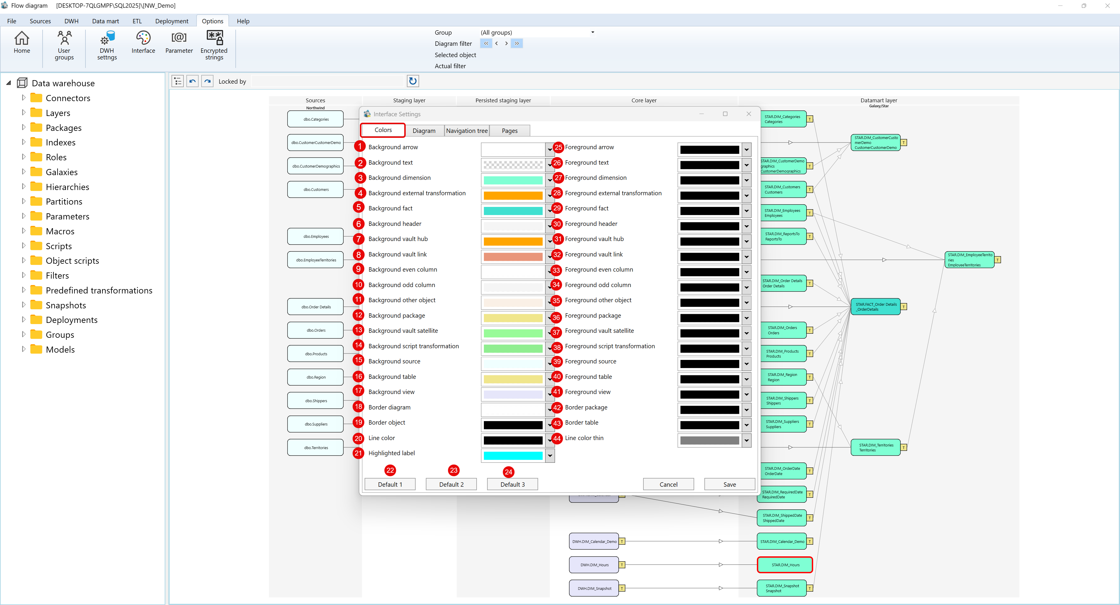
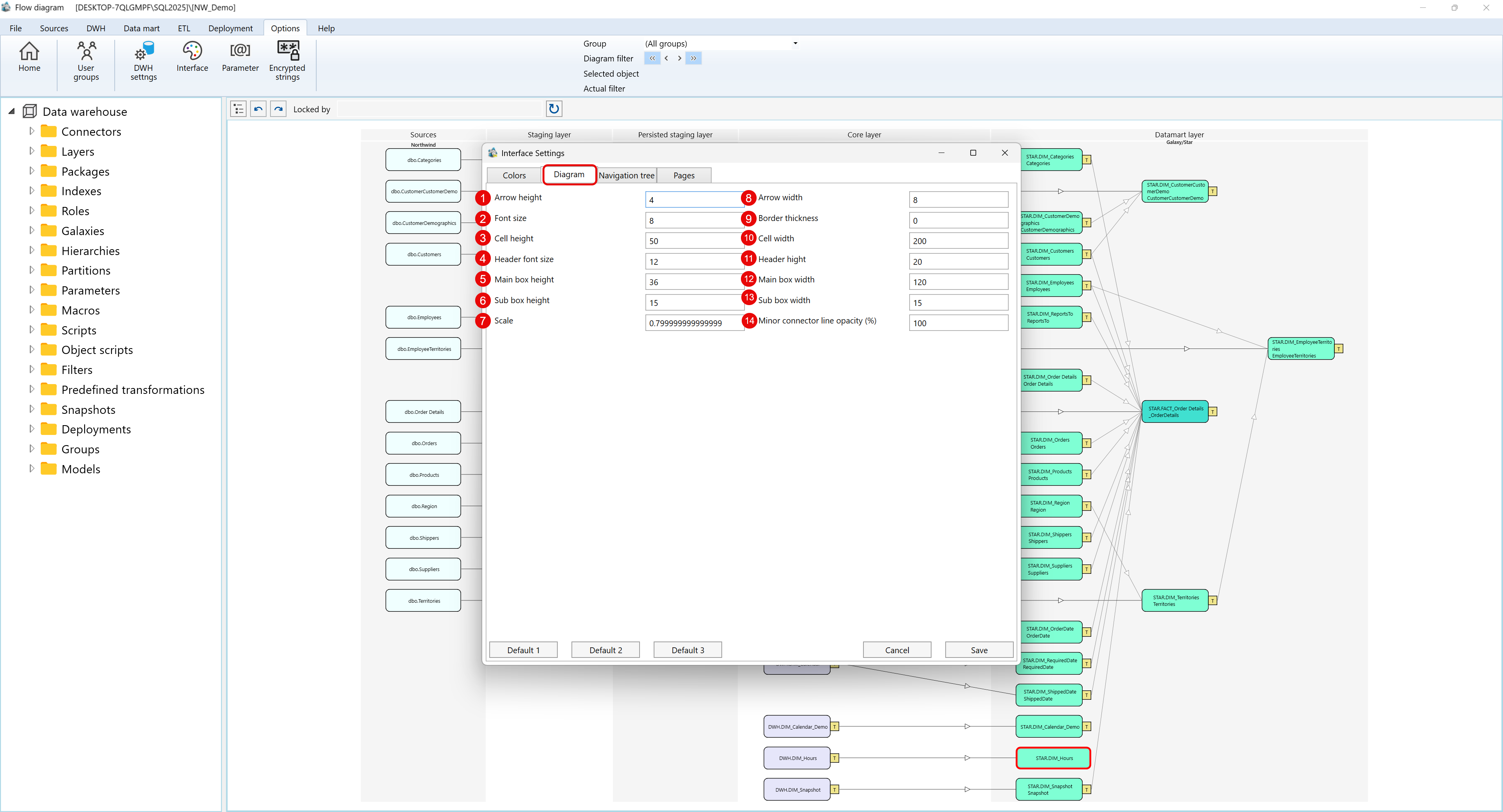
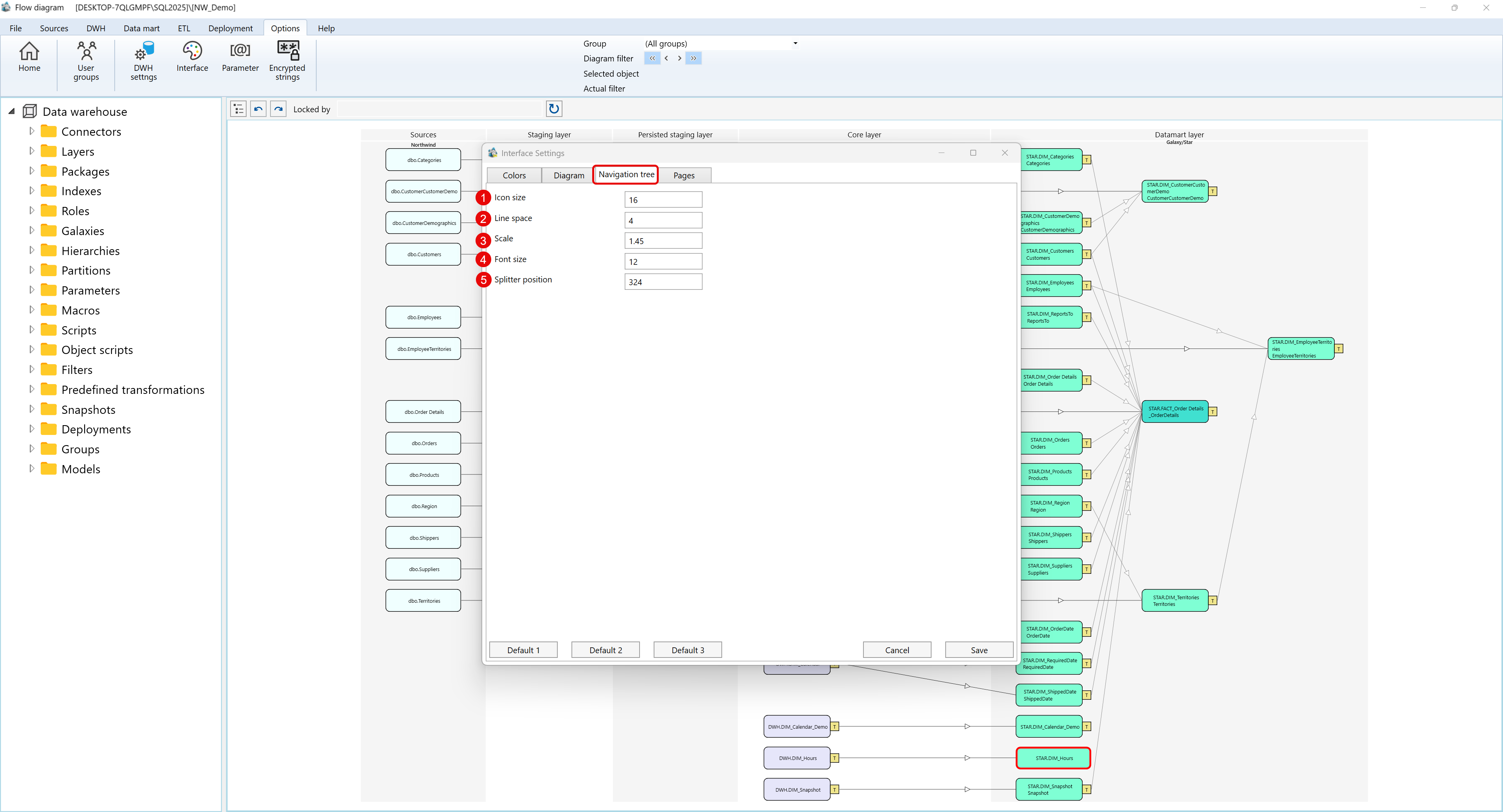
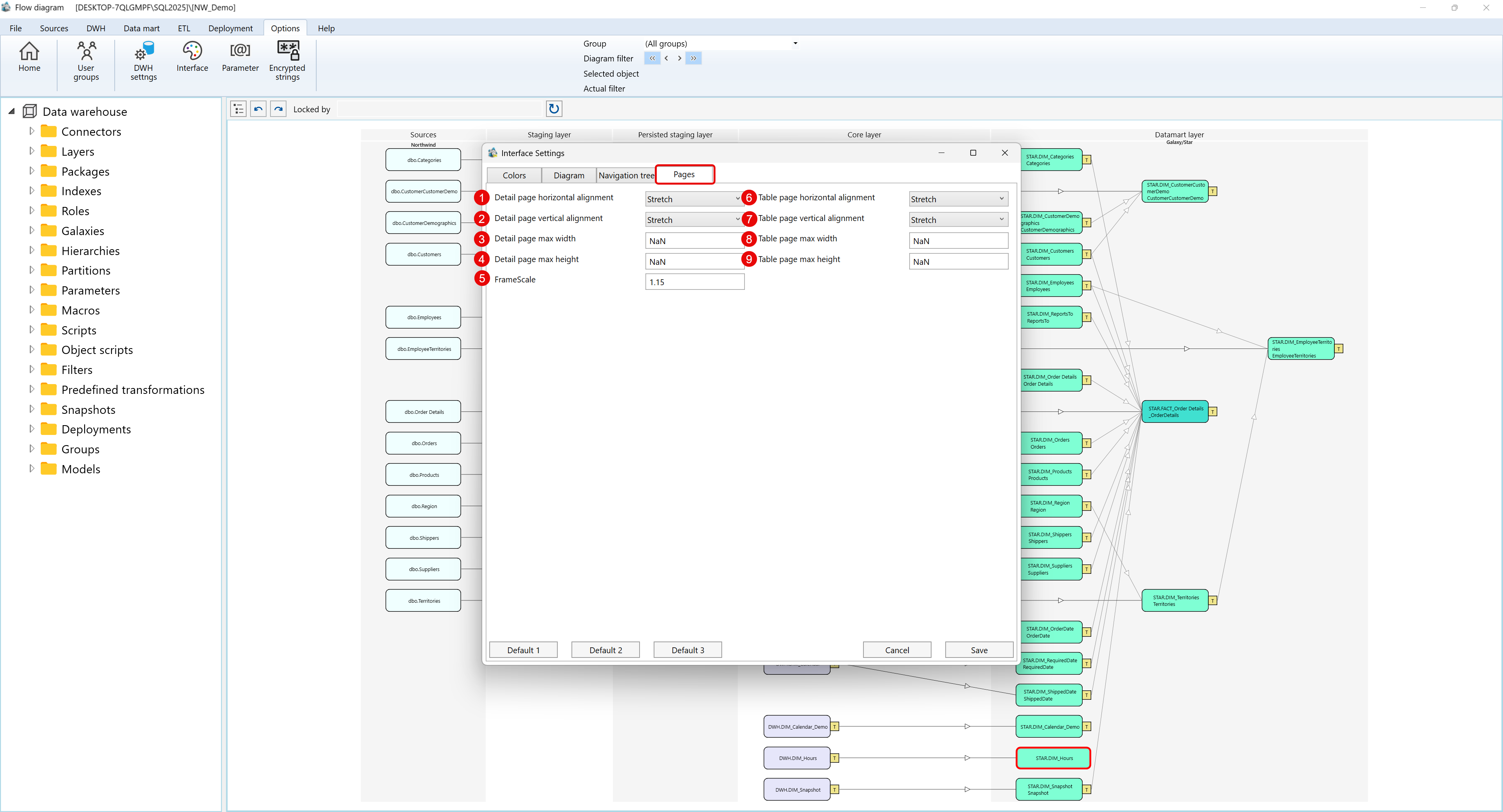